Shoebox
ShoeBox
Crew needed a solution tailored to their needs.
As a former film and television production freelancer, I routinely encountered an annoying problem. Every time a new job came my way, I was faced with loads of paperwork. I always wished there was a way to automate and organize all of it and had a hunch other people felt the same way.
I was right, but even having experienced the problem myself didn’t make defining the problem very easy. I had to keep my assumptions in check on this project and work to organize information in ways that made sense to other people.
Customer Validation
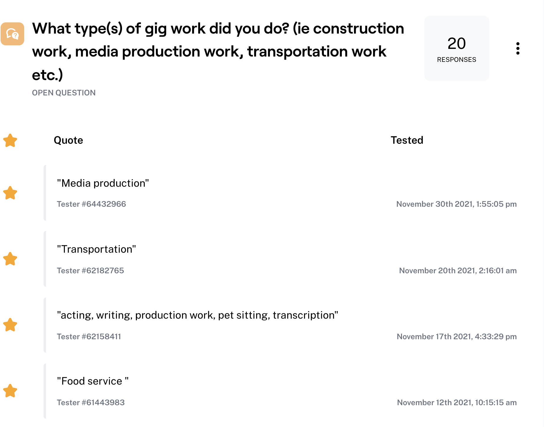
Before beginning any research plans, I sent out a customer validation survey to get a general sense of what “gig” workers experienced in this problem space. My initial scope was wide because I was unsure if this problem was specific to just myself as a crew freelancer.
I found that a lot of people complete general gig start work via secure online portals like Upwork and Uber. Interestingly, these workers also expressed wanting a more uniform way to apply and save information when using more than one portal.
I was looking for high-volume freelancers not working with just one or two online portals or a freelance aggregation site (like Upwork). I paid special attention to respondents who worked a higher volume of jobs, but also used responses from the other gig workers to inform my product validation conclusions.
Customer Validation Survey Questions
Validation Results
Of the 20 responses, 4/6 of the high volume gig workers were tv and film workers, so I interpreted this as lending evidence to my hypothesis that this was indeed a problem for this group. Further, 10/20 respondents reported having sent start work containing sensitive information in an insecure way.
With these findings, I decided to focus the brief on film and television freelancers (crew). I felt a product that could solve this problem for crew could also be useful to other gig workers but in different ways and for different cross sections that needed further identification.
Industry Research
I dove into desk research to gain a better understanding of the industry as a whole and to understand how the problem was currently being solved.
Streaming companies like Netflix, Amazon, HBO, and Hulu etc. were only growing in popularity. Streaming customers had what seemed to be an insatiable appetite for new content. Although large studios produced a significant portion of overall productions, the independent space was at the lead and growing. These independent productions sold to the larger studios meaning there were production crew working across many smaller production companies who all had their own systems for hiring and payroll.

Competitive Analysis
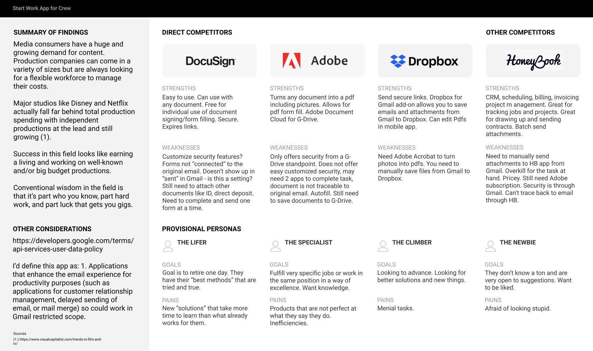
Although I couldn’t find an exact product that fully addressed the all the problem of start work, I did find companies that addressed various parts of it.
DocuSign solved signing documents well but was designed for the sender more so than the recipient.
Adobe Acrobat offered some autofill but potentially necessitated 2 apps to complete 1 document via mobile device. Dropbox was a great place to store things but not great for searching and referencing information.
Honeybook
was good at those things, but required an additional Adobe subscription for some functions and while it had email integration it was only for already defined projects. Crew routinely received emails for new projects with no existing project setup on their end. Also, crew could forward attachments to HoneyBook but not entire emails unless the project was already set up.
No one provided a total solution for the start work problem.
Provisional Personas
Based on my past experience working in the industry I went into the interviews with 4 provisional personas I expected to see. While one provisional persona didn’t necessarily encompass a whole person, I thought I would see aspects of these in my interviews.
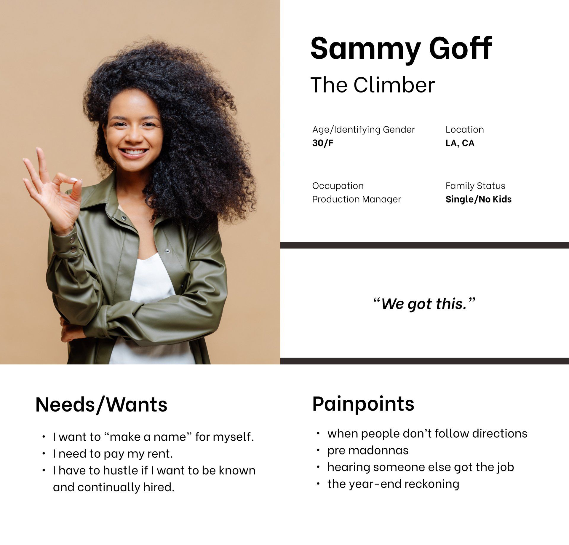
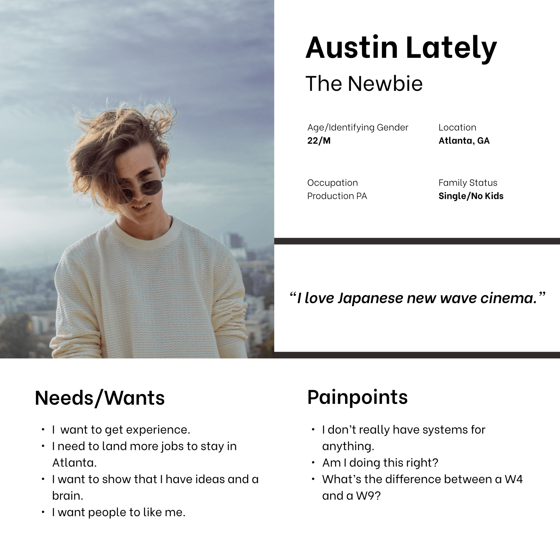
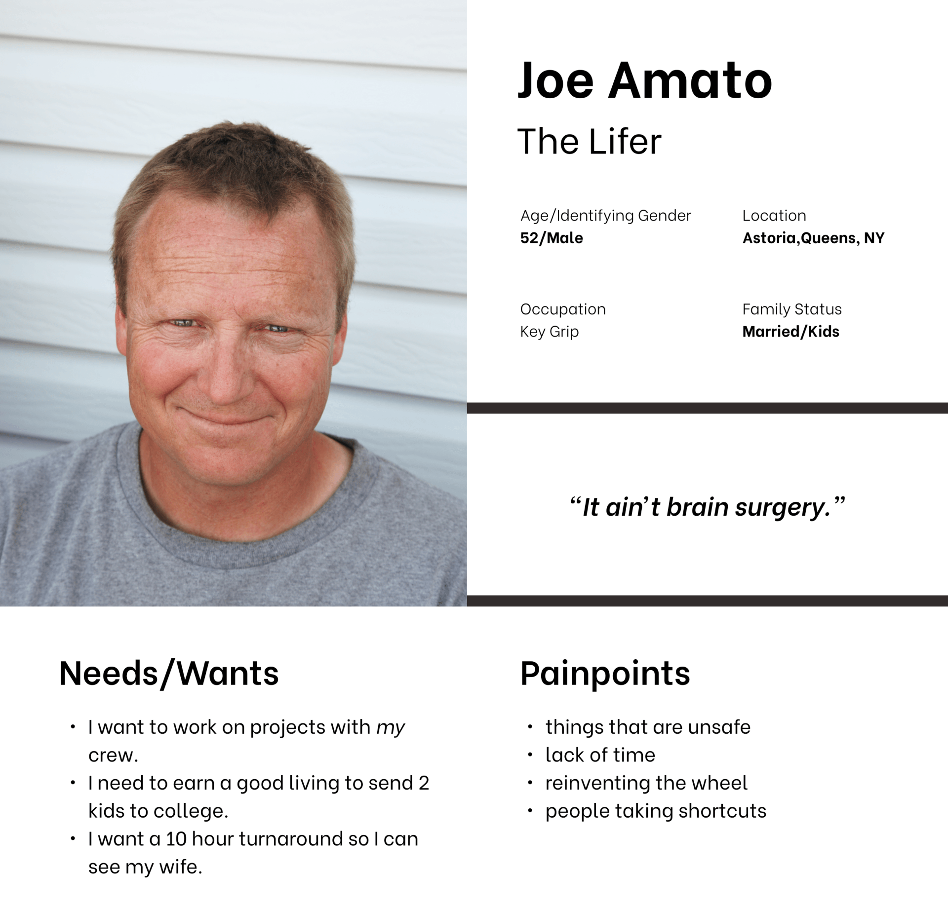
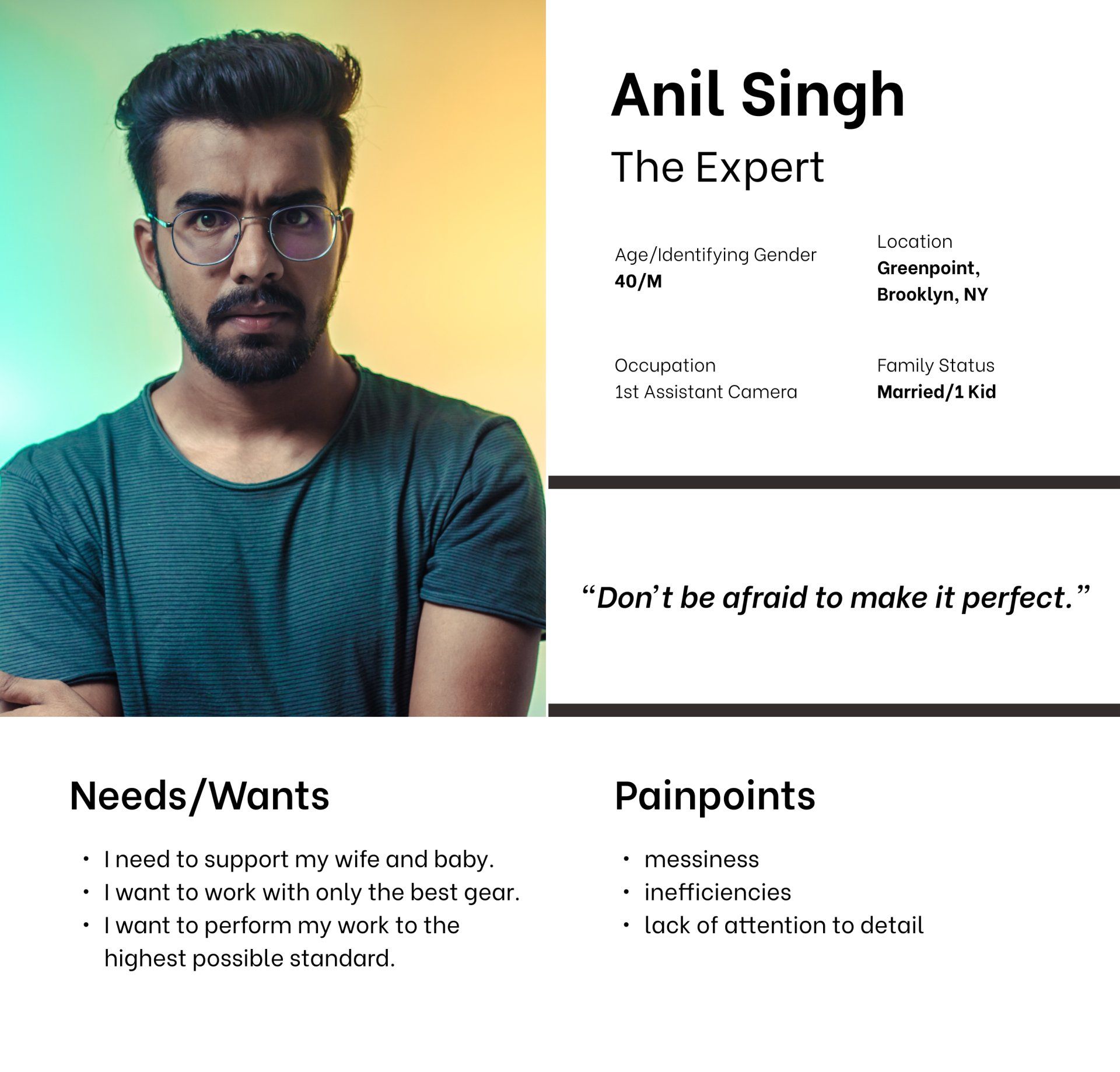
Why don't you use a different system?
Do you protect your personal information? How?
The Interviews
Along with some demographic questions, I asked questions about how the 6 interviewees got start work, where they were when they did it, what it was, and how they completed it and got it back to the sender. I probed for specific information like, “Where do you save that file?”, “Why do you save it?” , and questions to identify their process timeline along with any hiccup points.
After my first interview, I discovered a group of payroll products crew were using to complete start work
that wasn’t sent in email attachment form. The crew member would receive a link and then be directed to one of these products where they could autofill their start work to varying degrees so I added questions about this to my interview script.
Key Findings
1.
Mostly, crew completed start work at home on laptops and at the job in person.
All but 1 interviewee stated that they completed this type of work from a laptop or desktop - where they sometimes kept already filled forms like 1099s in a folder.
The most common reason crew gave for this was that it was easier to see the documents on a desktop and that they could save things there to reference later.
"You know, my phone is kind of limiting."
2.
Crew cross referenced tax forms at end of year with pay stubs, invoices and documents they sent to production.
Contacts, job titles, email titles, and attachment names all played a role in how people traced back jobs to validate W4s and 1099s. The key objective for the interviewees was to match the number of jobs they had to the number of tax forms they received so they didn’t miss claiming income tax for any specific job.
"It's such a pain to have to go through a long list of emails to have to pinpoint something."
3.
Crew were logging into more payroll companies to start jobs and to get paid.
As with the first interview, crew members stated an increase in payroll system logins to complete start work, but there was still plenty of it done outside of these platforms. Additionally, crew needed to login to all payroll sites either quarterly or yearly to gather their tax documents. One freelancer was very irritated that he was recently sent yet another portal login to get paid for one of his 1099 jobs. This interviewee had even gone so far as to get himself a workers comp policy so he didn’t have to fill out timecards on sites or on paper but he was still required to manage another portal to get paid.
"It's super f*cking annoying...and it's still 1099. It's like, there's nothing to be gained from this..."
4.
Crew couldn't remember all the jobs they'd worked in a year.
Crew kept notes on their phones about which jobs they’d worked but it was informal - or as one interviewee stated, “I haven't figured that out yet. It's usually a pretty sloppy execution of going back through the year."
"It wouldn't be 100 (jobs). That'd be too high. Maybe around like 60ish."
5.
Crew received attachments such as PDFs. Some were fillable, others not.
Crew received some PDFs that were fillable while others were not. They managed this task in a few different ways. Some used Markup to fill out and then save the forms on desktop, others had an Adobe subscription and used Adobe Fill & Sign. 1 person physically printed, signed, saved, and uploaded and another person used a pdf converter app.
"Sometimes they might have links. Mostly attachments."
6.
Crew sent sensitive personal information through insecure mechanisms.
Crew members reported sending their personal information like driver's licenses and passport copies, social security information and bank account information via email and text message to complete start work.
"It's like pretty incredible how open people are to sending things in an insecure way just to get the job done."
The Persona
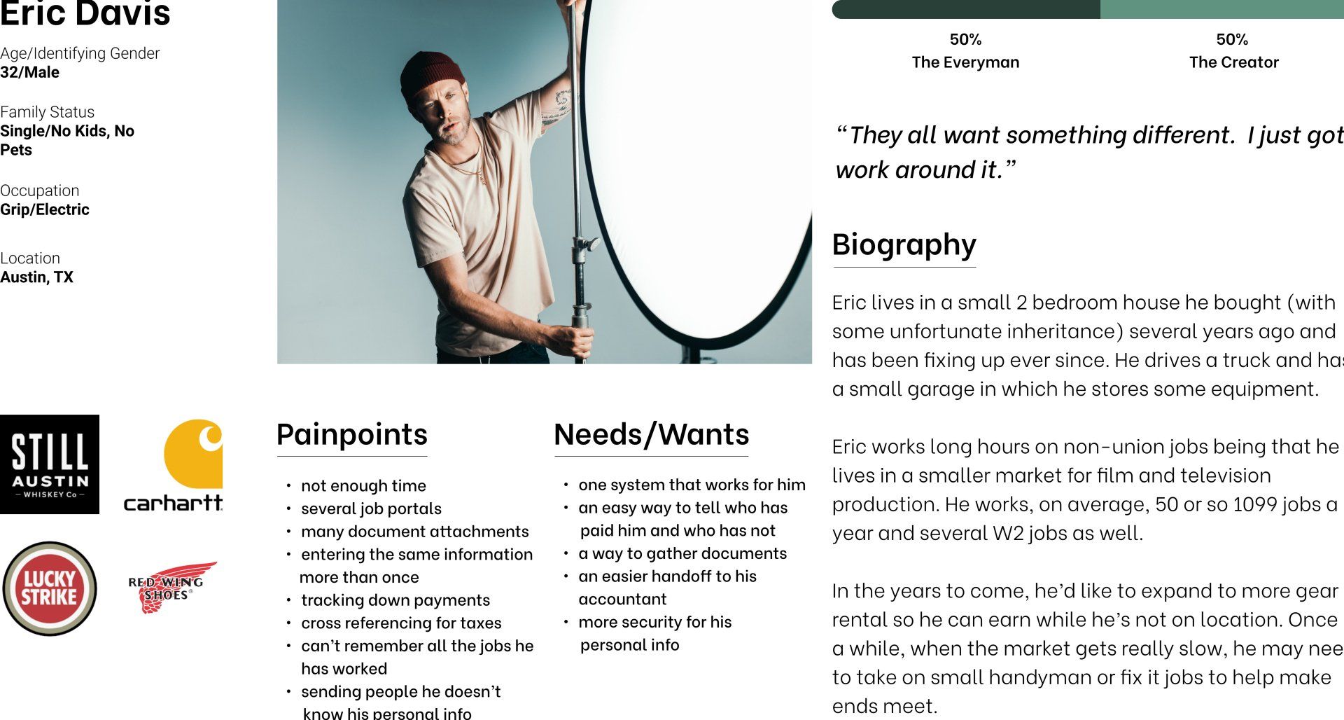
I based my persona, Eric, on the people I interviewed. He embodied the sort of lifestyle and character I thought someone facing these problems in the context of film and television might have. He lived in a secondary market, worked a high volume of jobs, and had "loose systems" for his paperwork that could be improved.
Isn't that just QuickBooks?
Nope.
If it were Quickbooks, Eric would have already been using it. A key part of what he needed was the ability to track back job details through his email with specific search terms - like someone's name, a phase in their email, or the production name.
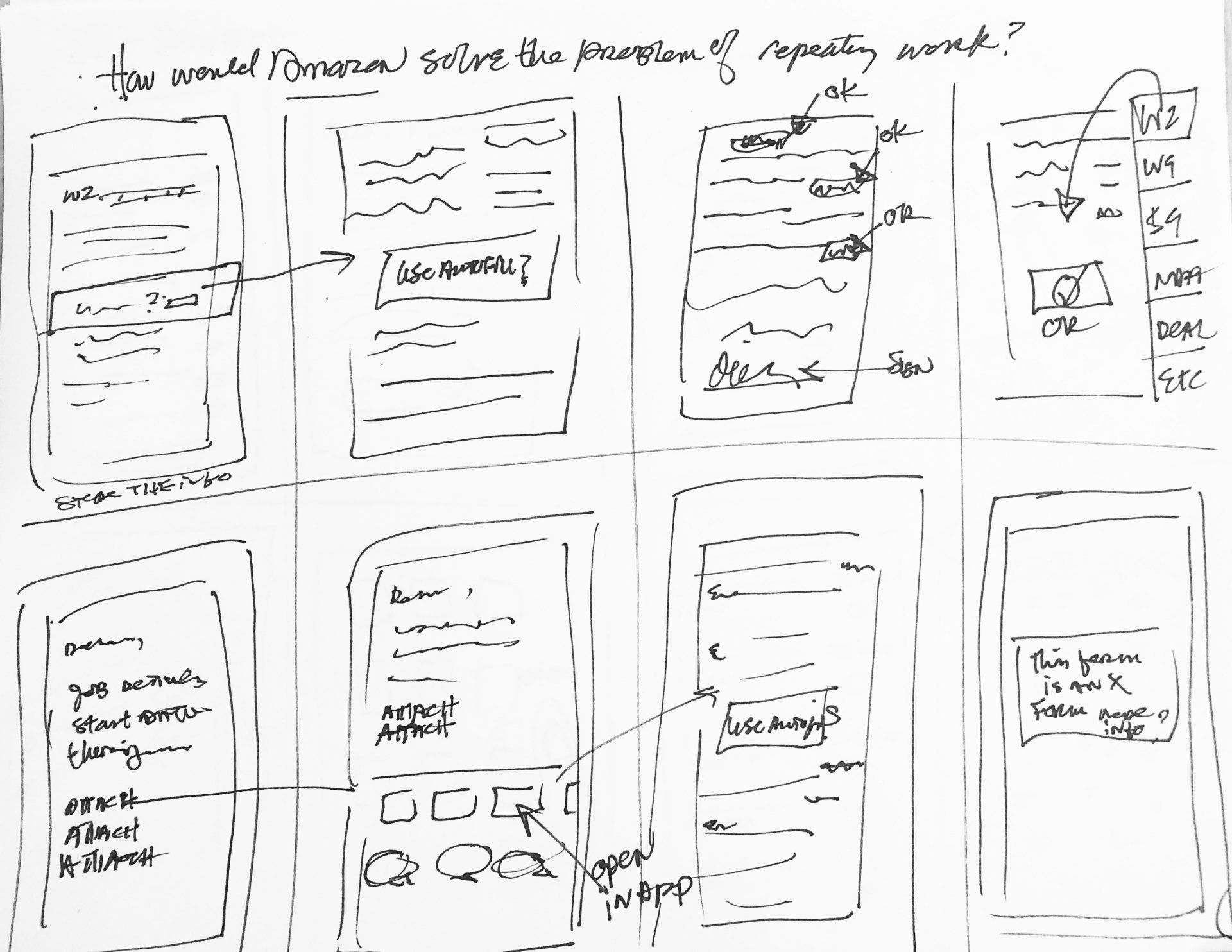
To get creative, I sketched out some ideas using crazy 8s. I gave myself the question how might Amazon, DJI, Uber, AirBnb, Fitbit, Sol Lewitt, and Thom Yorke solve Eric's problem?
Some of my "solutions" were bizarre but others stuck, and all got me thinking. The most promising ideas were from a DJI and Fitbit standpoint. I liked the dashboard of Fitbit and how it summarized personal information and I liked the automatic flight log that DJI generated after every flight.
Slide title
Write your caption hereButton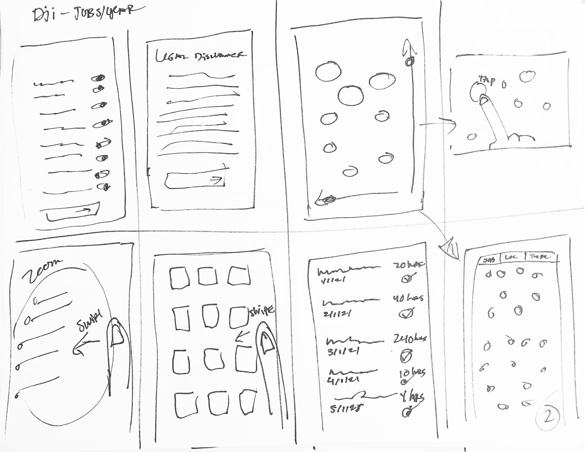
Slide title
Write your caption hereButton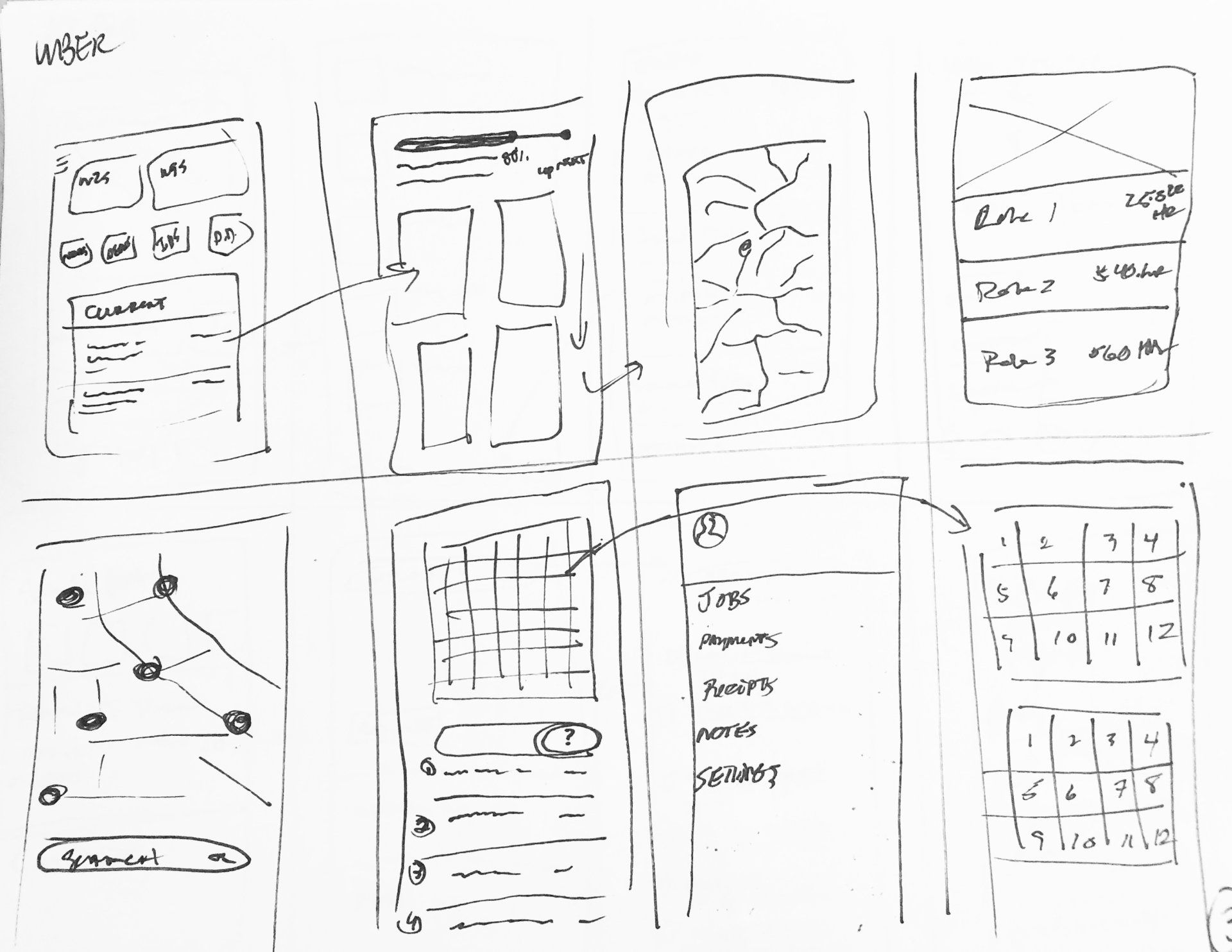
Slide title
Write your caption hereButton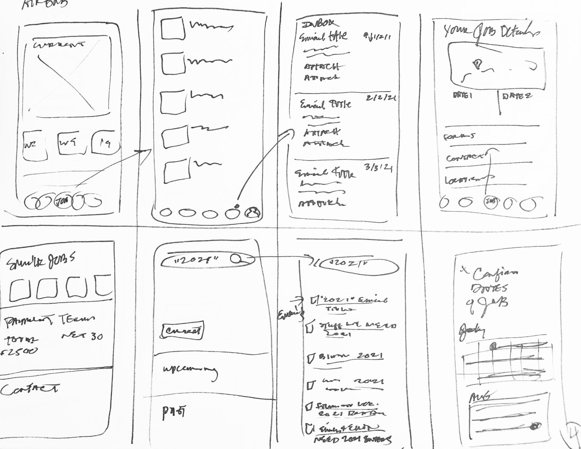
Slide title
Write your caption hereButton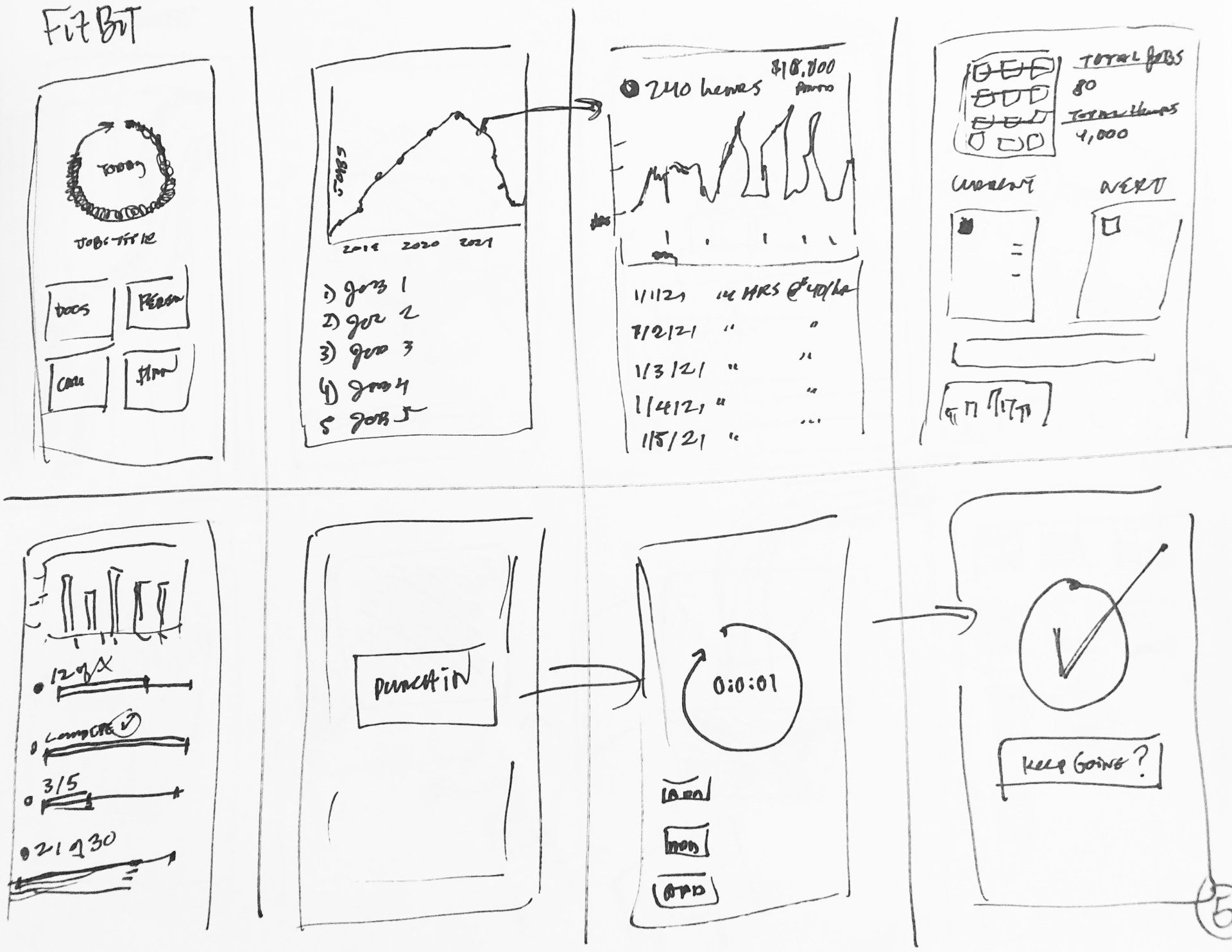
Slide title
Write your caption hereButton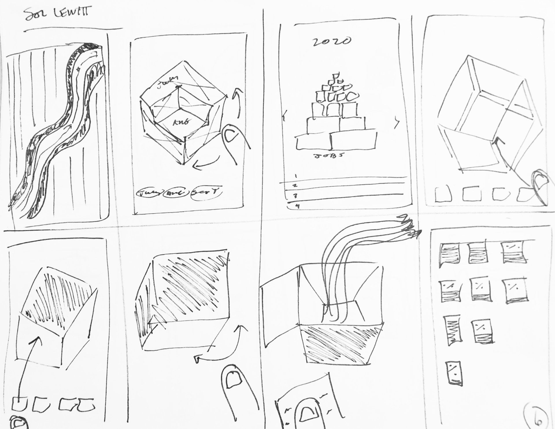
Slide title
Write your caption hereButton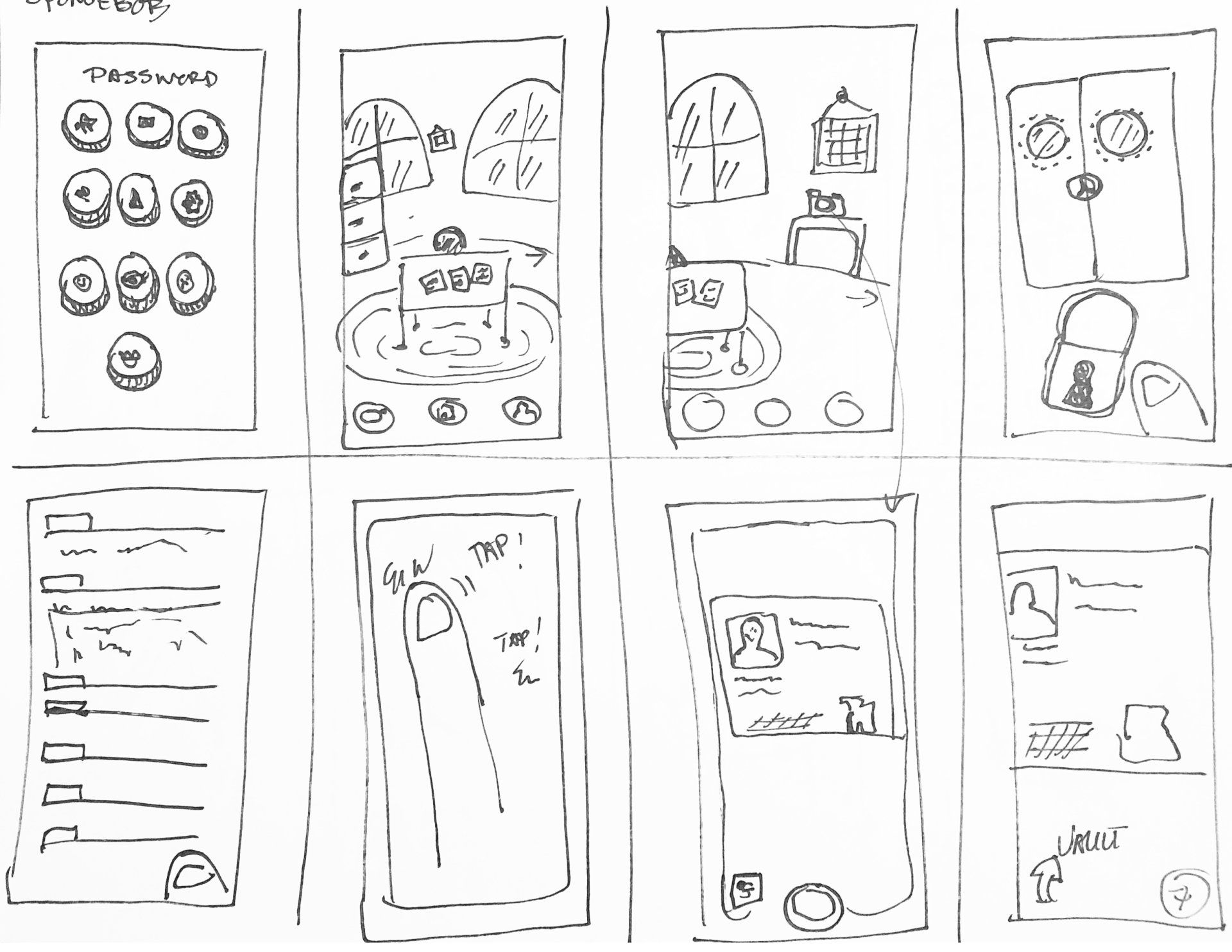
Slide title
Write your caption hereButton
The Storyboard
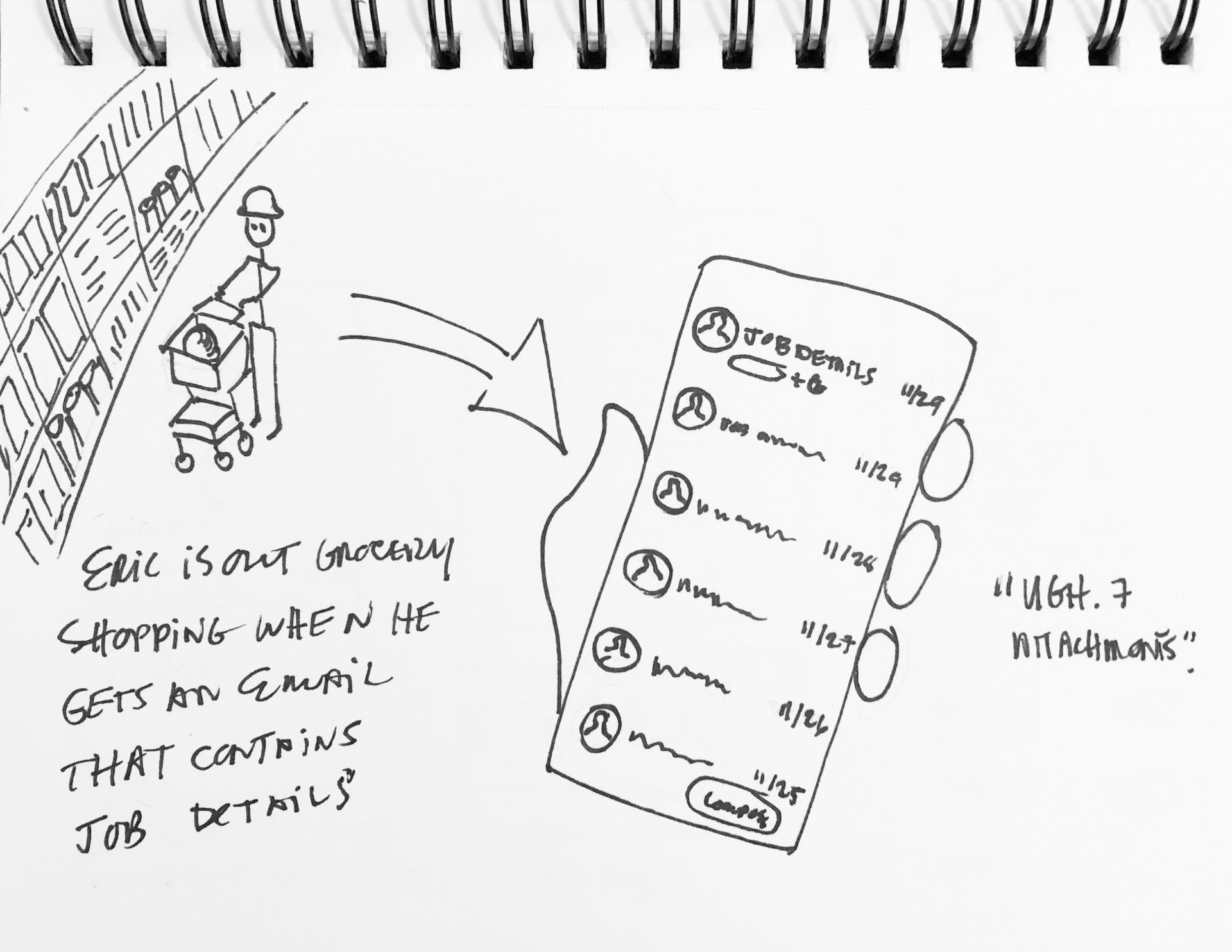
Eric would be out and about doing errands or at another job when he got an email containing start work for an upcoming job. Ideally, he'd be able to complete the start work on his phone quickly without needing to go home and use his laptop.
Slide title
Eric is out grocery shopping when he gets an email from production that contains job details. "Ugh, 7 attachments."
Button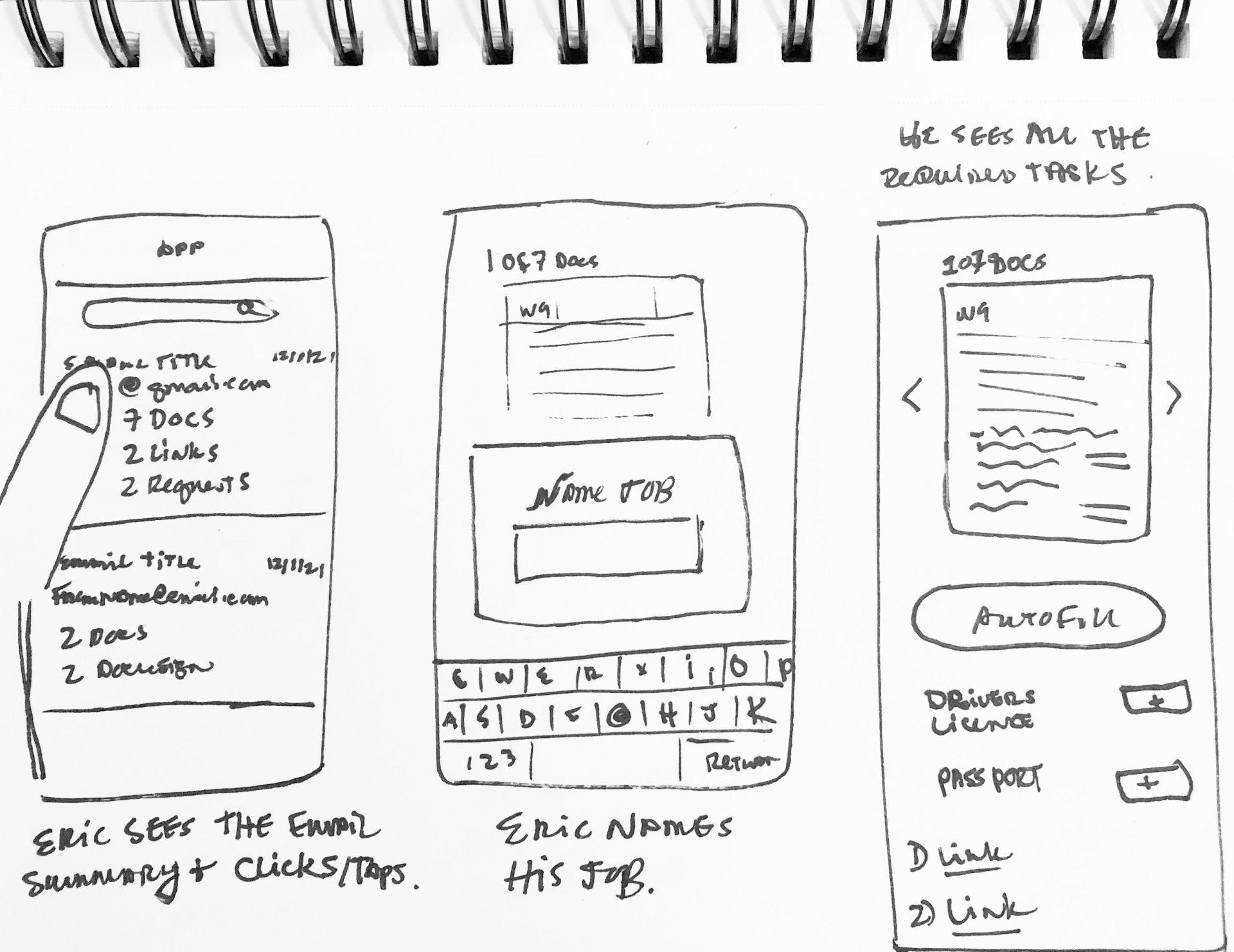
Slide title
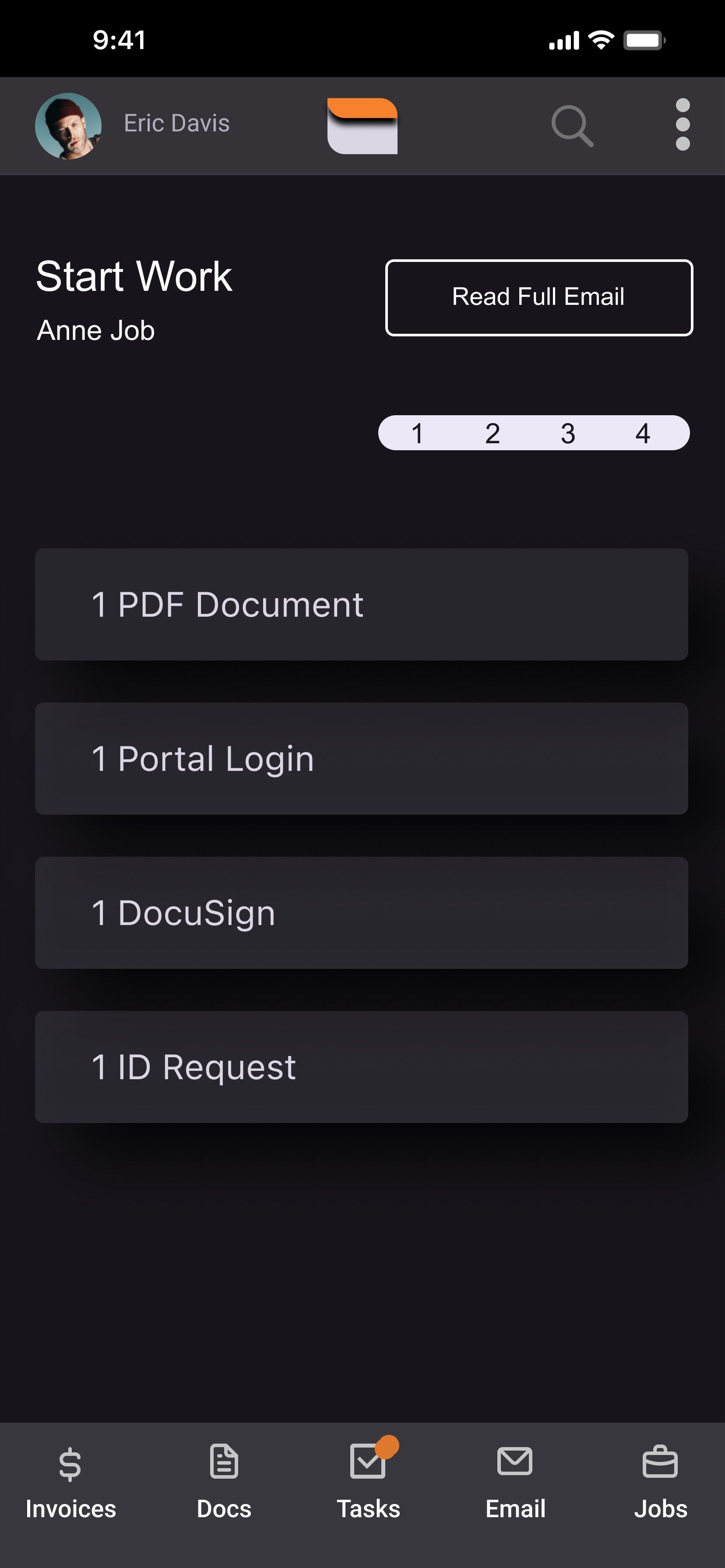
Eric opens his app and sees the email summary. Eric names his job, and sees all the required tasks associated with it.
Button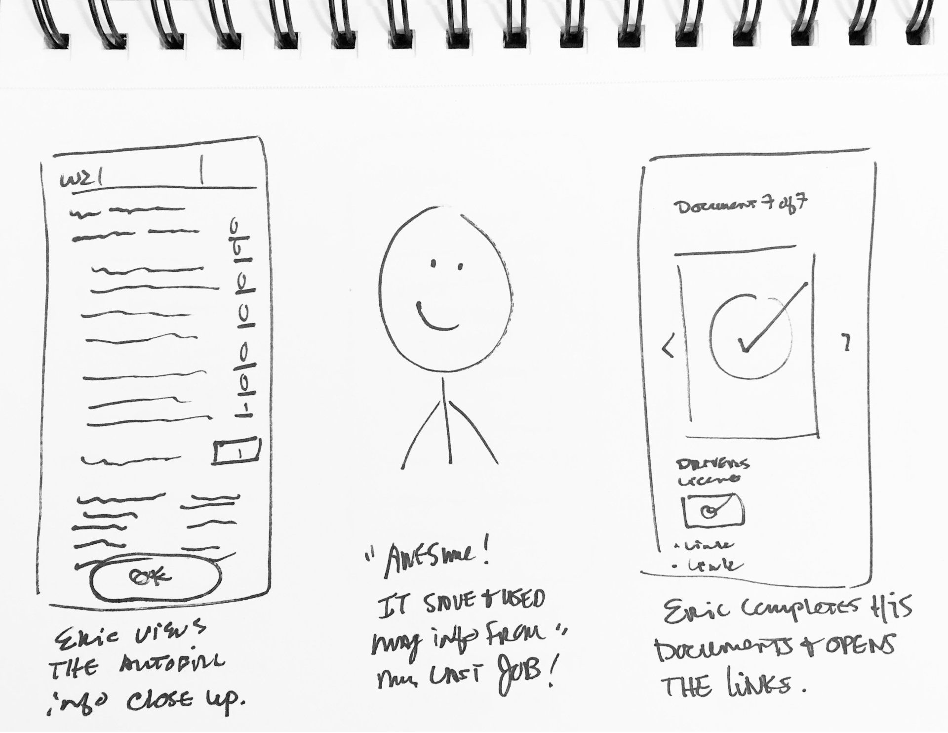
Slide title
Eric views the autofill info close up. "Awesome! It saved my information from my last job!" Eric completes his documents and opens the links.
Button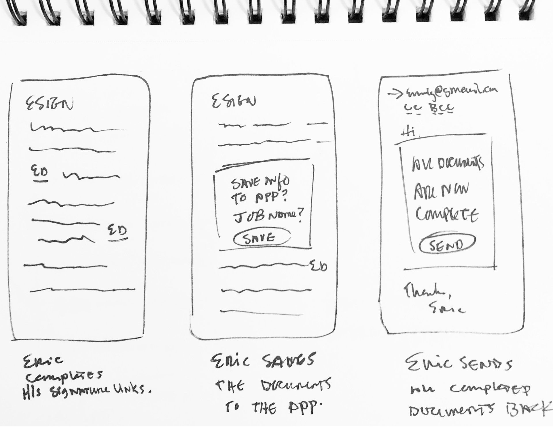
Slide title
Eric completes his signature links and saves the documents to the app. Eric sends his completed documents back.
Button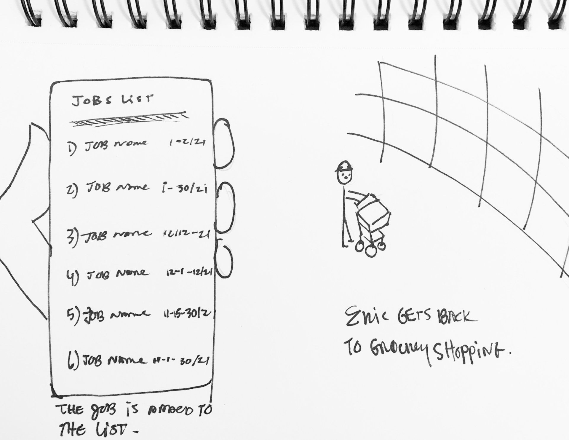
Slide title
The job is added to the job list. Eric gets back to grocery shopping.
Button
Initial User Flow
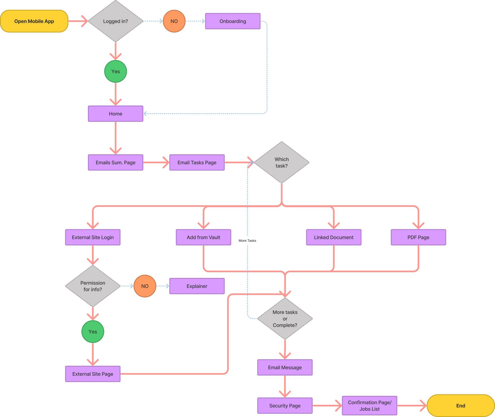
I designed my original user flow and wireframes to have an “email summary” page and then an “email tasks” page. I eventually decided the email summary page would be better as simply a recognizable Gmail inbox page. I wanted the user to quickly identify the email that required their attention. I separated the tasks into 4 paths, but in my later versions, I condensed all of them into 1 larger task. This original user flow was too complicated with too many options, so I worked to simplify it.
Revised User Flow
I decided to focus the user flow on the main goal which was sending all completed information back to Anne (the email sender). In an ordinary case, Eric would have several types of tasks to complete before sending a link back with the reply email so that's the flow I designed. Upon opening the app, Eric needed to find his tasks. He could find them in three ways from the homepage, but I envisioned a "tasks" indicator and a CTA that would provide the main route.

Mid Fidelity Wireframes
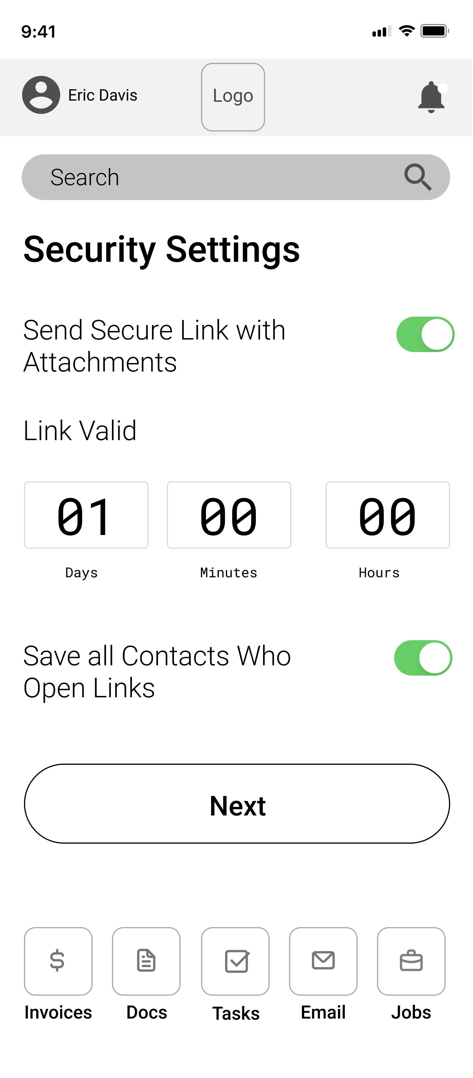
With the revised flow in place, I built the mid fidelity wireframes. I used dashboard designs for my homepage inspiration. I wanted the user to have all the high level information immediately available with options to dig deeper into the documents and numbers. First and foremost, however, I wanted the CTA to be front and center. I included a summary page for email task summaries (accessible via the bottom app bar) to give a broader overview of work to complete vs. work that has already been done. Mid Fidelity Wireframes


Initial User Testing Key Findings
I user tested the wireframes with 13 Maze testers and completed 1 testing interview. The users had a polarizing experience testing through Maze. Some ranked the “submit the PDF” task as relatively easy while others found it very difficult. Testing produced more general areas that needed improvement and not so much specific feedback. The population was general, not specific to the task I tested which was not ideal, but was what I could access.
Almost all users completed the task
and within under 1 minute. 1 user gave up/bounced.
Bounce Rate: 1 person
Testing Time: 56.6 Sec
8.3% misclick Rate
Some users were confused about product purpose
and the population it aimed to serve as illustrated by comments.
“I’m not sure as I got the feeling this was a product that finance or HR departments would use.”
Other users understood the basic product
and compared it to others they had used.
“This is kind of like a to-do app except with more functionality…”
“I use other secure websites for contract signing and receiving billing information…”
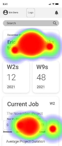
Users clicked both the CTA and the "tasks" option
and while clicking on “tasks” was also correct, the CTA probably needed to be more explicit.
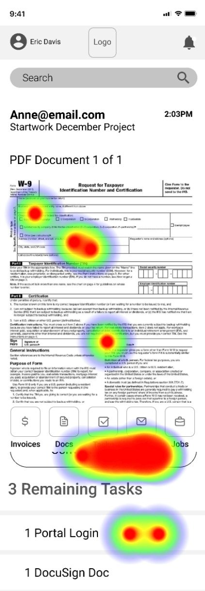
Users tried to click on the PDF to fill it out so I needed to make sure the PDF autofill feature was more apparent. Also, some users tried to click on the second task. I likely needed to communicate that there were 4 distinct tasks to complete.
Logo and Branding
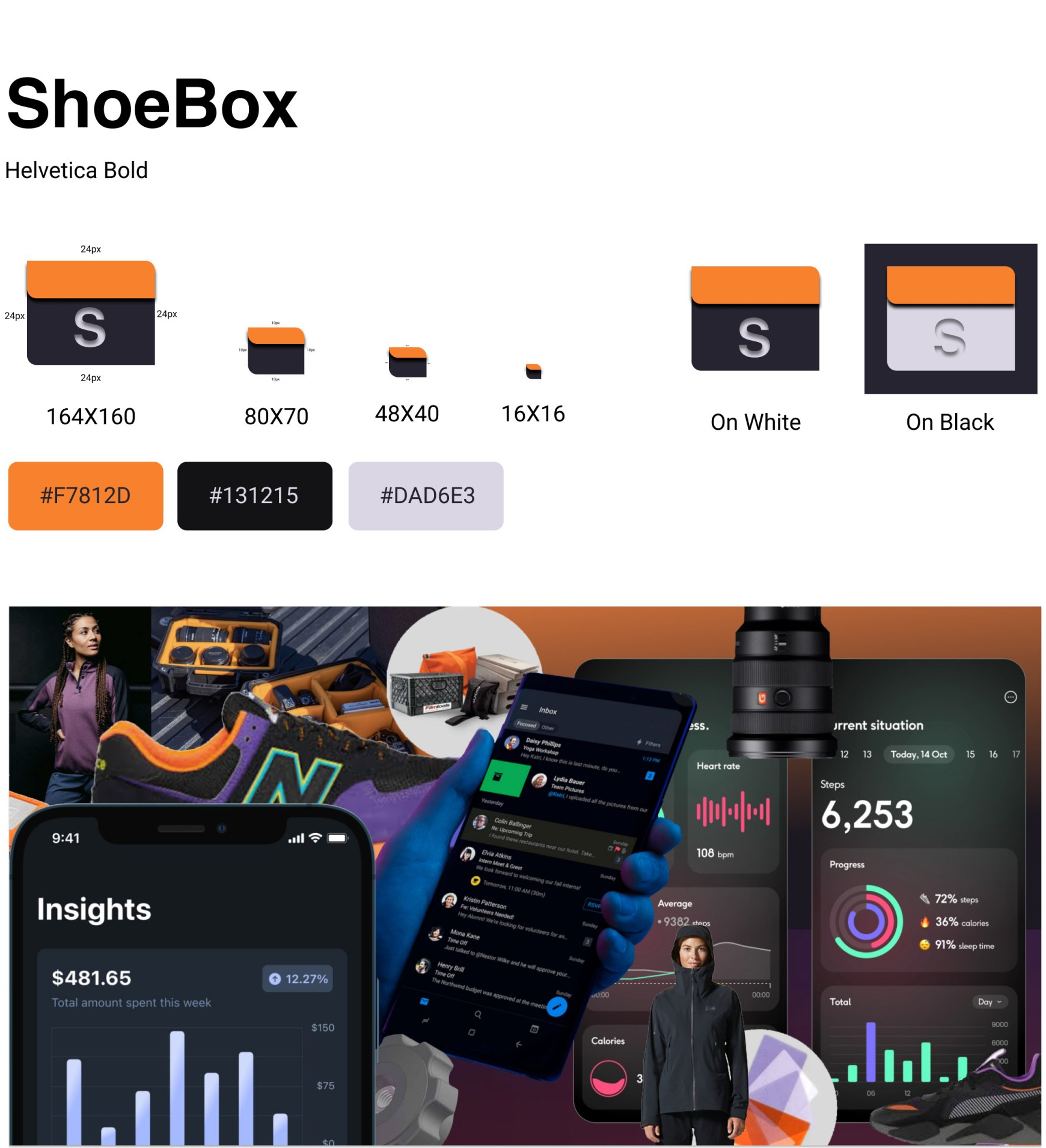
I moved on to branding so I could make a higher fidelity prototype that addressed the user stumbling points I identified. I decided on the name "ShoeBox" because it's the stereotypical way that disorganized people store their tax documents.
I based the colors bright orange and deep purple off of outdoor gear and equipment film crew members used and wore on set. I chose to design the app in dark mode so that crew could use it while on set without drawing attention to themselves or interfering with lighting.
High Fidelity Prototype
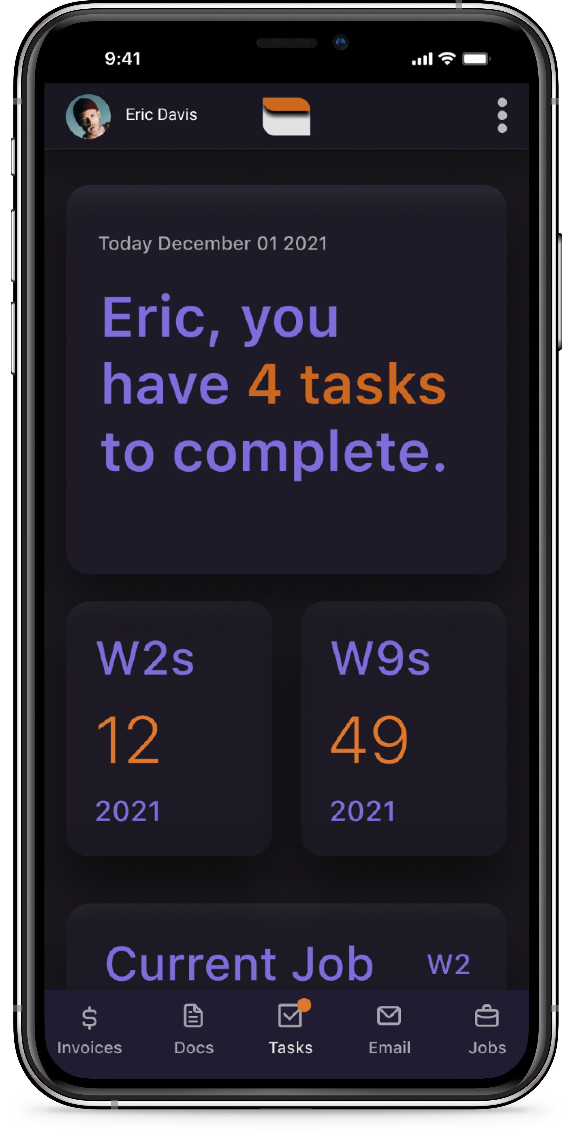
I applied the Shoebox branding to the high fidelity prototype and made changes from the initial user test.
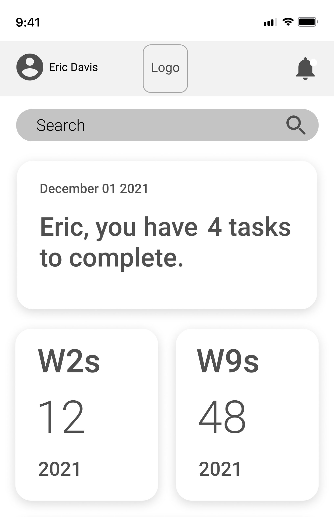
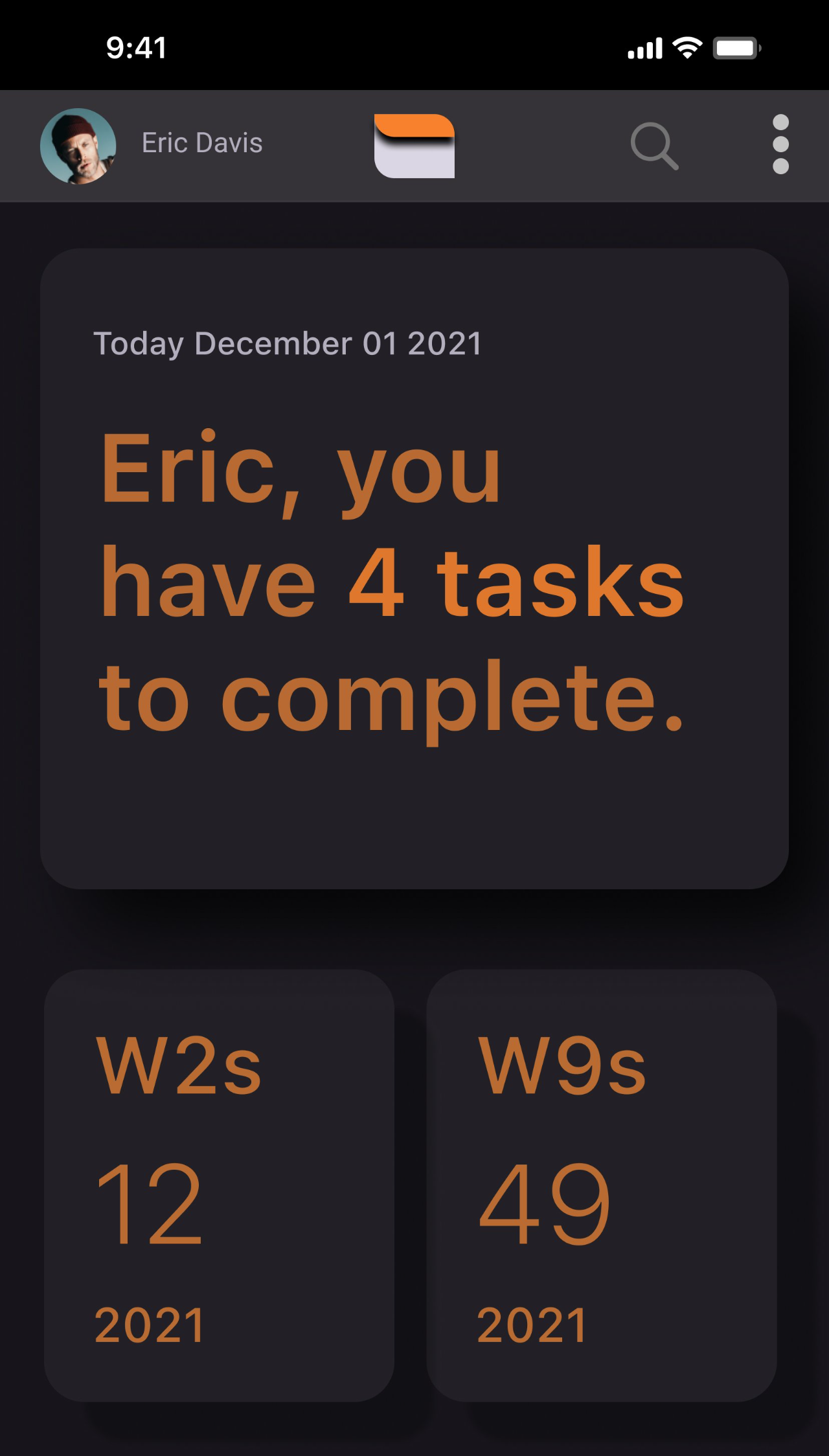
I made the CTA larger and emphasized the number of tasks to complete.
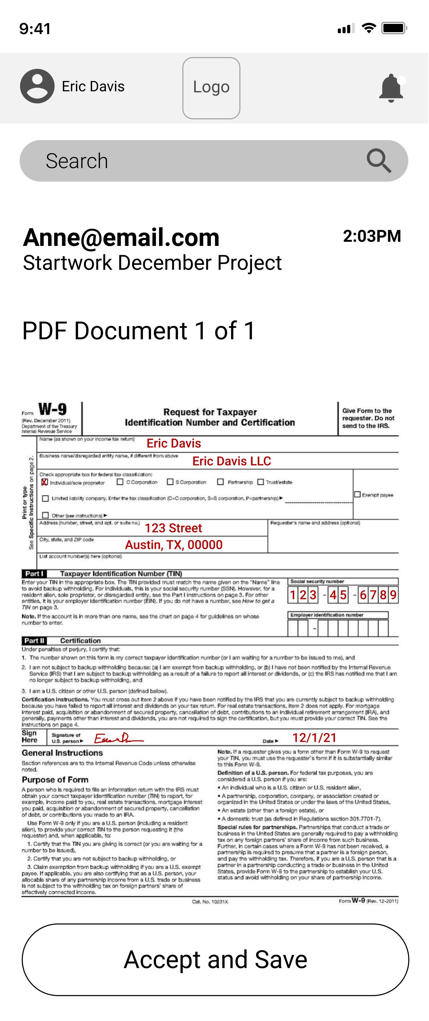
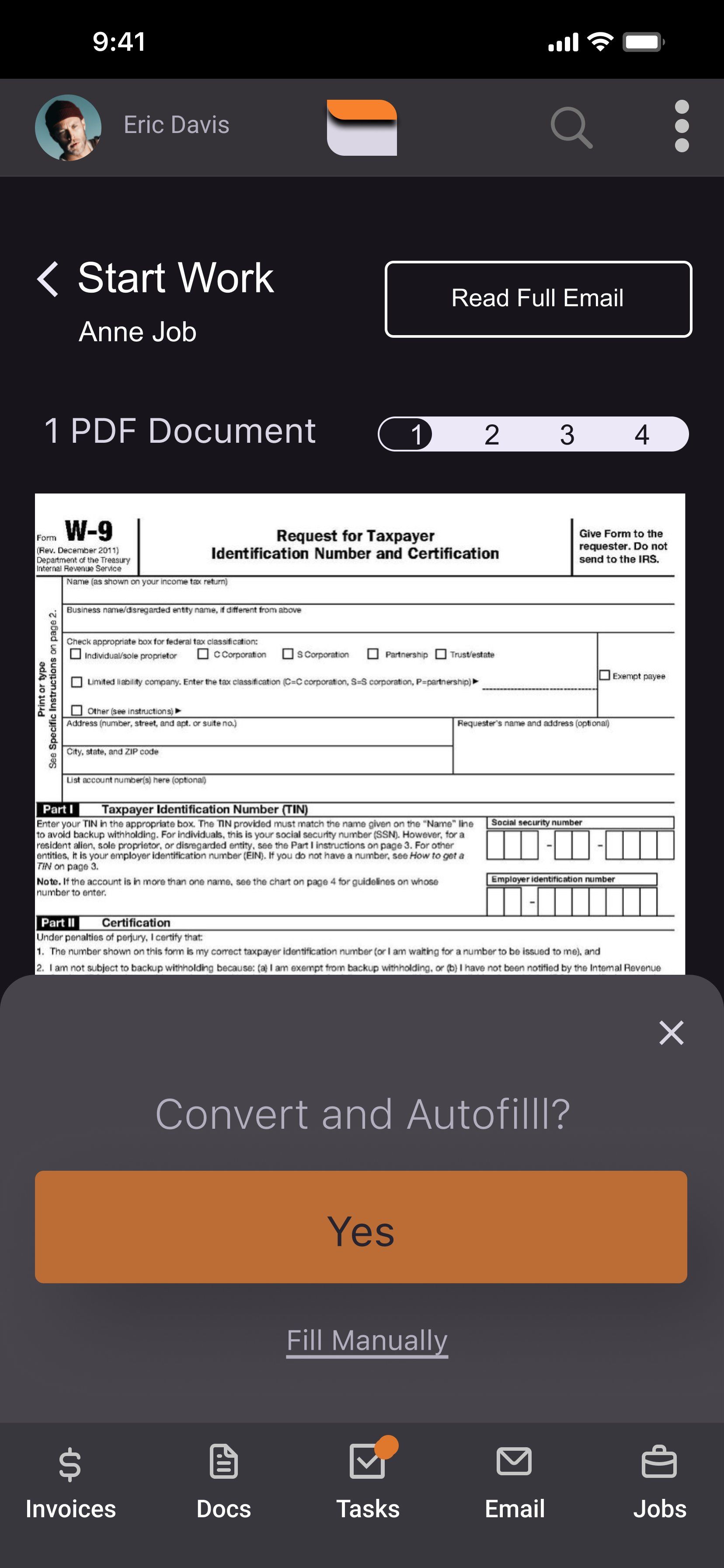
I moved the autofill button from below the PDF to on the PDF.
High Fidelity Prototype Testing Results
I tested the higher fidelity prototype on 3 core users (a much more specific audience than the first user test) and uncovered a few issues.
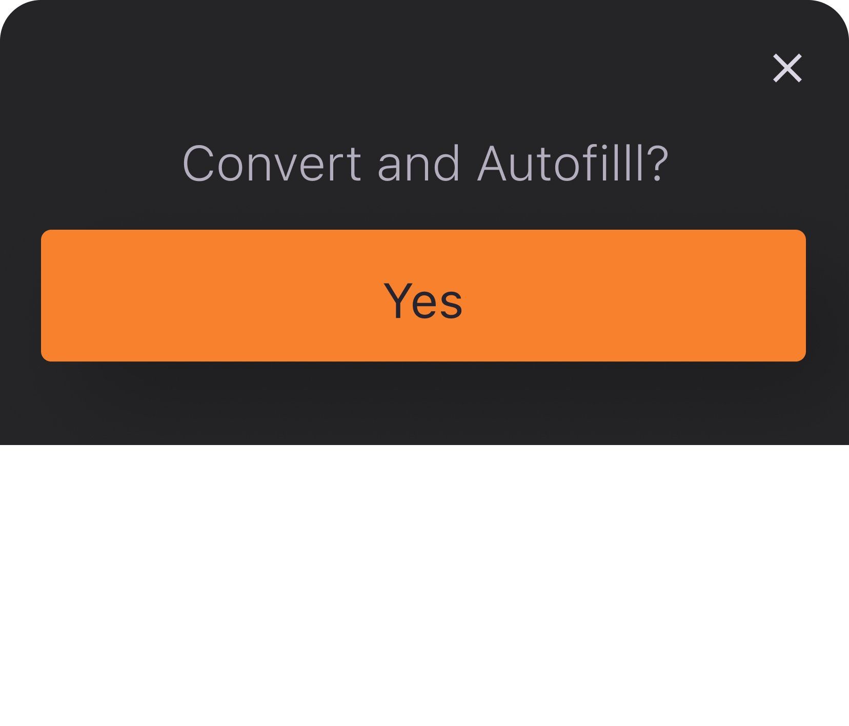
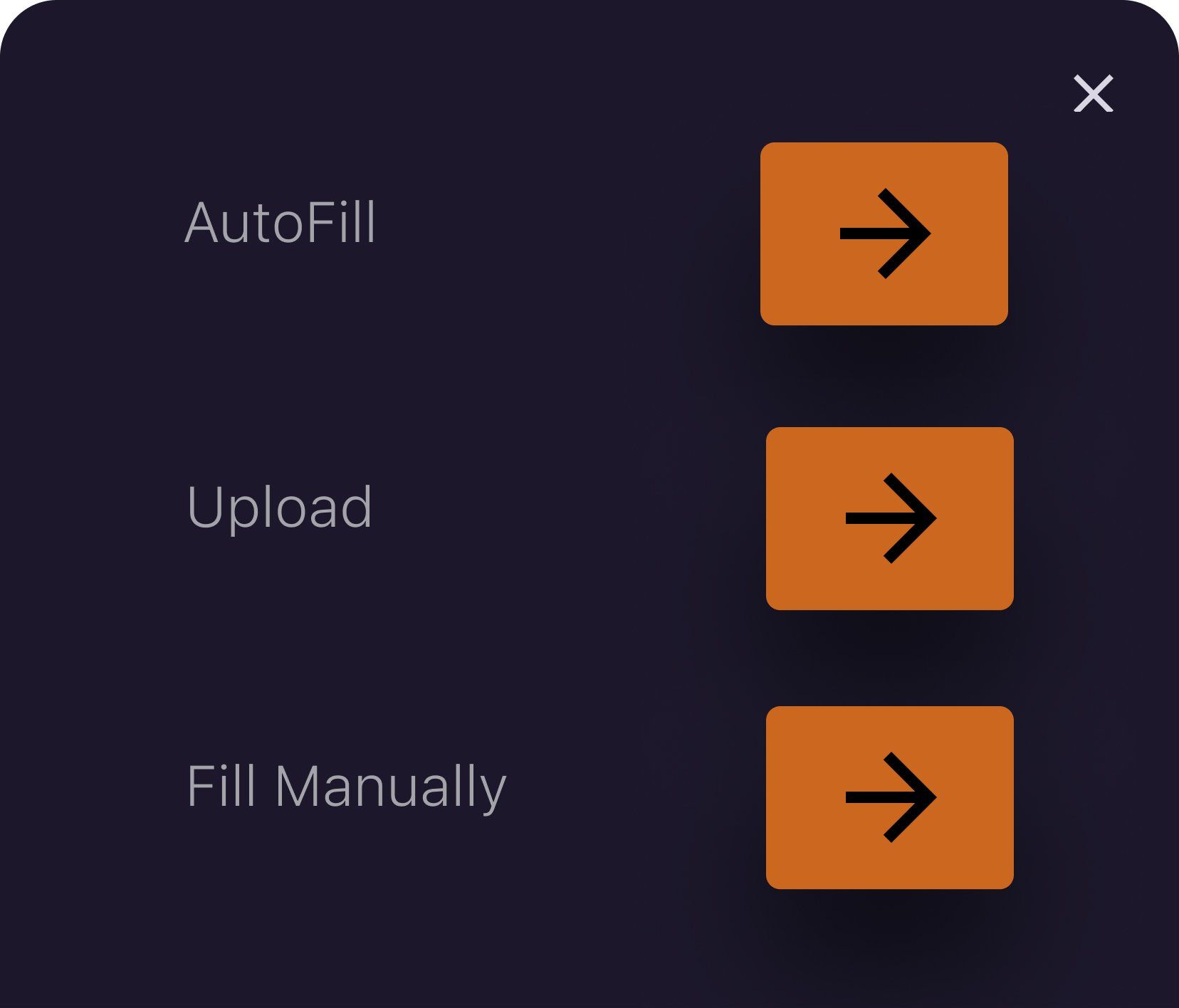
Users wanted to be able to complete PDFS manually or by uploading in addition to the autofill so I added options for completing PDFs manually and for uploading an existing document.
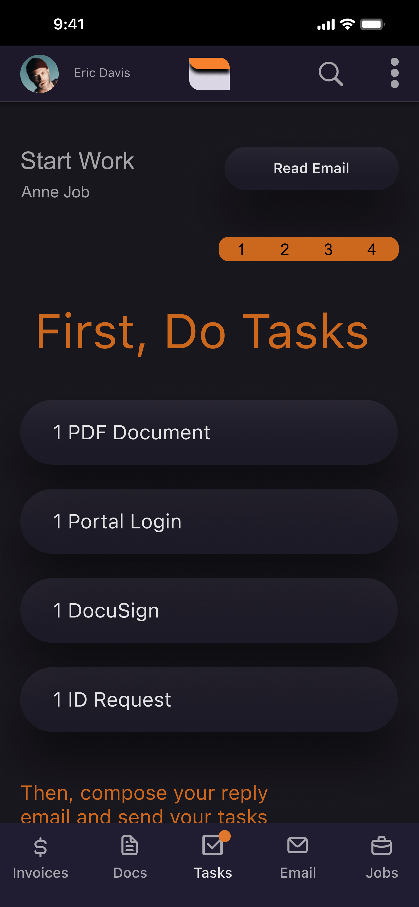
Users were unsure when they were sending the link(s).
To address this,
on
the tasks page, I gave explicit directions so users would know the email with the link would come after the tasks had been completed.
Fine Tuning the Final Design
I worked on making the dark mode darker while still maintaining accessibility standards and giving the product depth and shape. I replaced much of the orange with purple as this was the primary color and I made the orange buttons smaller to keep the screen darker. I also toned down the orange overall and included active and pressed color states to match the depth of the design.
Lessons Learned
I learned that It's important to communicate to the user what the journey is before they start it. This could happen in various ways ranging from text instructions to illustrations. It all helps the user with way finding through a task.
I also learned that knowing something about a particular industry can be helpful, but only to a point. It becomes relative because the more you might know the deeper the problems get and the more likely you are to make assumptions about possible solutions.
Moving forward, I would design and test the "documents" page. I would explore how users could use previously saved documents for other job start work completion.
See More Work >>>
Montplaisair Studio needed a site independent of Esty to directly reach customers and better convey a unique brand.
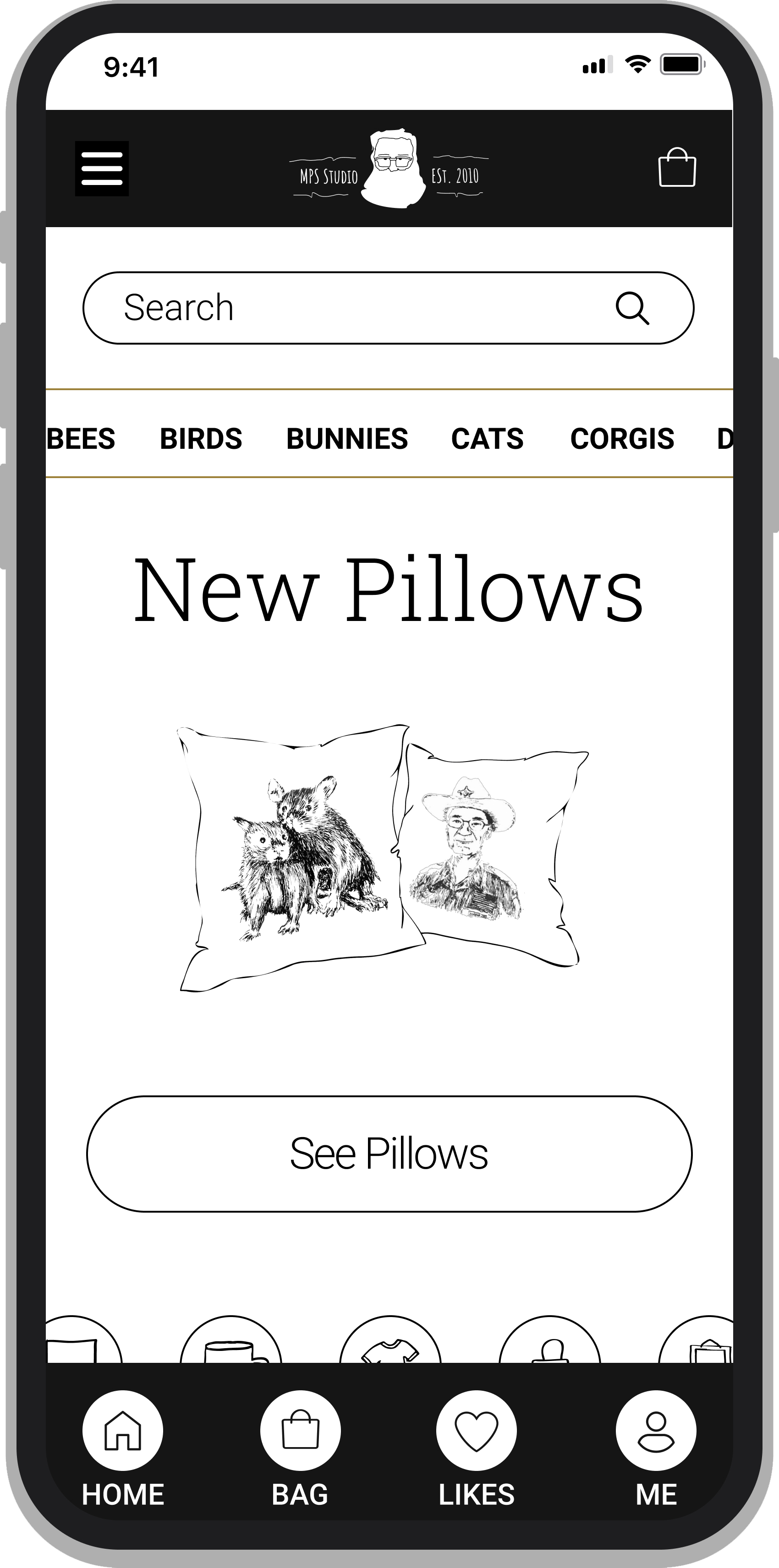
"It's time I got a website."
-Client
