Montplasir Studio
Monstplaisir Studio needed a place to call home.
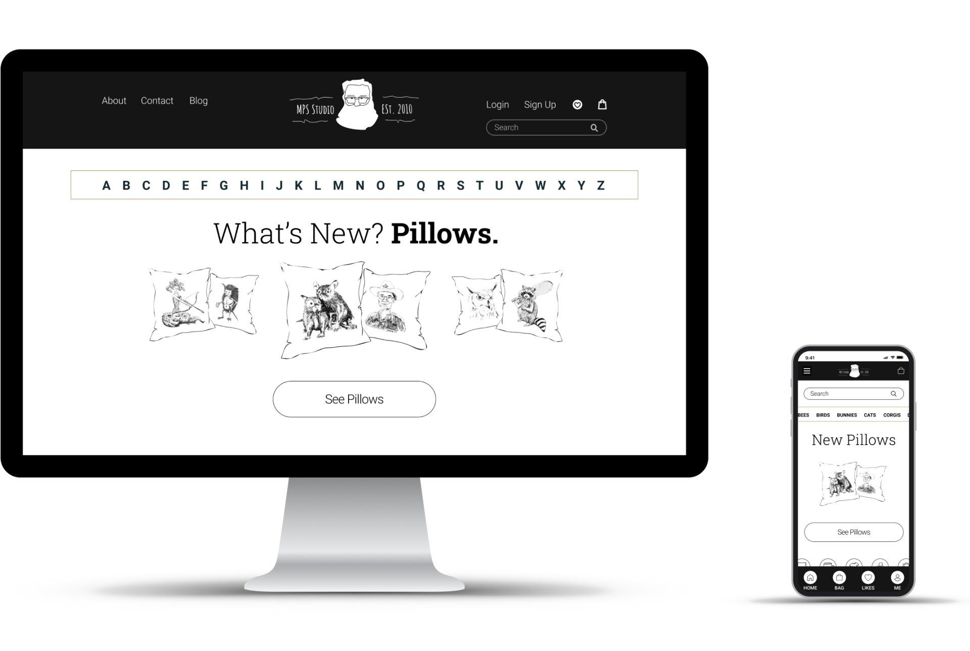
Henry Montplaisir needed a site for his business Montplaisair Studio. He made and sold unique illustrations printed on various items people bought for themselves and as gifts for others. Henry needed a site independent of Esty to directly reach customers and better convey his brand.
Background Research
I knew little about the specific retail space so I dove right in. I found 4 key areas that could potentially play a part in the Montplaisir Studio site design:
- Online gift shopping for unique items is growing.
- Customers want customizations.
- Ethical fashion and handmade goods are on the rise.
- Artist aggregator sites are popular.
Gap Analysis
I wanted to know where Montplaisir Studio could stand out from the competition so I could assess if Henry's business goals and his vision were in line with my findings. They were.
Direct competitors offered unique and custom work, but the sites were either non-existent or template sites. Indirect competitors were much larger companies that offered products made by a variety of artists/artisans. Their product listings were numerous, and their sites modern, but none offered custom work. The market gap was a site that looked modern, offered customization, offered unique products, and drew upon the artist's personality/process.
Provisional Personas
I based my provisional personas on conversations I had with the business owner and on industry research.
The provisional personas helped provide me with a framework for my later interview questions. I better understood areas of motivation (the 5 Whys) to probe for in my interviews.
The Artist
35/F
Austin, TX
The Carer
57/F
Madison, WI
The Different
30/M
Brooklyn, NY
The Ethicist
40/F
Denver, CO
The Research
I conducted 6 interviews - 3 from current customers, and 3 from participants who have "purchased unique or quirky gifts for themselves or others." I asked questions that probed interviewee purchase motivations. Then I used stickies to categorize key interview points.
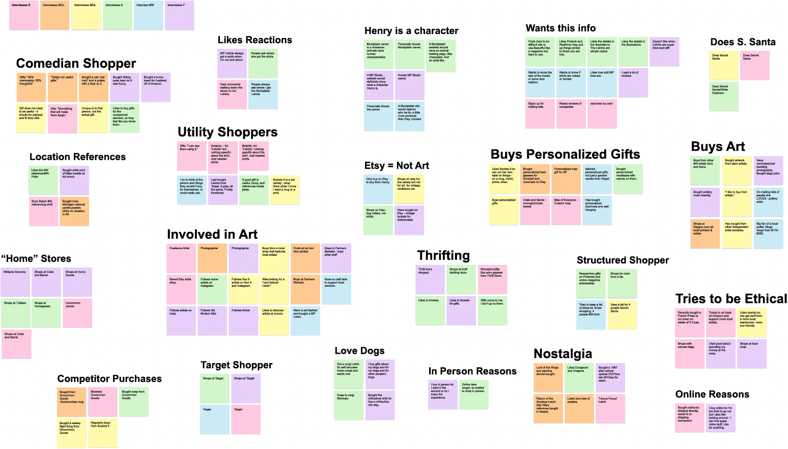
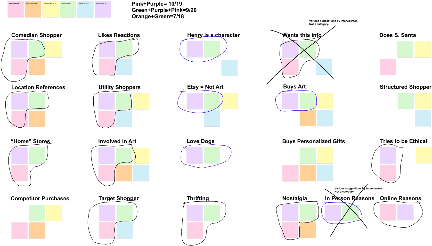
I looked for instances in which colors appeared together the most often and found that pink/purple were most often found together, followed by pink/purple/green. I based my persona on pink/purple and a bit of green.
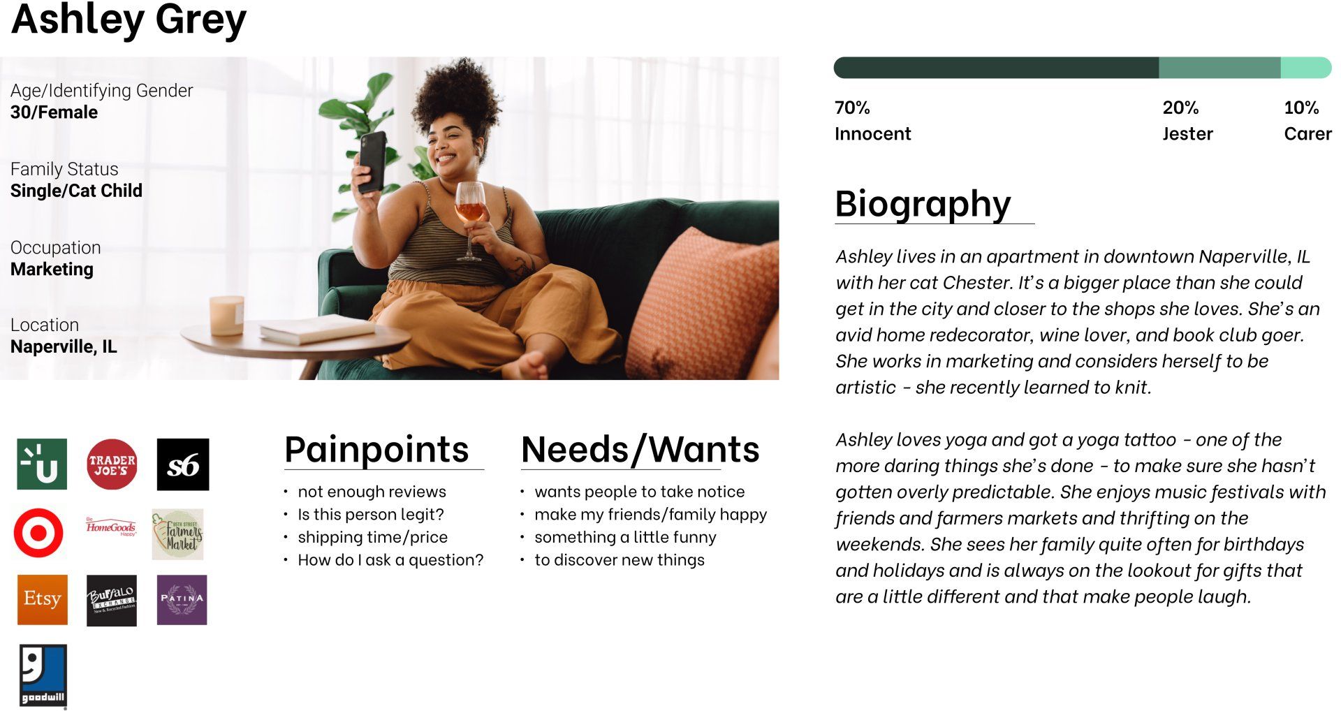
The Persona
The Storyboard
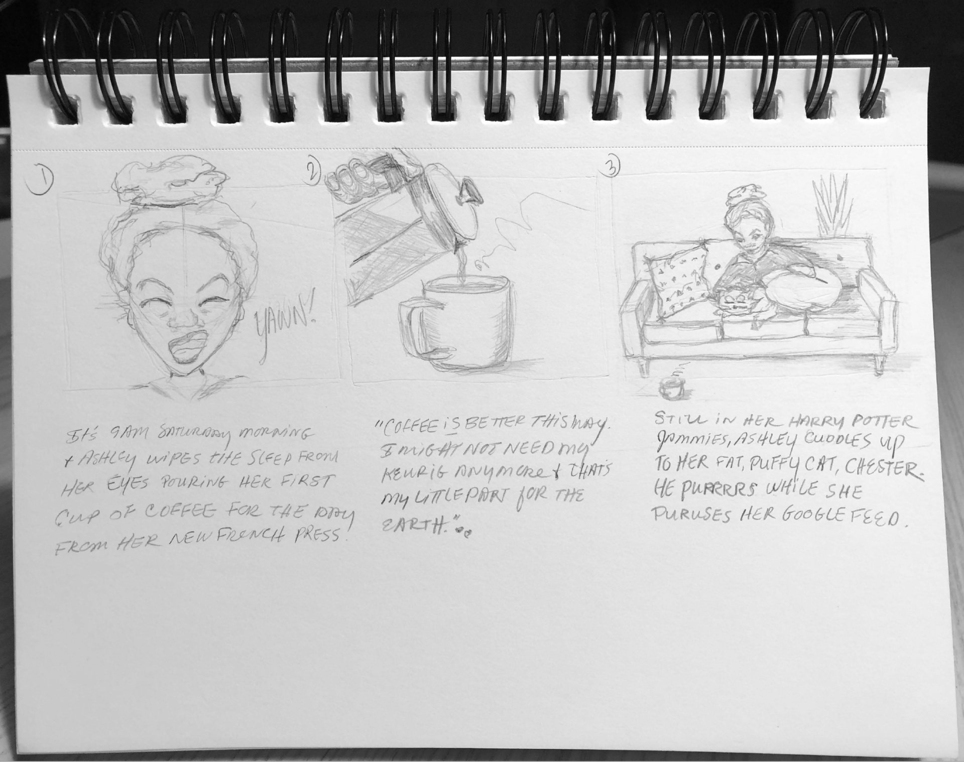
I had a great feel for who Ashley was, but I needed more definition so I could design a site for her behaviors so I decided to do a storyboard.
Slide title
It’s 9am Saturday morning. Ashley wipes the sleep from her eyes pouring her first cup of coffee for the day from her new French Press. “Coffee is better this way. I might not need my Keurig anymore and that’s my little part to help the planet.” Still in her Harry Potter jammies, Ashley cuddles up to her puffy cat, Chester. He purrs while she scrolls her Goodgle feed.
Button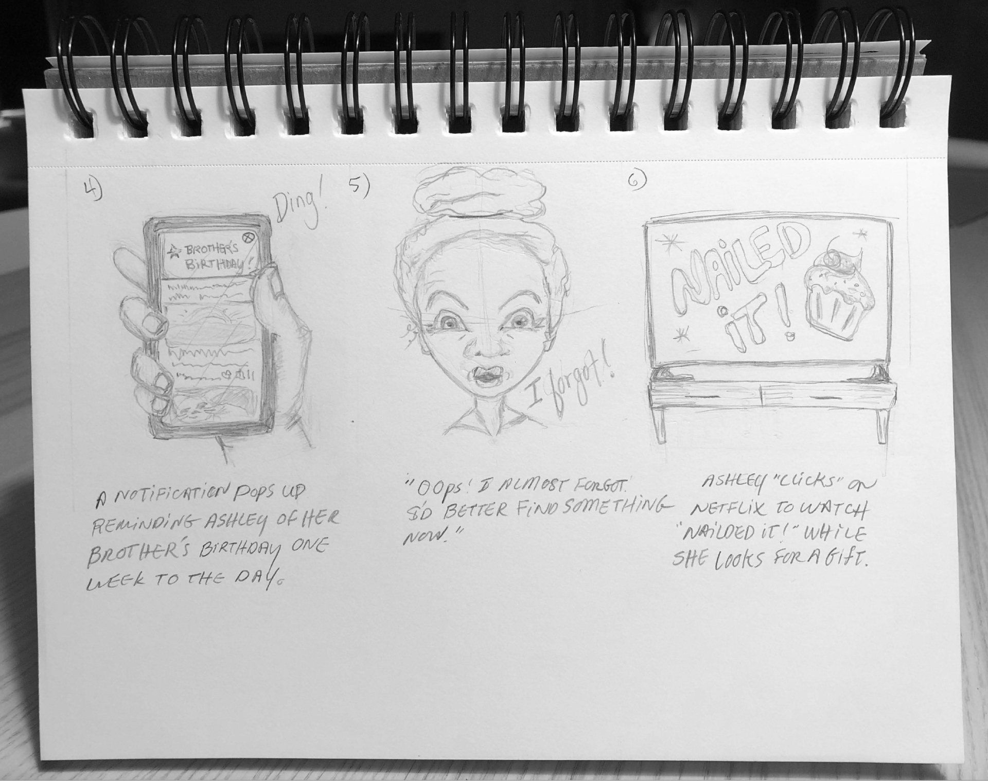
Slide title
A notification pops up reminding Ashley that her brother’s birthday is one week away to the day. “Oops! I almost forgot. I better find something now.” Ashley turns on Netflix to watch “Nailed It” while she shops. This could take a while. She’s ready to settle in and enjoy.
Button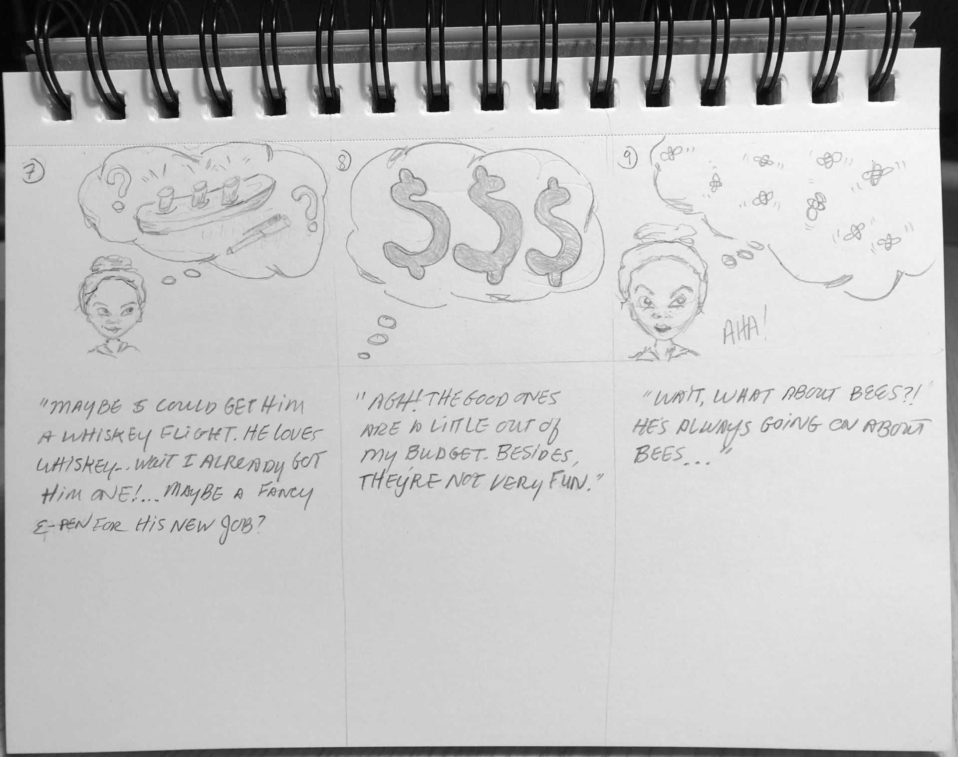
Slide title
“Maybe I could get him a whiskey flight. He loves whiskey. Wait, I already got him one… Maybe a fancy e-pen for his job? Agh! The good ones are a little too spendy. Besides, they’re not very fun. Wait! What about bees? He’s always going on about bees…”
Button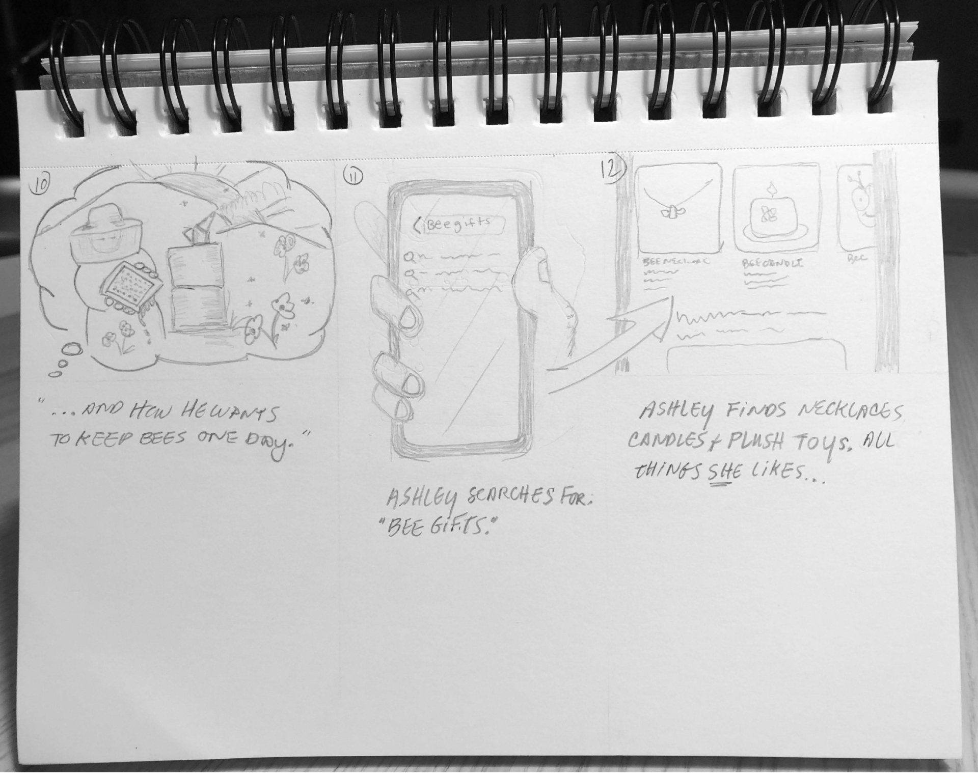
Slide title
"...and how he wants to keep bees one day." Ashley searches for "bee gifts." She finds necklaces, candles, and plush toy bees. All things she likes.
Button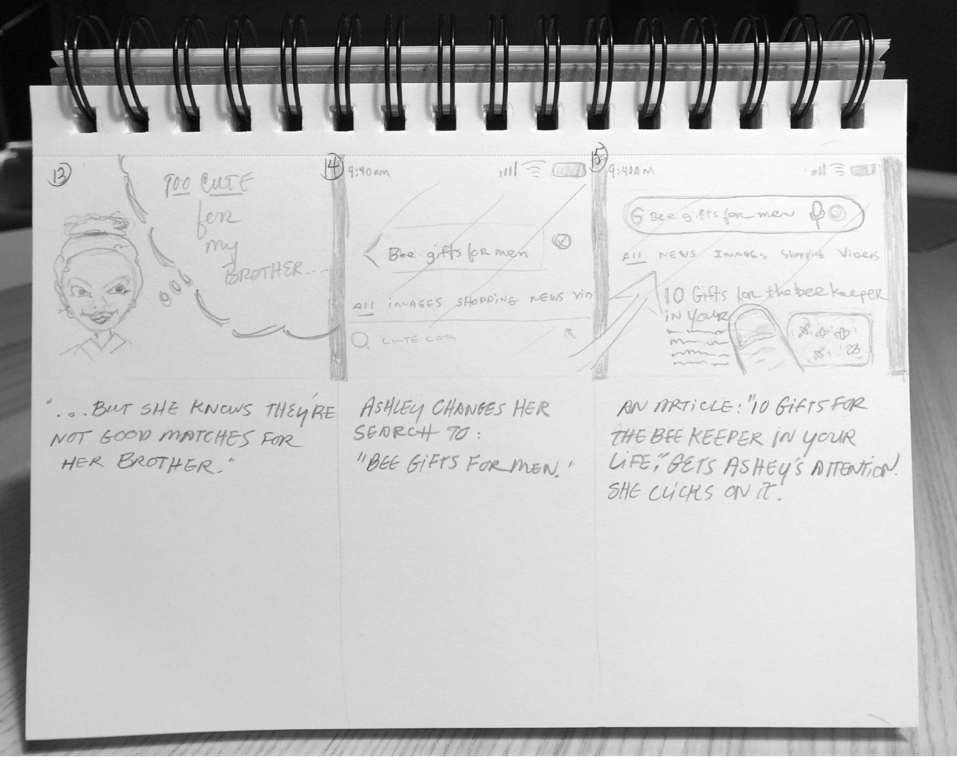
Slide title
But she knows these bee gifts aren't good matches for her brother. Ashley changes her search to "bee gifts for men." An article titiled "10 Gifts for the Bee Keeper in your Life" grabs Ashley's attention. She clicks.
Button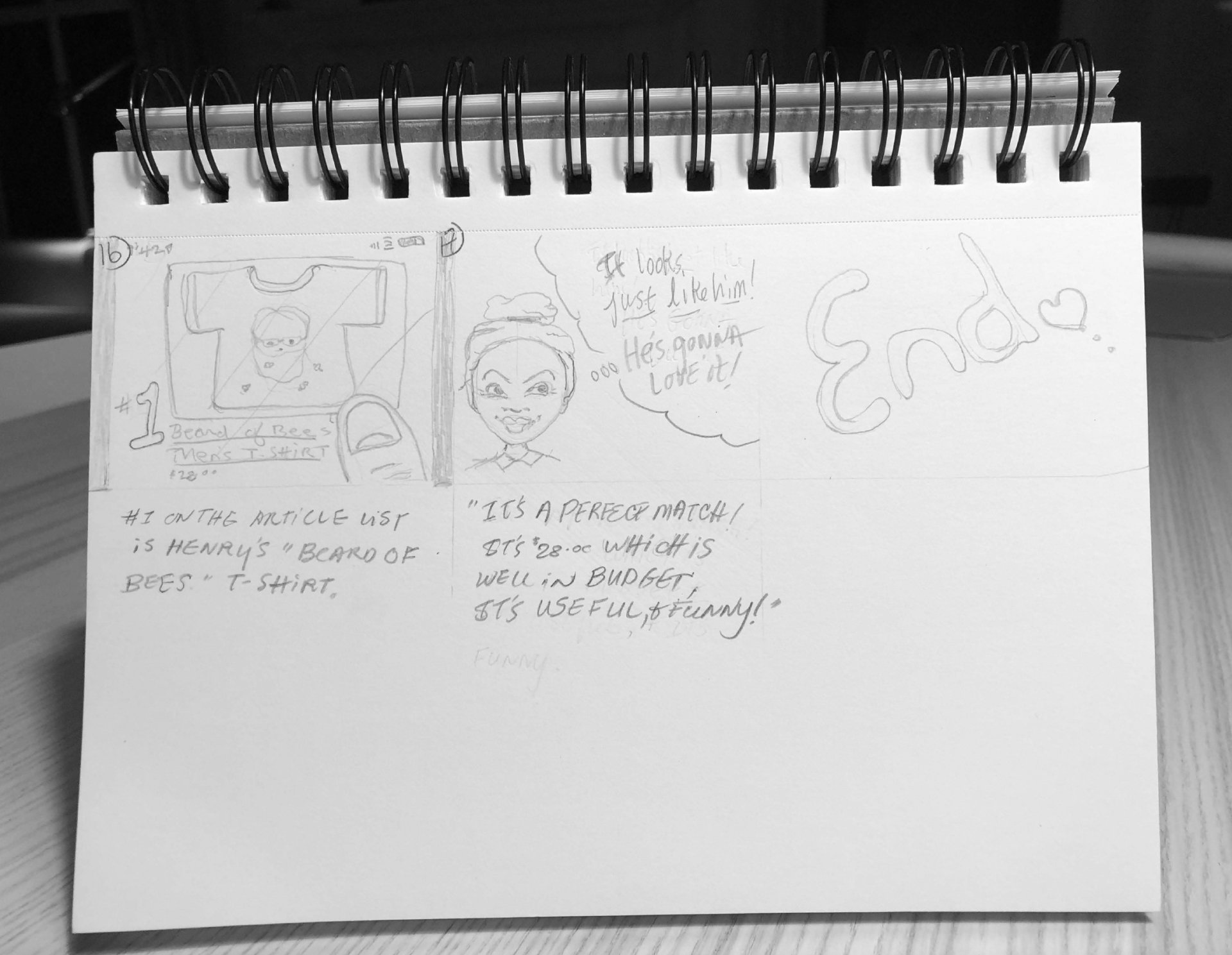
Slide title
Montplaisir Studio's Beard of Bees T-Shirt is #1 on the article list. "It's a perfect match! It's $28 which is well in my budget, it's useful, and it's funny."
Button
The Man, the Character
I knew who Ashley was and how she shopped. I also knew how some actual Montplaisir Studio customers shopped from the interviews.
I learned from Henry Montplaisir's existing customers how much they liked and connected with him as a person. They described him as a "character" and I agreed.
The site needed to be more than a pure e-commerce site. It needed to have Henry woven into it because people loved him.
I wasn't sure how I would do this, but I started with having at least an artist bio page and a blog. I made a mental note to work Henry's voice into the site wherever I could.
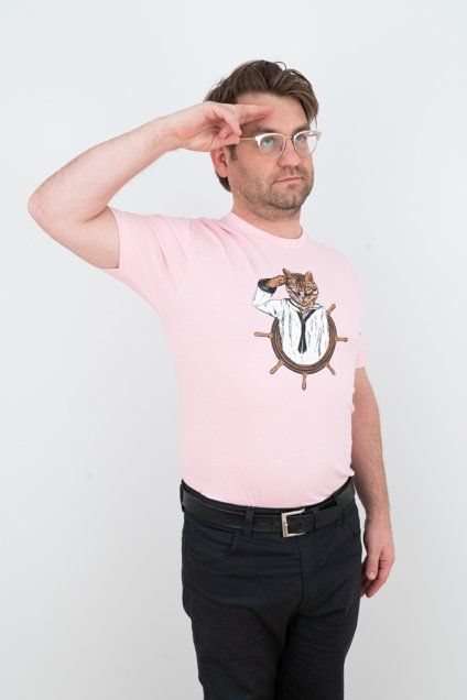
Ideas needed patterns
Henry, as a business owner, needed to maximize his already large library of illustrative work and take on new illustration challenges to stay creatively connected to his business. Concurrently, the more listings he could have, the better for his SEO.
Henry expressed interest in expanding his bulk orders but later trashed that idea. He was more interested in doing custom illustrations because they drove him creatively.
I anticipated the "customization options" could be a space where I could design an experience that was a bit unique.
I drew on well established e-commerce site design patterns for most of the site, but looked forward to bringing customization options into the design as well.
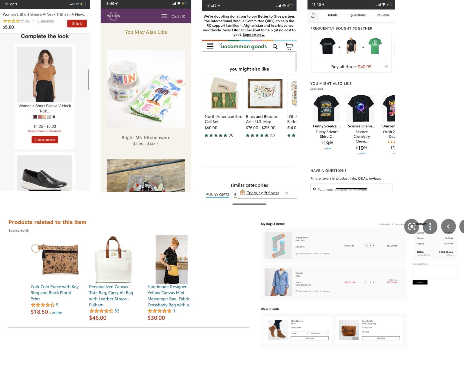
Recommended
After placing a product in the cart, retailers suggest related products, “wear it with,” “you may also like,” etc. The suggestions consist of multiple product listings through which the user can scroll/swipe. Product listings consist of a picture, a title, often a rating, and sometimes a size.
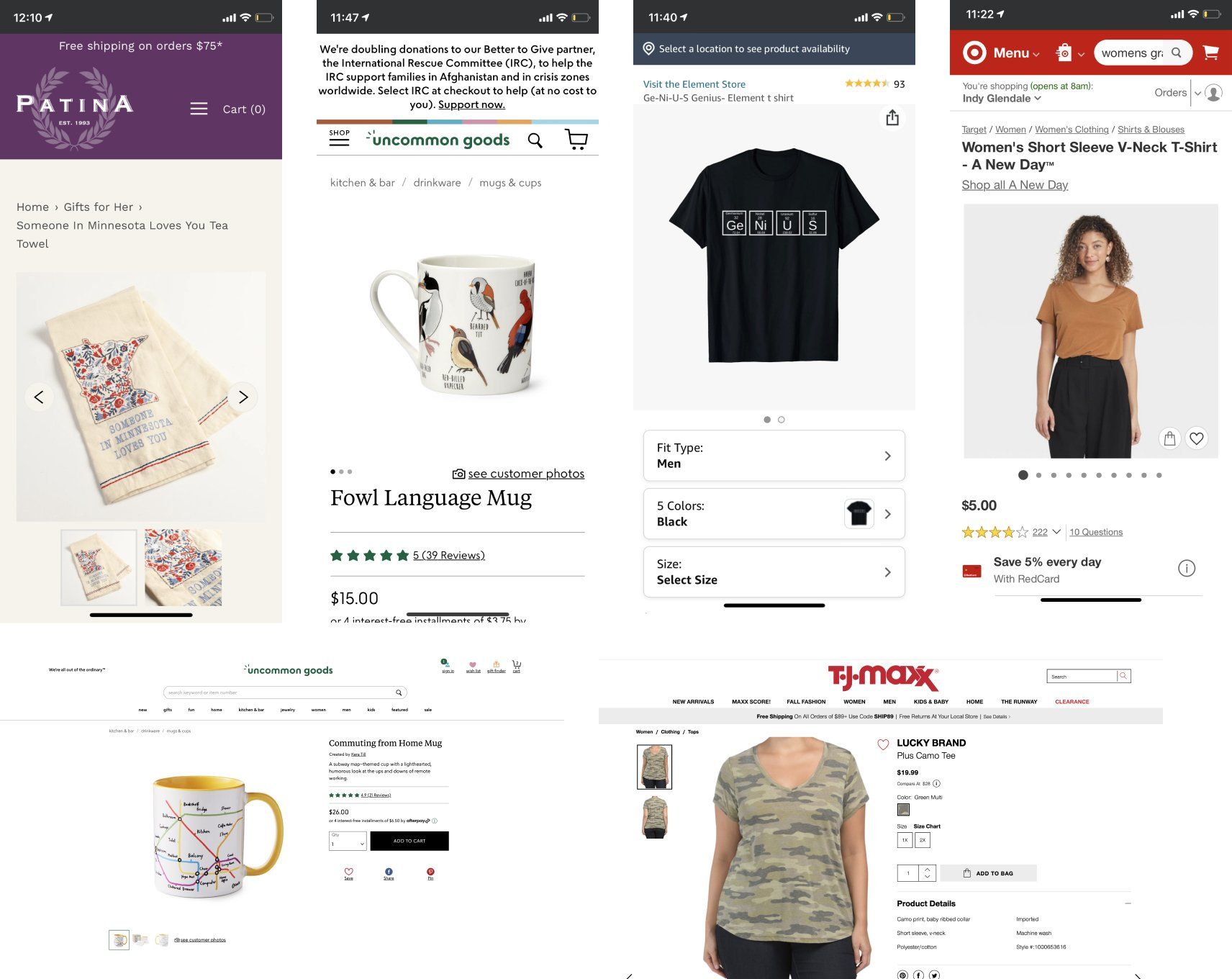
Product Listings
Common features of detailed product listings are: at least 2 pictures, a short description, often a light box to show details, an average rating, price, favorite button, items in stock, size/color/qty select options, and an add to cart button.
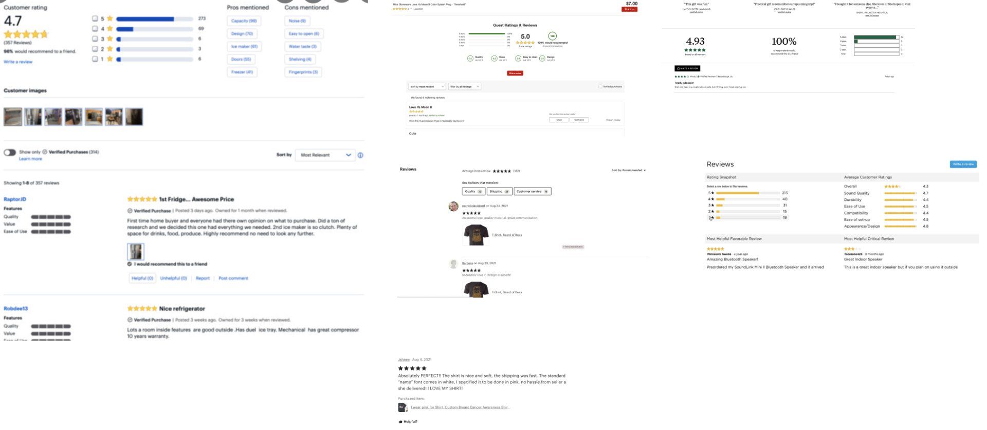
Ratings and Reviews
Ratings and reviews consist of the following: a five star scale, date posted, username and profile pic, a review title, and review text. Ratings overviews have: total number of ratings given and a breakdown of rating categories if possible.
A Simple Sitemap
The
sitemap was simple. Montplaisir studio sold uncomplicated, tangible products that were easily categorized. I used a combination of patterns I found on other e-commerce sites (listing pages for each product type, account, cart) as well as other competing artist sites (about, blog, custom orders).

Mid Fidelity Prototype
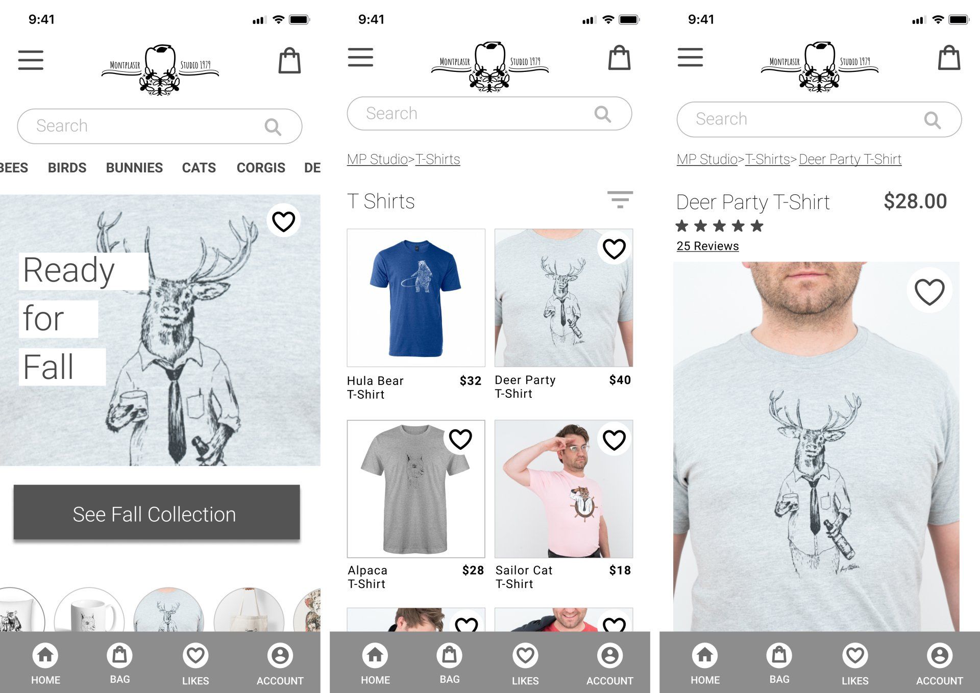
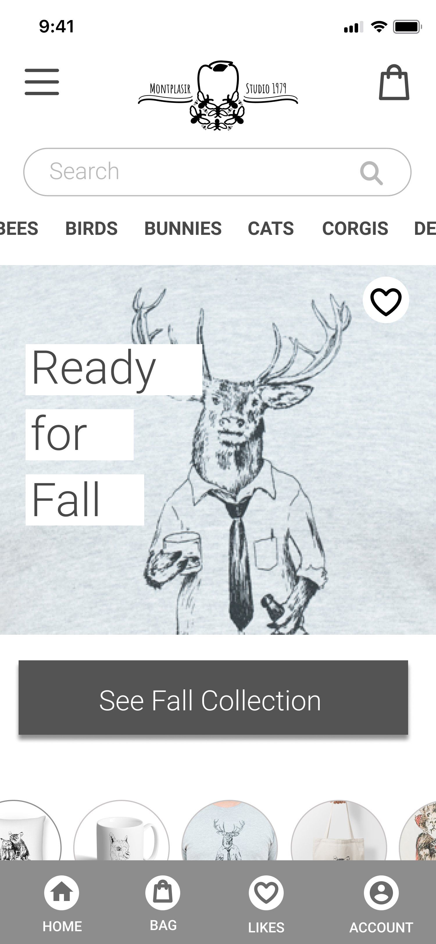
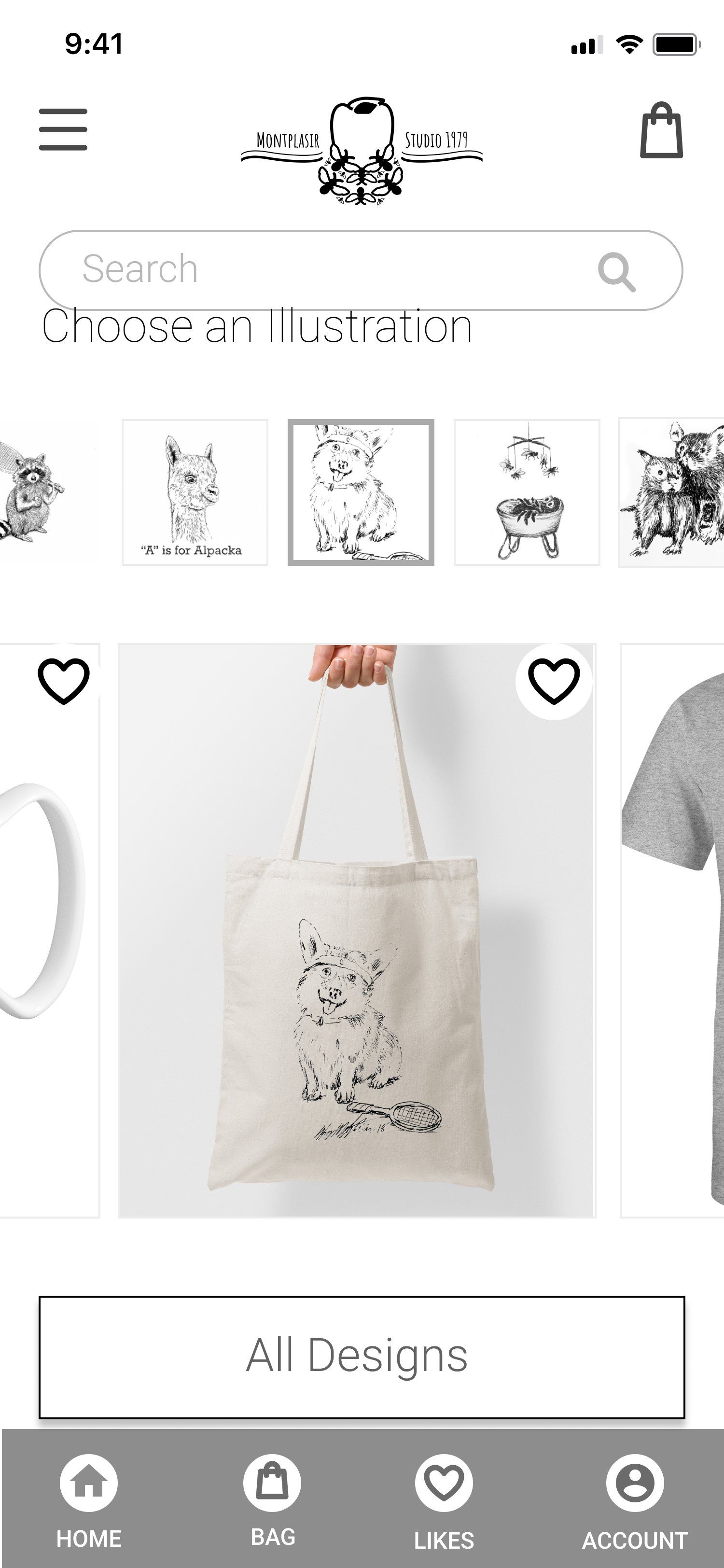
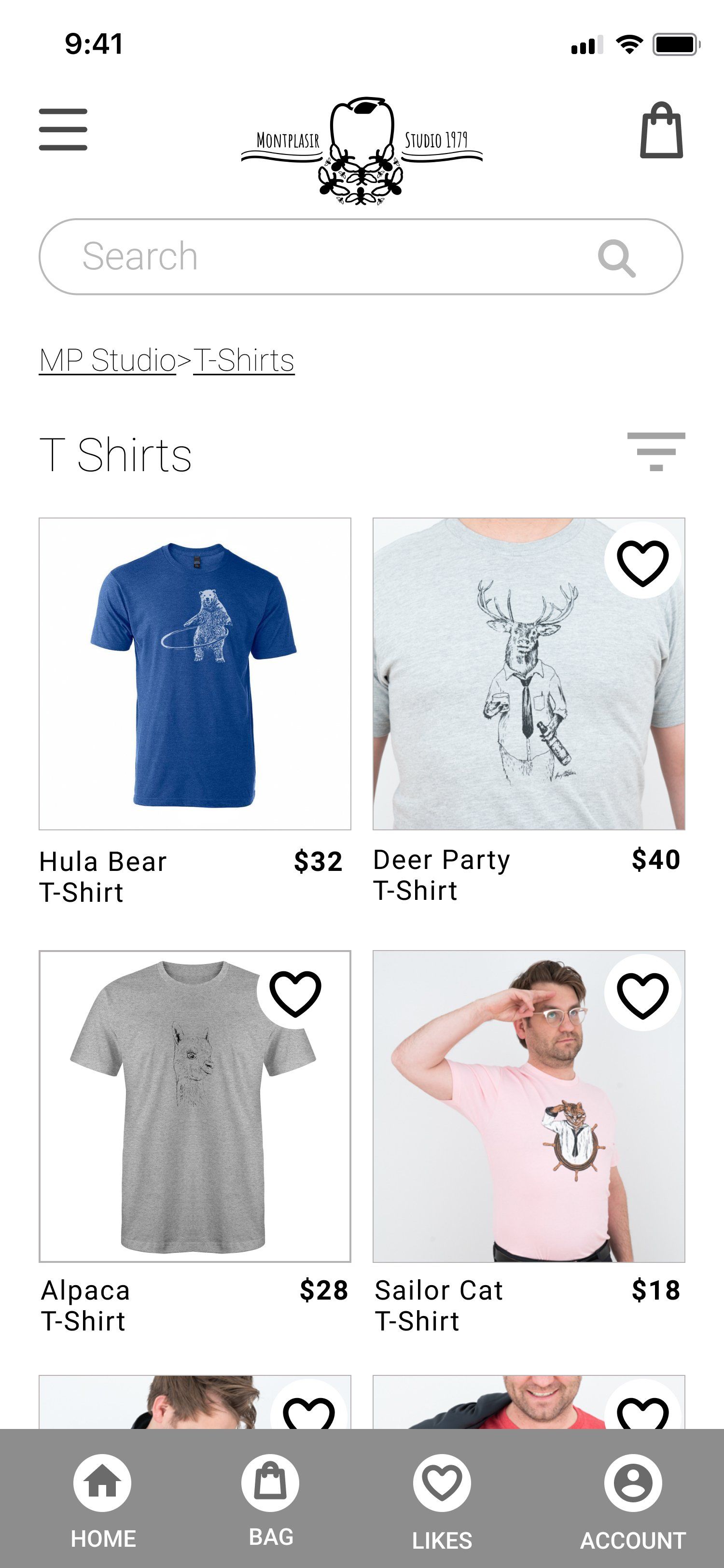
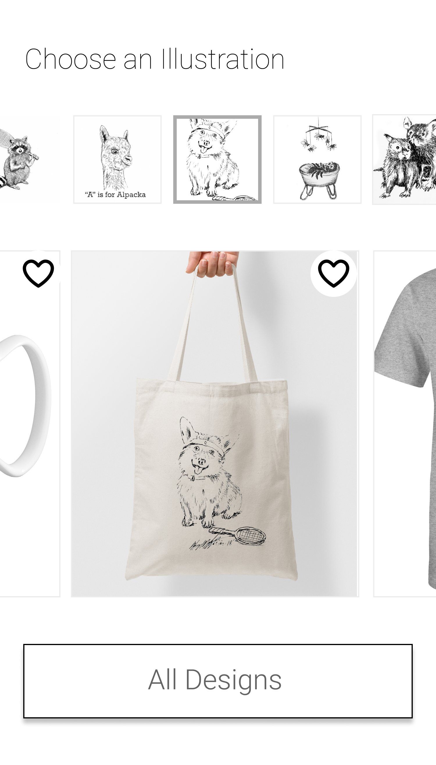
Before building out any further, I tested the prototype below. I thought it would be fairly easy to use, but I wasn't sure if the "Choose an Illustration" section would be clear.
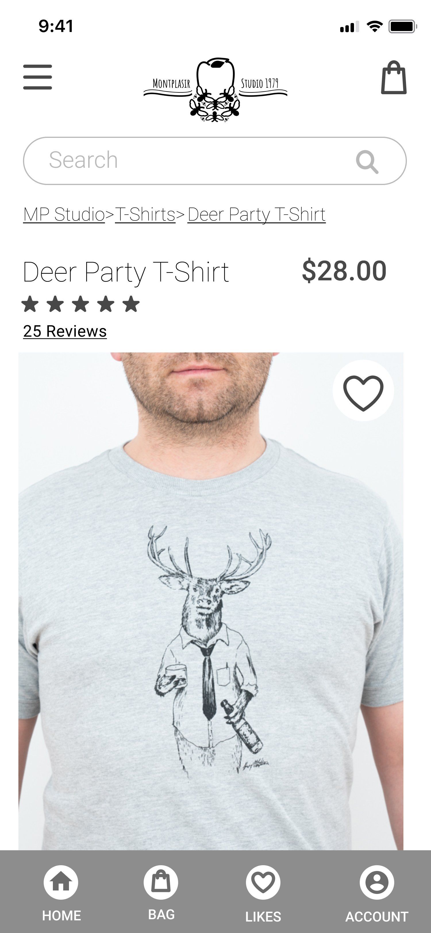
Test Results
Although most user feedback was very positive, some feedback indicated I needed to improve the design in the following ways:
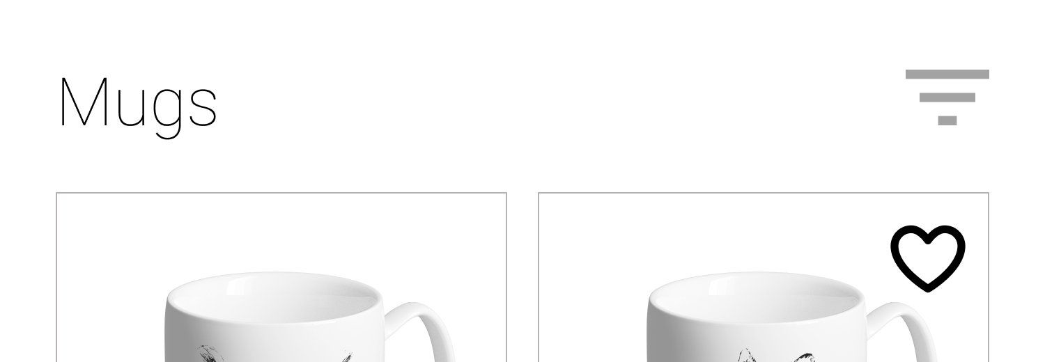
- Change the filter icon to something more recognizable.
- Make the homepage feel less cramped and more organized.
- Improve the "Choose an Illustration" section so it's more understandable.
“I guessed on the filter icon bc it didn’t look familiar but it was in the right spot. Perhaps a more familiar icon?”
"It looks like a cool and unique brand. Some of the elements felt a little bit cramped though, especially on home page"
"It did take me a few seconds to figure out how each section is categorized, maybe a title will help. "
"I think the only thing I would add, would be a little more instructions to the illustrations part?"
Solutions
I replaced the filter icon with a "Filter/Sort" button.
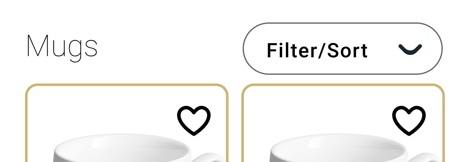
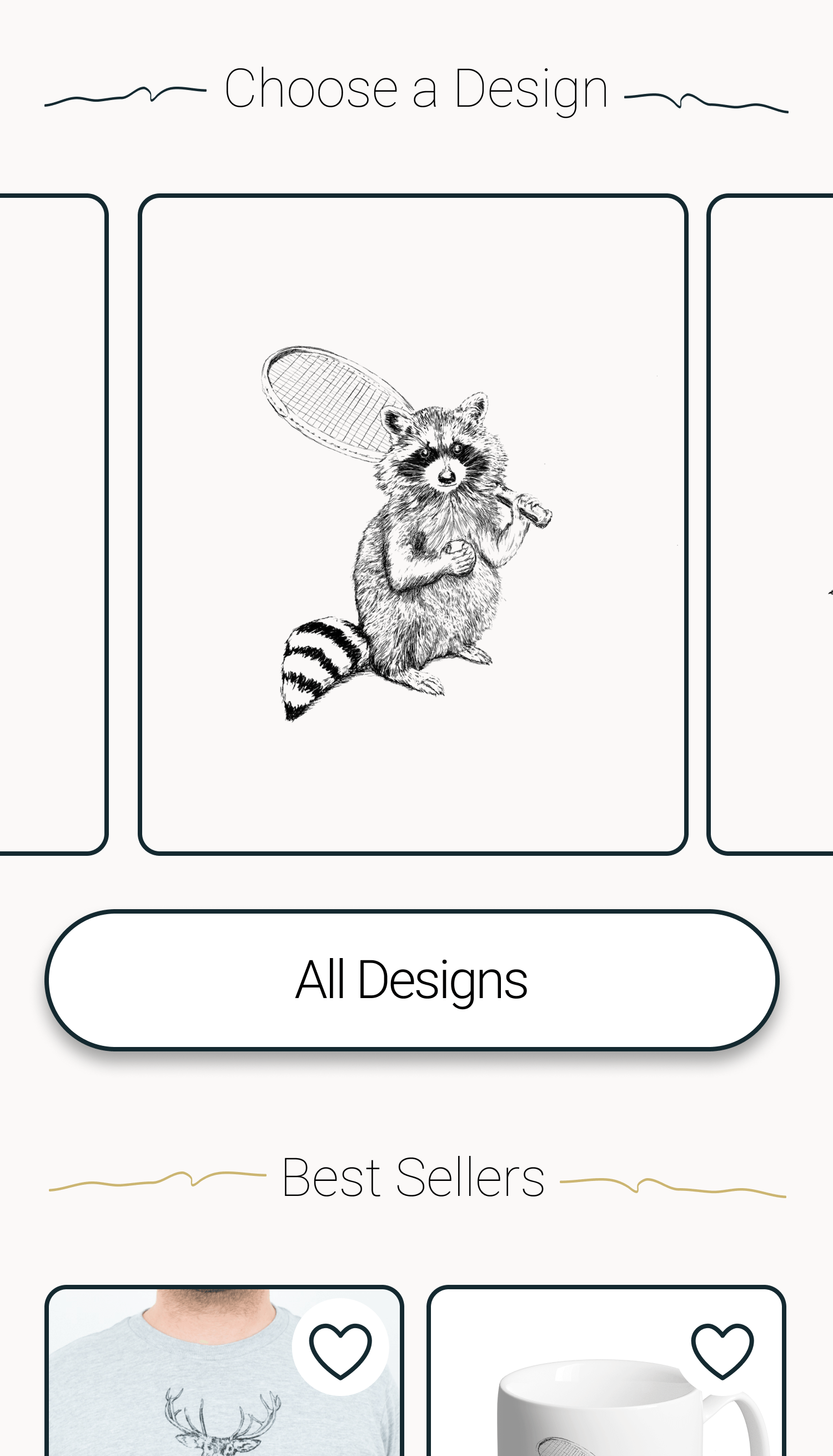
I moved the section headers to the center position and added a gold graphic element to draw subtle attention to it.
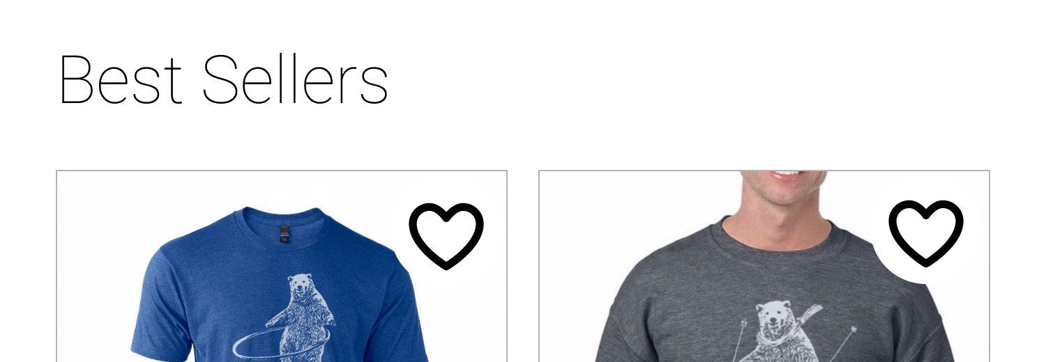
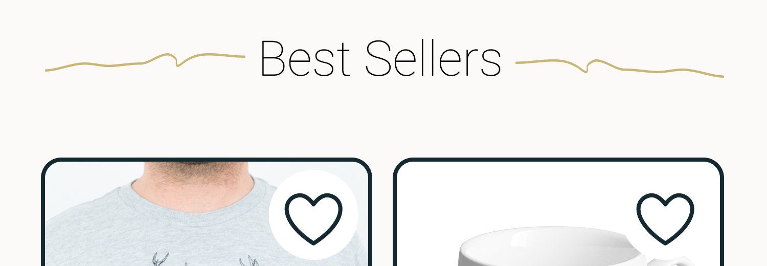
I redesigned the "Choose an Illustration" section so that the illustration itself was larger. I struck the tote, mug, print, etc. images, making the illustration the key item of focus.
Additionally, I moved the "Choose an Illustration" section higher up on the page. I reasoned that the illustrations were primary to the medium on which they were printed. Montplaisir Studio customers (as evidenced through interviews) shopped for the illustrations more than they did the tote, mug, t-shirt etc.
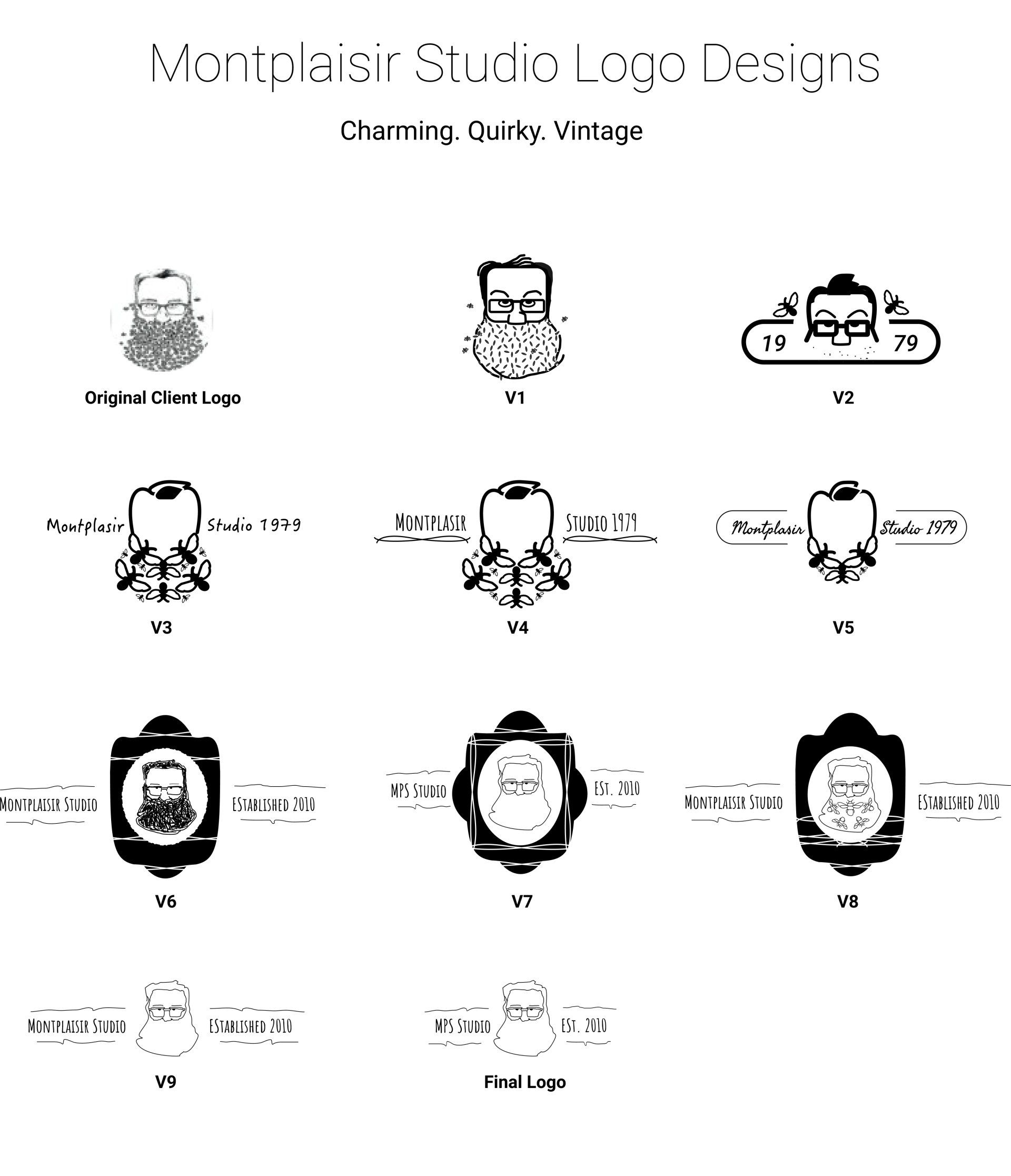
Logo Design
Henry did have a logo, but it only existed as a poor resolution jpg file. The original logo also didn't resize well due to the level of detail in the image.
I used the original logo as a basis for the redesign and designed with the words "charming," "quirky," and "vintage in mind.
In the end, less was definitely more. I designed some pretty bad logos but they eventually got me to something that was good. I ultimately needed to decide between incorporating the bees OR the beard into the design. I chose the beard because it was simpler and made more sense with Henry's face.
Style Tile
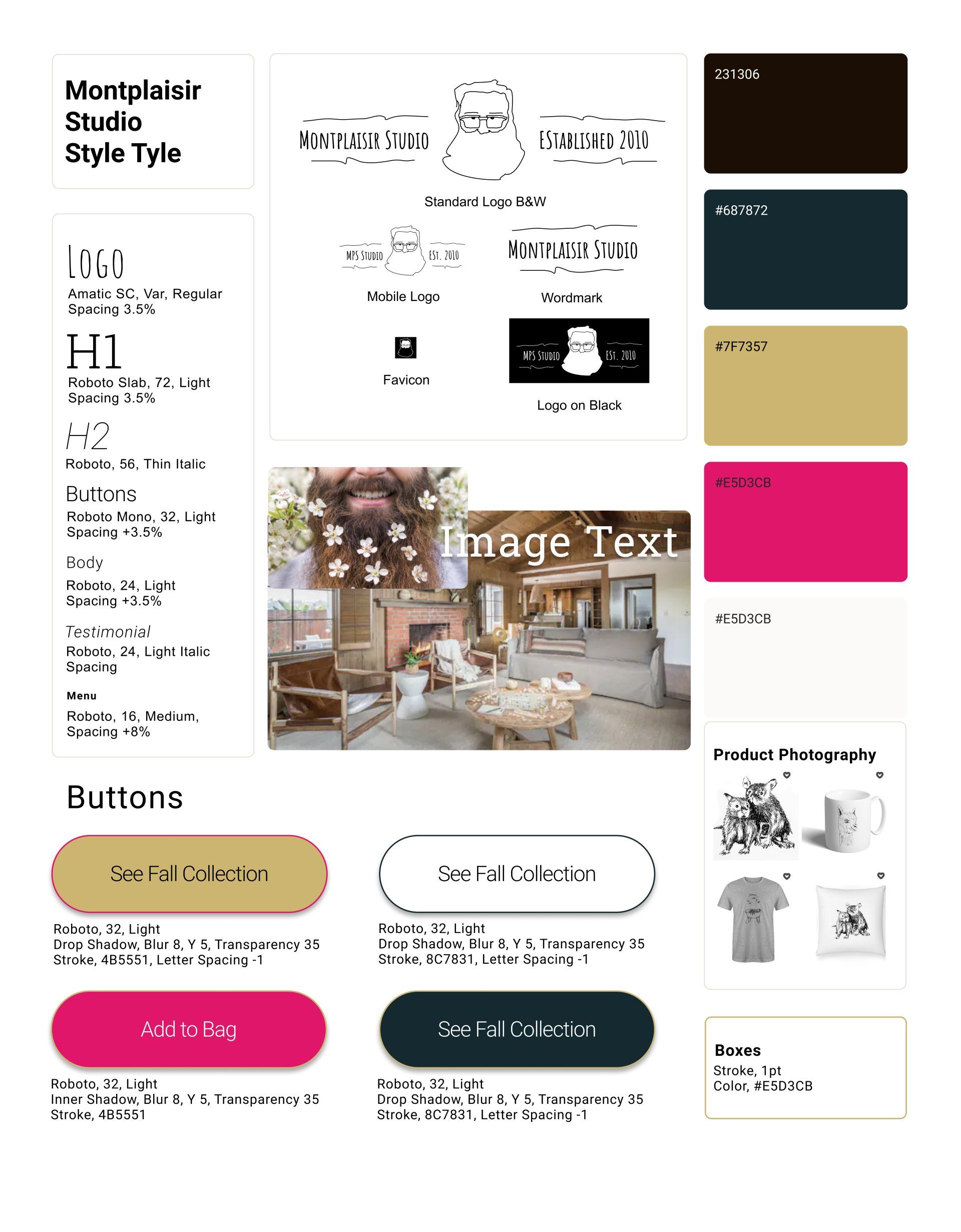
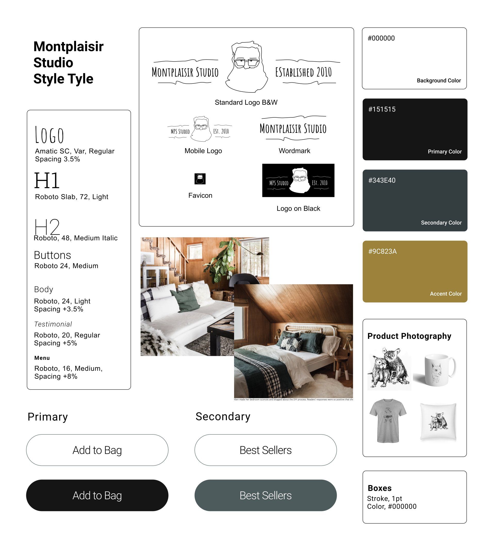
Charming. Quirky Vintage.
One of the mid fidelity prototype test participants had remarked that the site was fresh and modern but also reminded her of a "cabin in the woods."
I ran with this comment as inspiration for my style tile. The first style tile looked too loud once applied so I toned it down considerably (right image).
UI Kit
The UI kit took shape as I built the final prototypes. It reflects the more simplified style of the second style tile. Specifically, I removed all drop shadows, decreased stroke thickness in lines, outlines, and in icon designs. I aimed for a more mature but still approachable UI that let the illustrations shine.

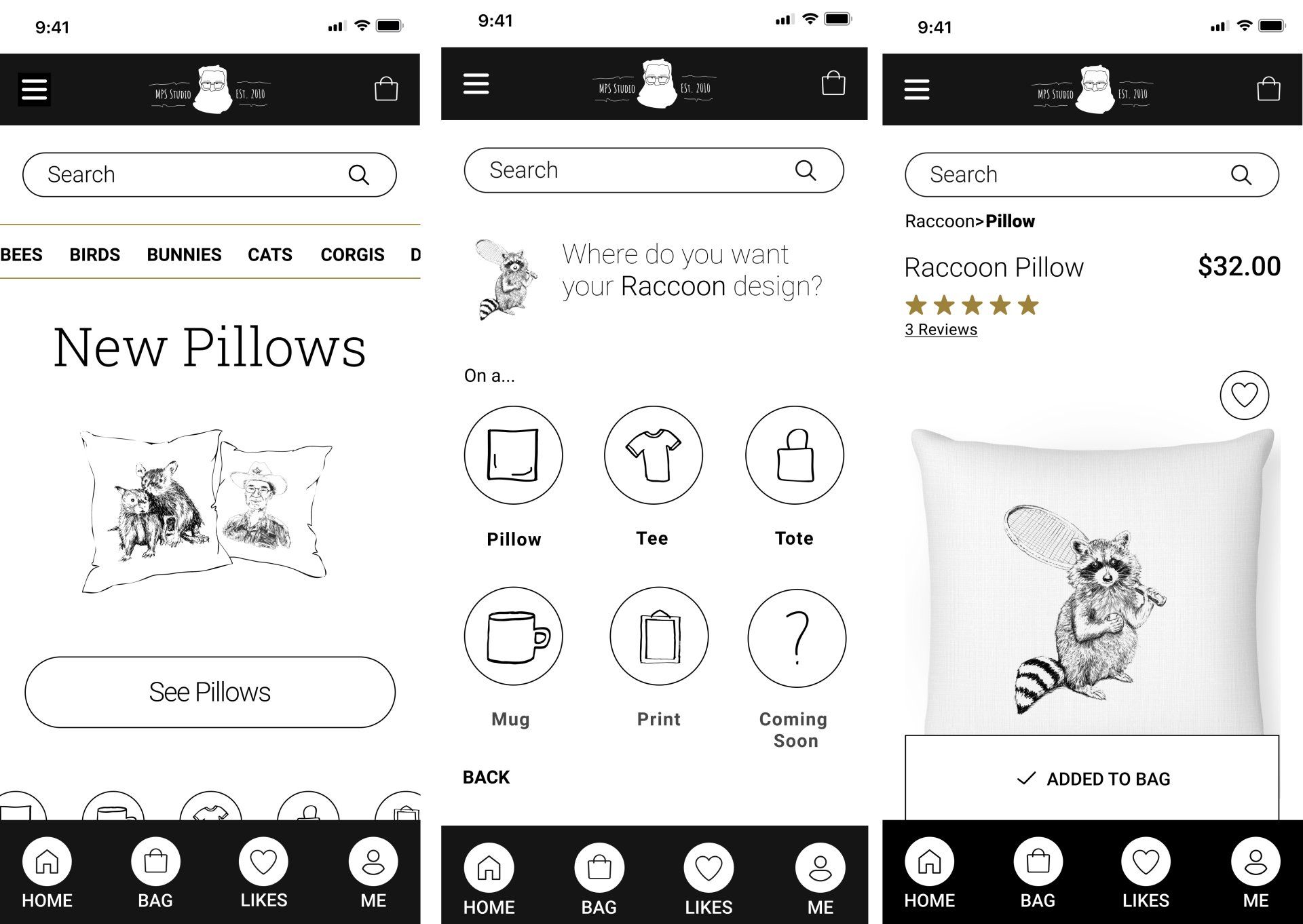
The Final Prototype
The final designs are understated, modern, and still playful. Henry, the owner of Montplaisir Studio, was very pleased with them and made plans to implement them as soon as possible.
Hover to use prototype.
Lessons Learned
I learned that less is more. If I spend less time building out prototype options and focus on the golden path, I can make the prototype even better. Less is also more in terms of branding and UI but it took the process to get me there. Designing several failures is part of getting to something that can eventually work.
Moving forward on this project, I would design Henry's About page because I know his customers will read it. I would also explore using subtle animations to support the overall playfulness of the brand.
See More Work >>>
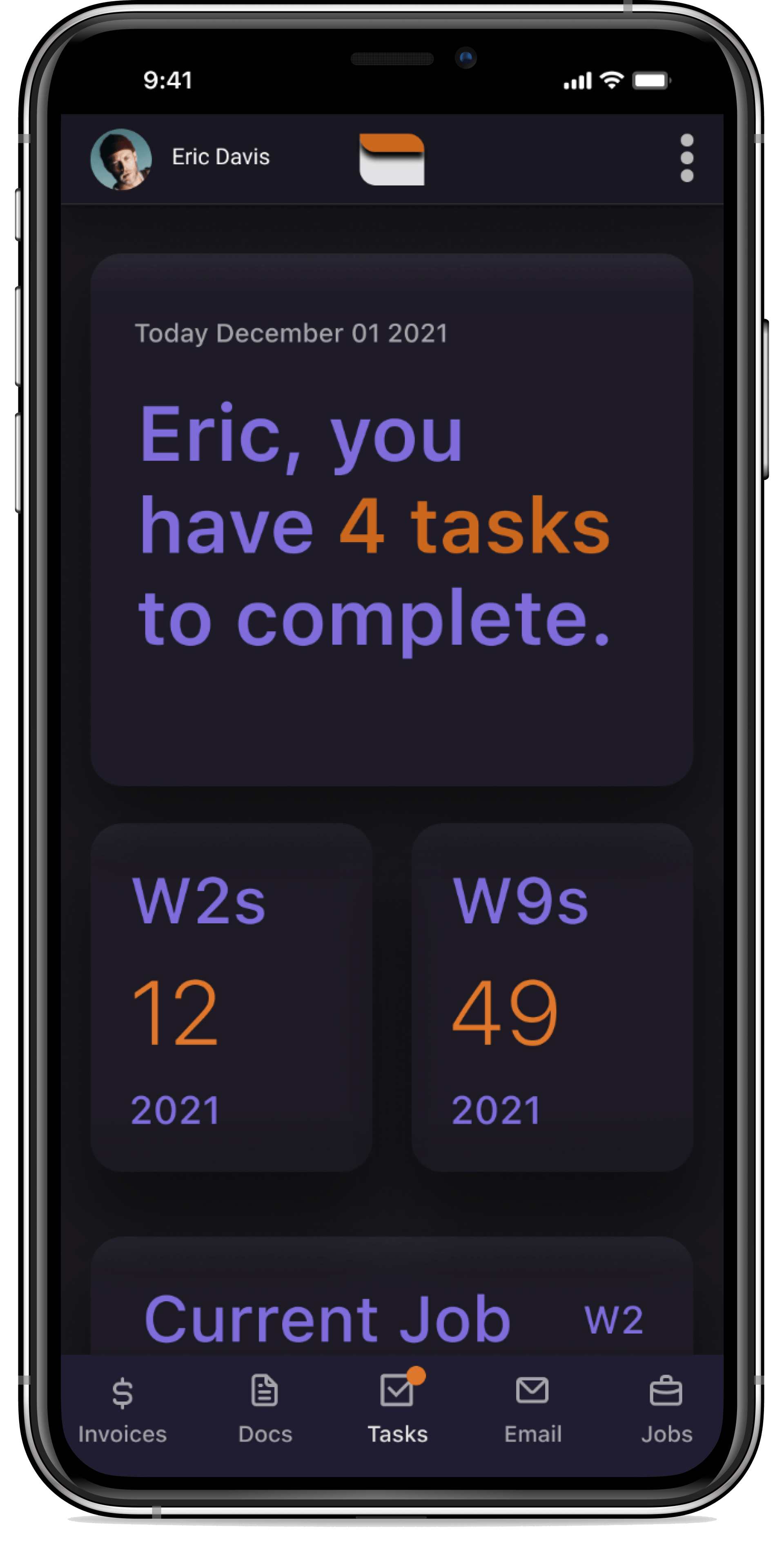
Film and television production crew needed a solution that helped them complete and reference start work documents efficiently and securely.
"It's such a pain to have to go through a long list of emails to have to pinpoint something."
-User Interview
See More Work >>>
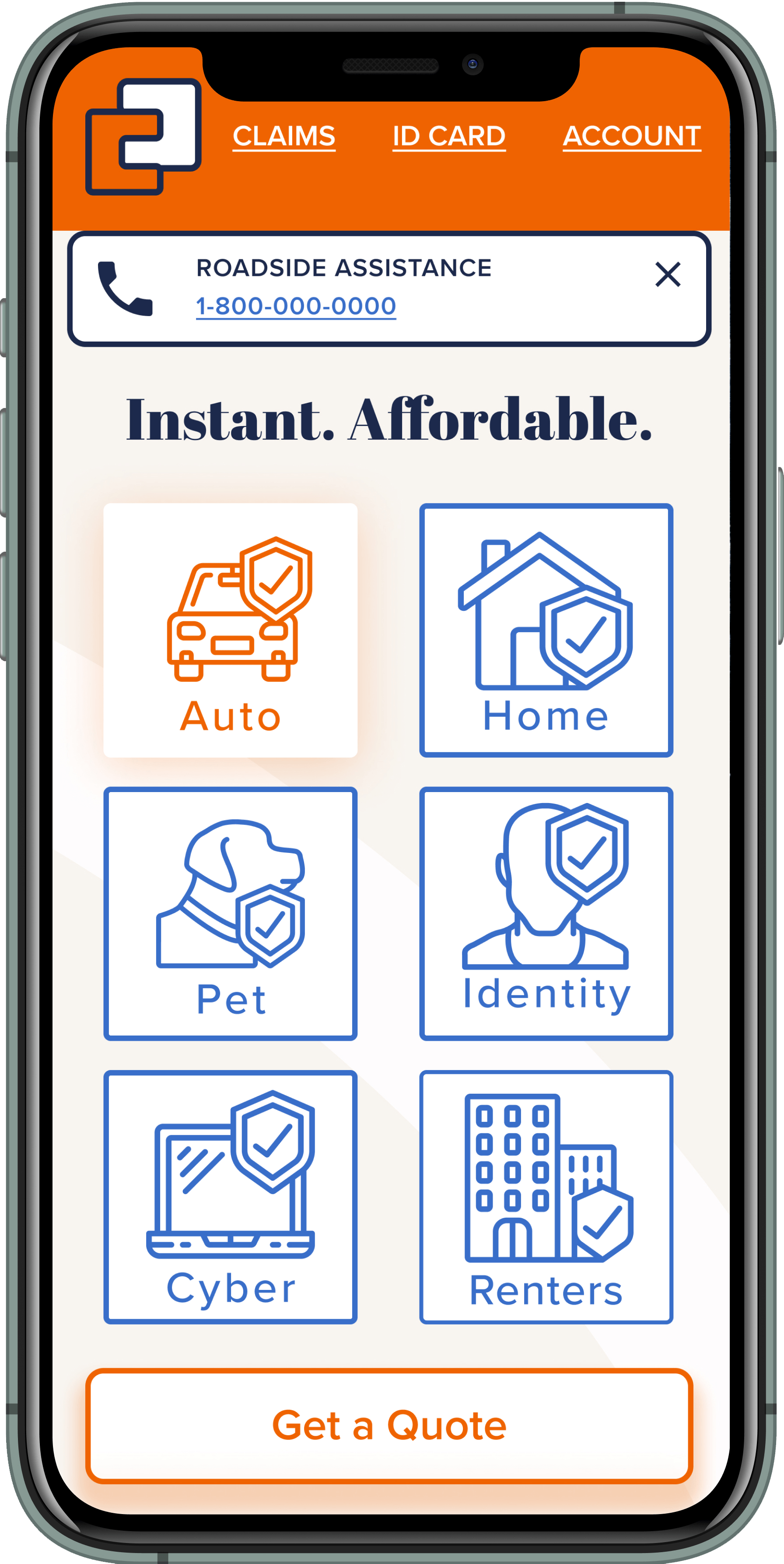
Bloc Insurance had been in business for 30+ years
but needed a digital presence that appealed to younger customers.
"I hate it. It’s a chore. I hear nails on a chalkboard."
-User Interview
