Bloc Insurance
Bloc Insurance
Bloc needed to appeal to "younger" customers.
Bloc Insurance needed a digital presence that appealed to “younger” customers. To keep competitive, Bloc was moving away from regional agents to a direct-to-customer model that could sell 350+ prepackaged products online.
Bloc needed to appeal to "younger" customers.
Bloc Insurance needed a digital presence that appealed to “younger” customers. To keep competitive, Bloc was moving away from regional agents to a direct-to-customer model that could sell 350+ prepackaged products online.
Who were these people?
Who were these people?
Gen X, Y, Z
Based on my research, I determined that "young" could reasonably be considered anywhere from 18-45 years old. It was a wide range but fitting for a company that did not have a previous digital presence. My key focus, however, was on Millennials because they were the largest demographic of the 3 and likely had the highest revenue opportunity for Bloc because of it.
Bloc was competing against:
All State
Progressive
State Farm and
Liberty Mutual
for these customers. Additionally, Lemonade Insurance and Ladder Insurance were indirect competitors doing innovative things in the market place.
What did they want?
What did they want?
No one had what
Millennials wanted
and what Bloc could offer
all in one place.
But how and why did these customers shop for insurance?
But how and why did these customers shop for insurance?
Let's Talk
To answer the how and the why, I remotely interviewed 4 people 1:1 about their online and offline purchasing experiences and used this information to understand potential user motivations and preferences.
Rick
35/M
Mpls, MN
Katie
45/F
St. Paul, MN
Justin
25/M
Mpls, MN
Ashley
35/F
Mpls, MN
Persona Creation
I used variable mapping to group participants together based on their answers and on their lifestyles uncovered in the interviews.
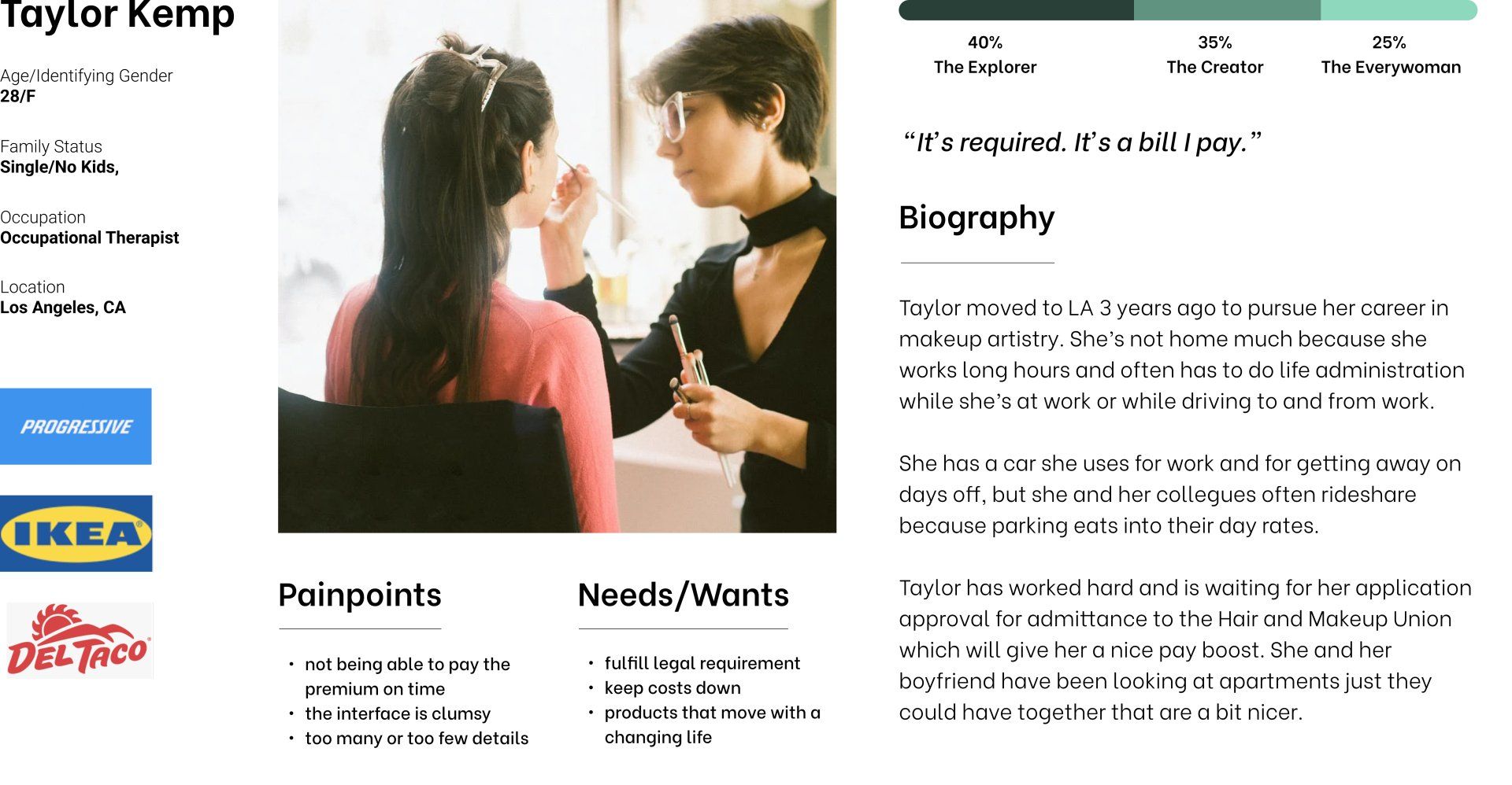
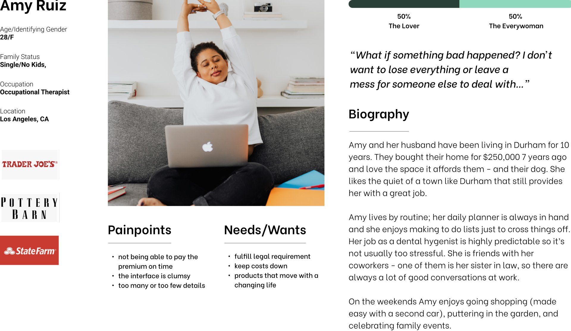
From the variable mapping, I identified 2 distinct personas, Taylor (Justin+Ashley) and Amy (Rick+Katie).
Amy was concerned with getting the right insurance because it could affect other people in her life. She did her research and was willing to pay a bit more for peace of mind. Taylor needed insurance now that offered good coverage at a competitive price.
Persona 1: Taylor
Persona 2: Amy
How would Taylor and Amy
use
an insurance site?
Defining Information
Architecture
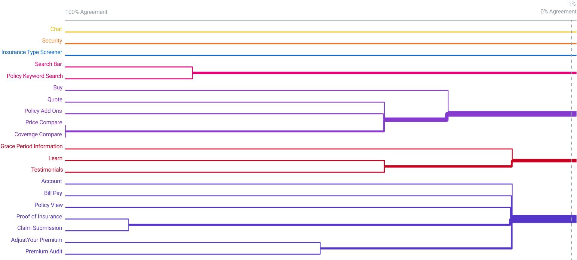
I included some “basic features” as well as “competitive features” I gleaned from my competitive analysis to create an open card sort. I included 18 Cards and 10 people completed the sort.
As seen in the dendrogram (left) participants were confused, but there were some loose categories around account tasks and the beginning of what was possibly a buying funnel. Participants didn’t appear to associate search with grace period, which was surprising to me.
The closed sort showed a clearer picture that formed the basis of the sitemap. And from there, the flows.
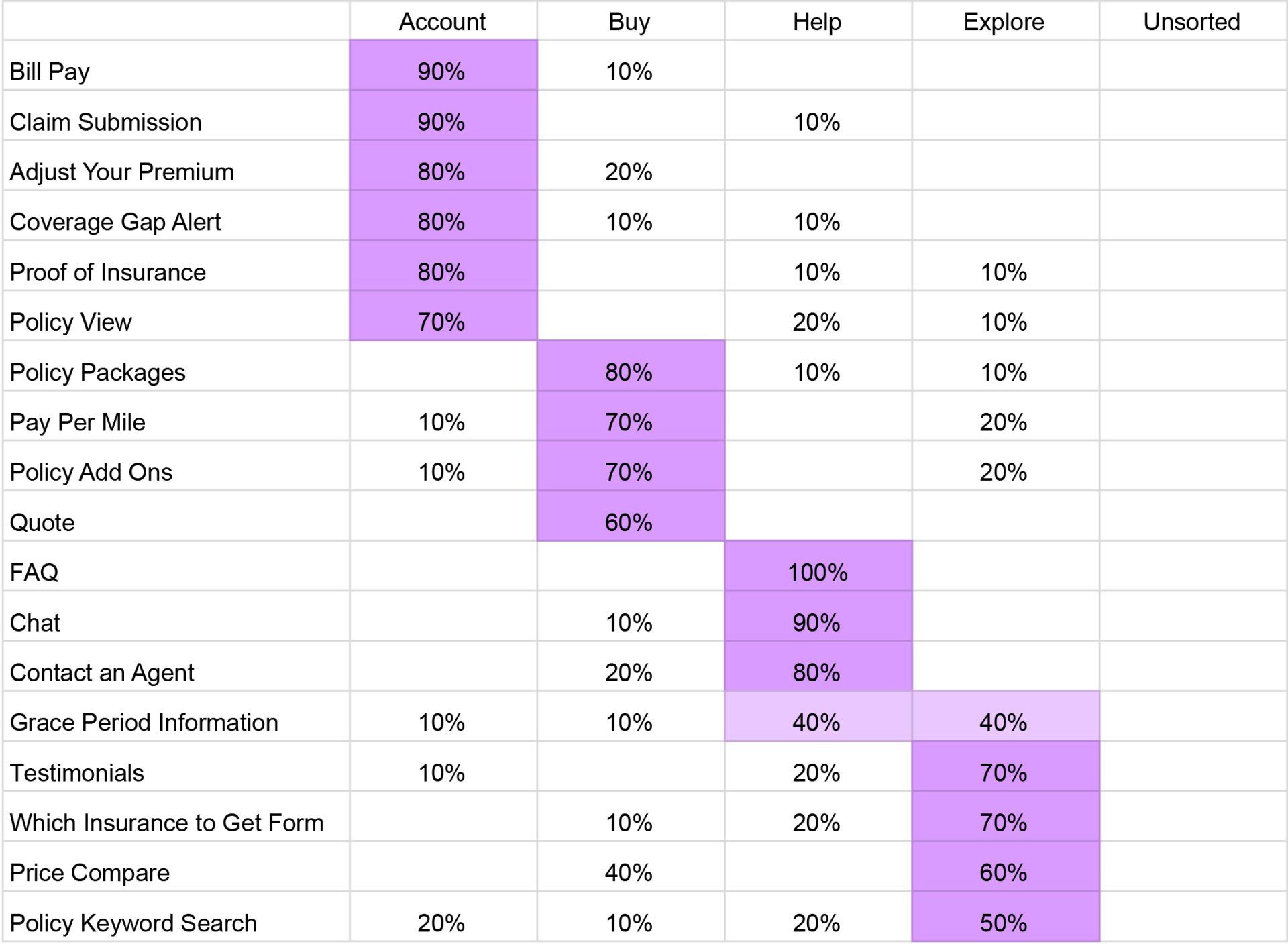
After the open sort, I used “Account” and “Buy” from the open sort and added “Help” and “Explore” to discern the difference between them. 10 participants completed the card sort.
Participants agreed strongly across categories. Areas where participants were confused were: where to find grace period information, and where to find price comparisons and quotes. Participants could, understandably, look for price compare and quote in more than one place so this did not overly concern me.
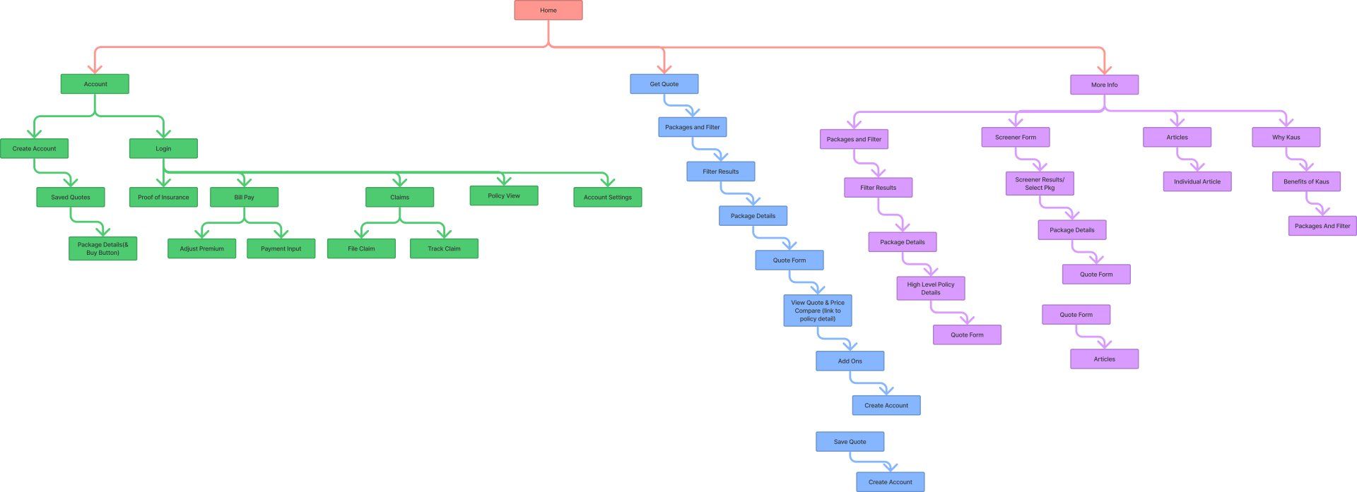
With the information from the card sorts and 2 personas, I created a site map. I hypothesized 2 different ways the personas might shop for insurance. Persona 1 would immediately select a policy and get a quote while persona 2 would not be ready for a quote and would browse insurance products for more information first.
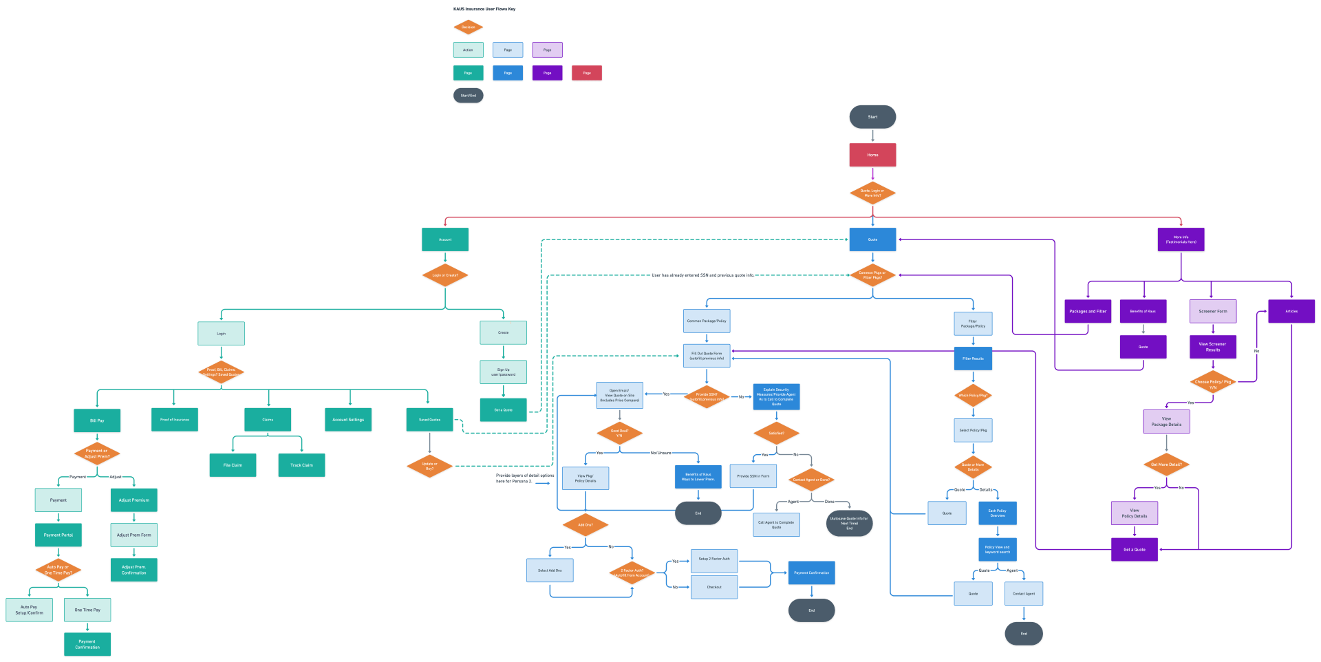
To place these items so Taylor and Amy could make sense of them, I created a user flow. This flow was based on everything I’d learned about my users’ motivations and how they organized information in the insurance purchasing process.
On the more granular level, I defined each user's task flow for purchasing insurance.
The MVP
I had a lot of ideas about what features the site could have that would appeal to Taylor and Amy based on the competitive analysis and on my personas' wants/needs.
After brainstorming, I prioritized the items I needed for an MVP.
How might this look?
My Sketches
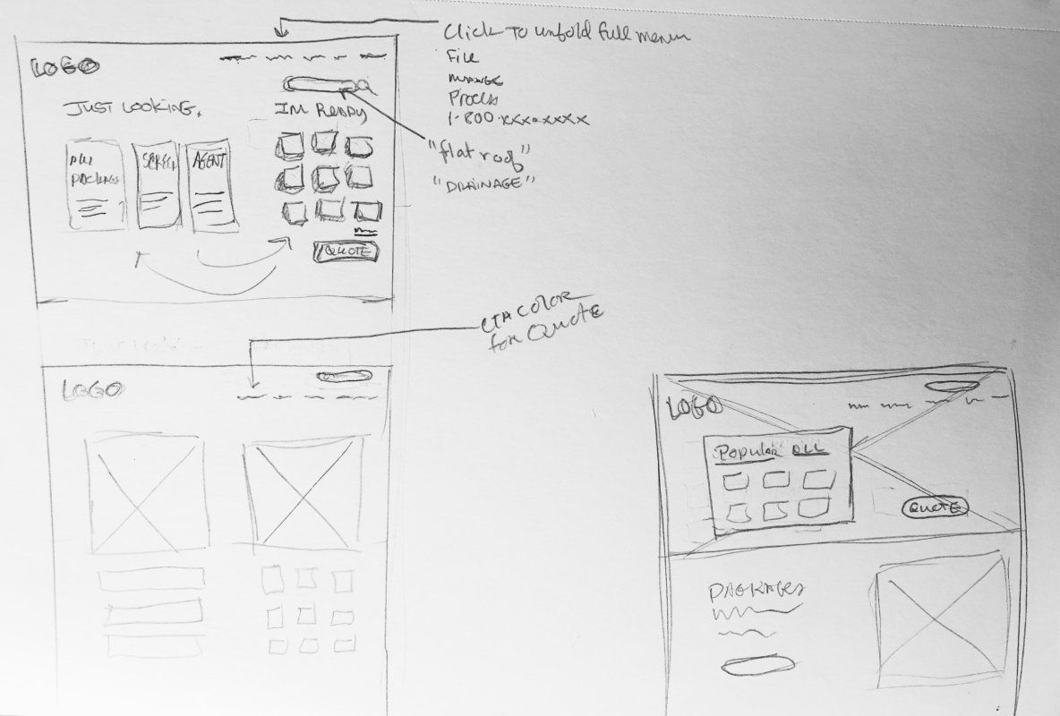
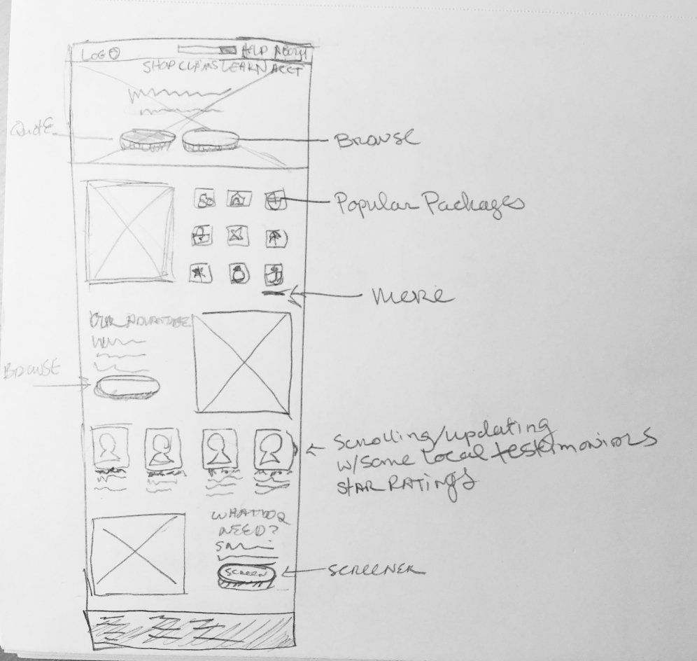
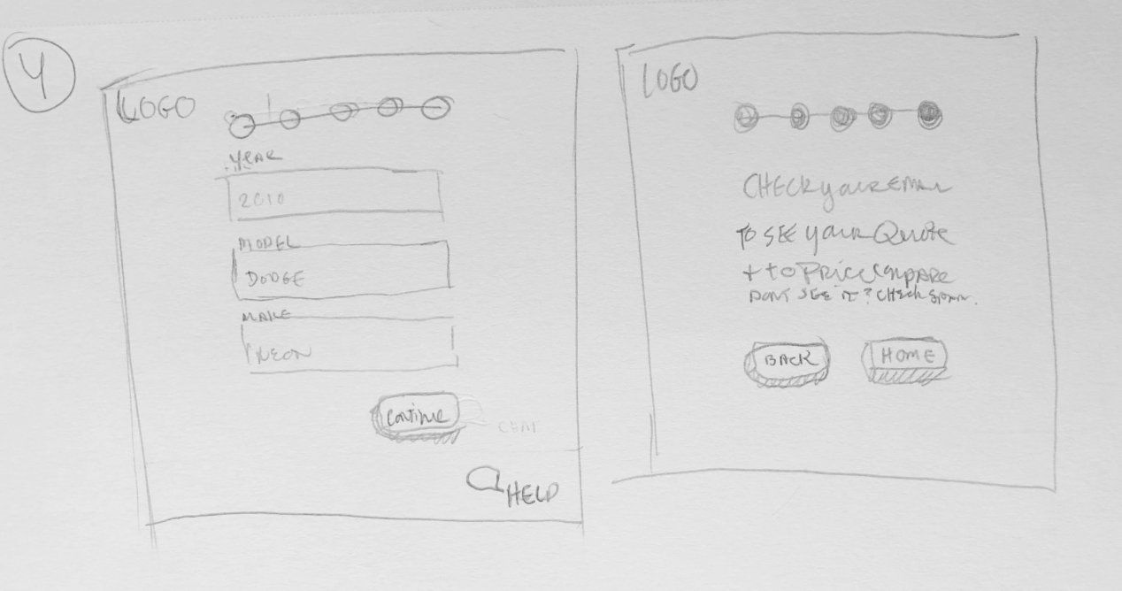
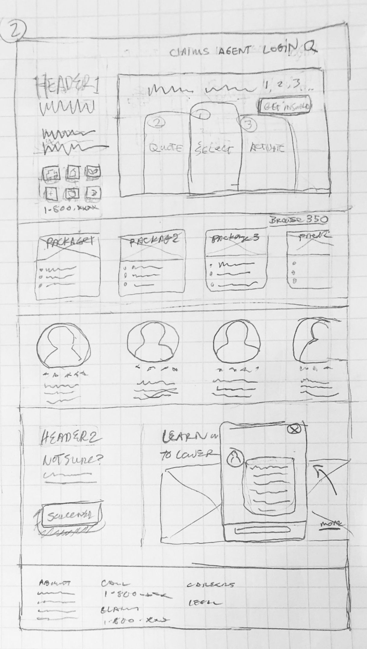
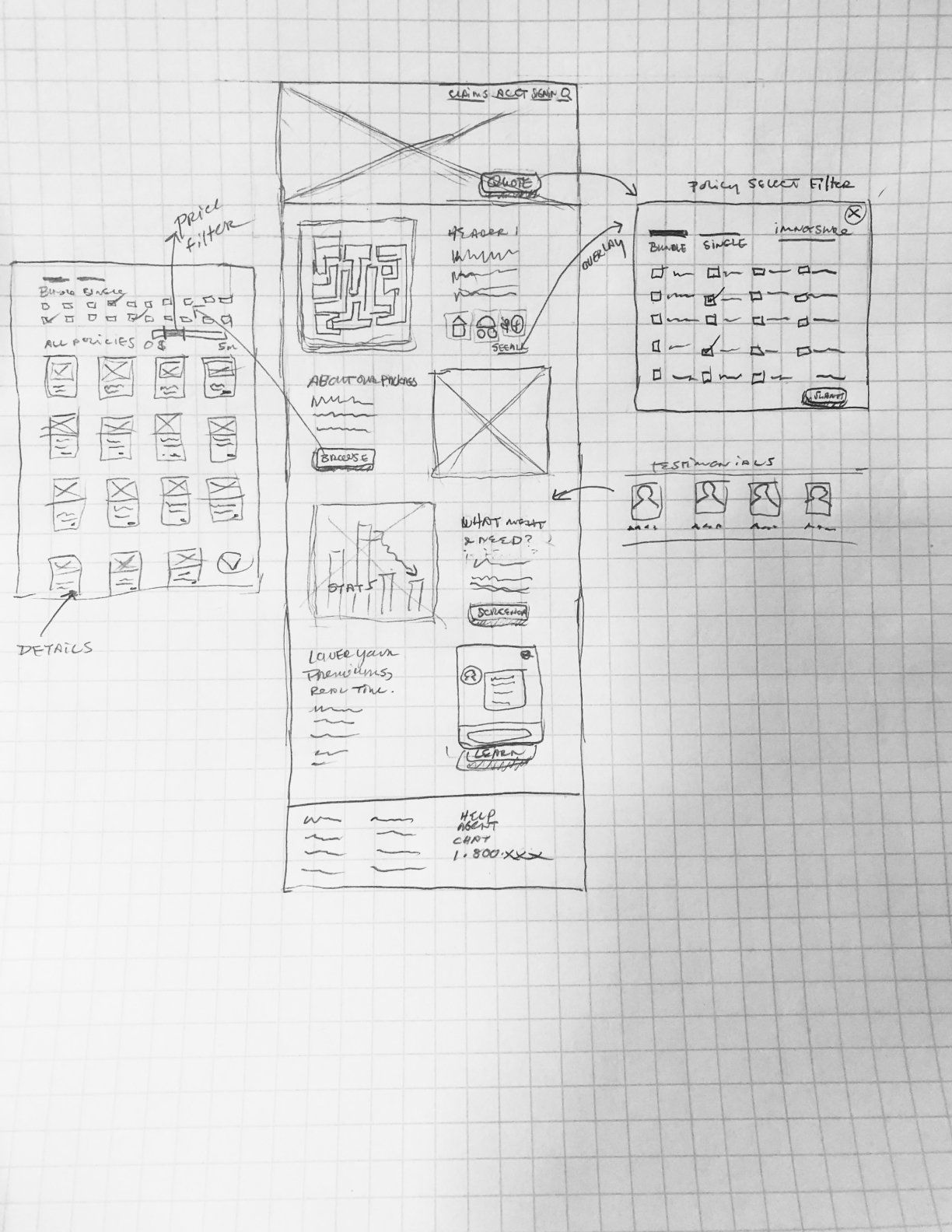
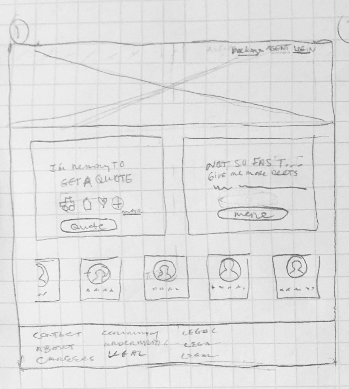
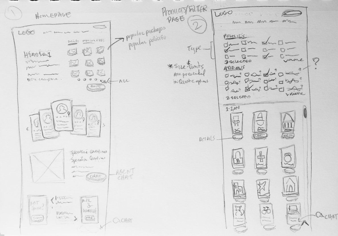
I explored homepage designs and various ways to appeal to both personas though "browse all" and direct to selection and quote options. I also sketched ideas for how an insurance product filter might work based on levels of coverage and types of policies with the product listings decreasing with every filter.
My Initial Wireframes
I designed 2 flows for the 2 personas. Taylor took the more direct path while Amy looked for more information on the homepage and then click "browse policies." From there, she could filter policies by her needs.

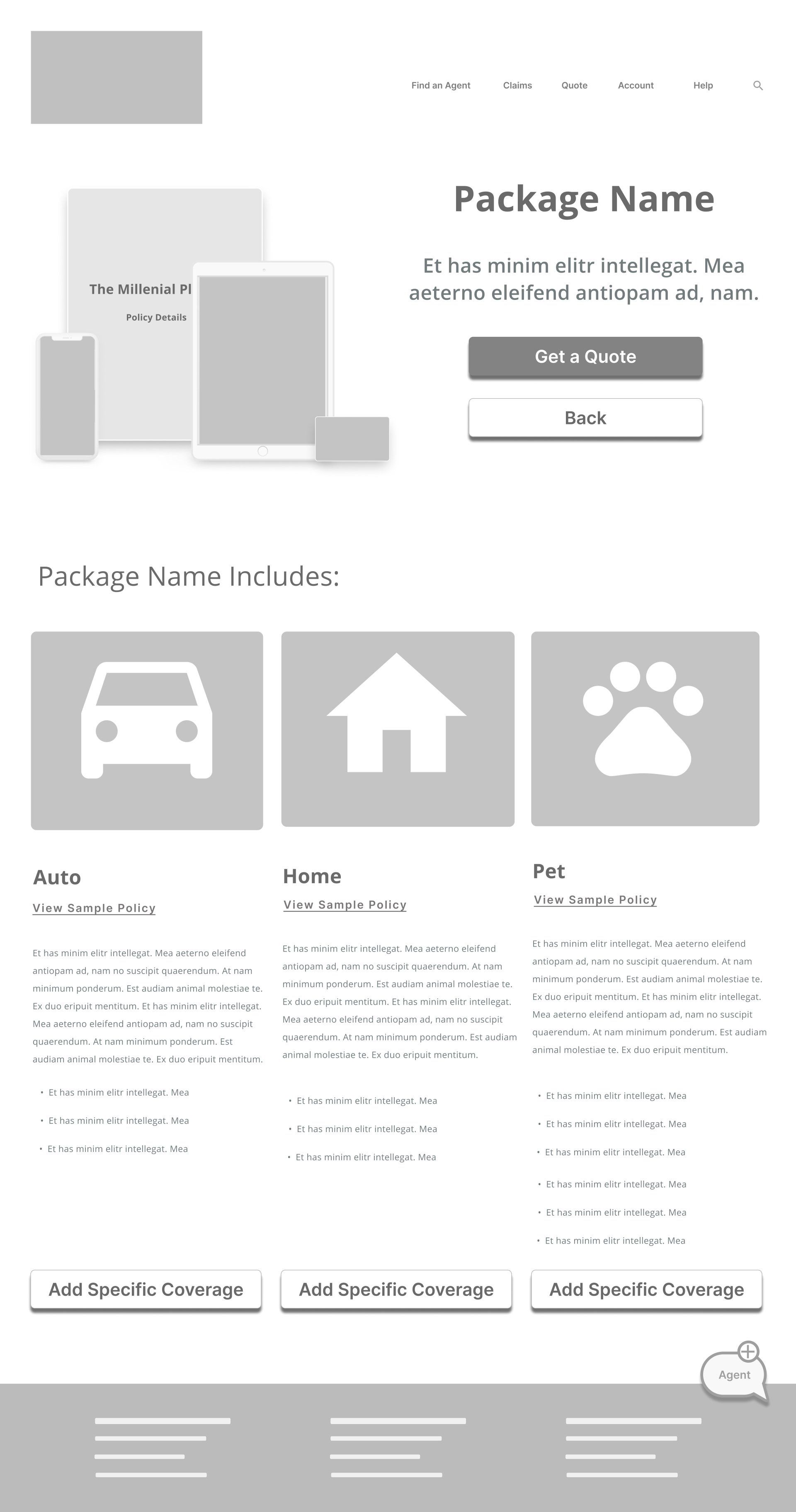
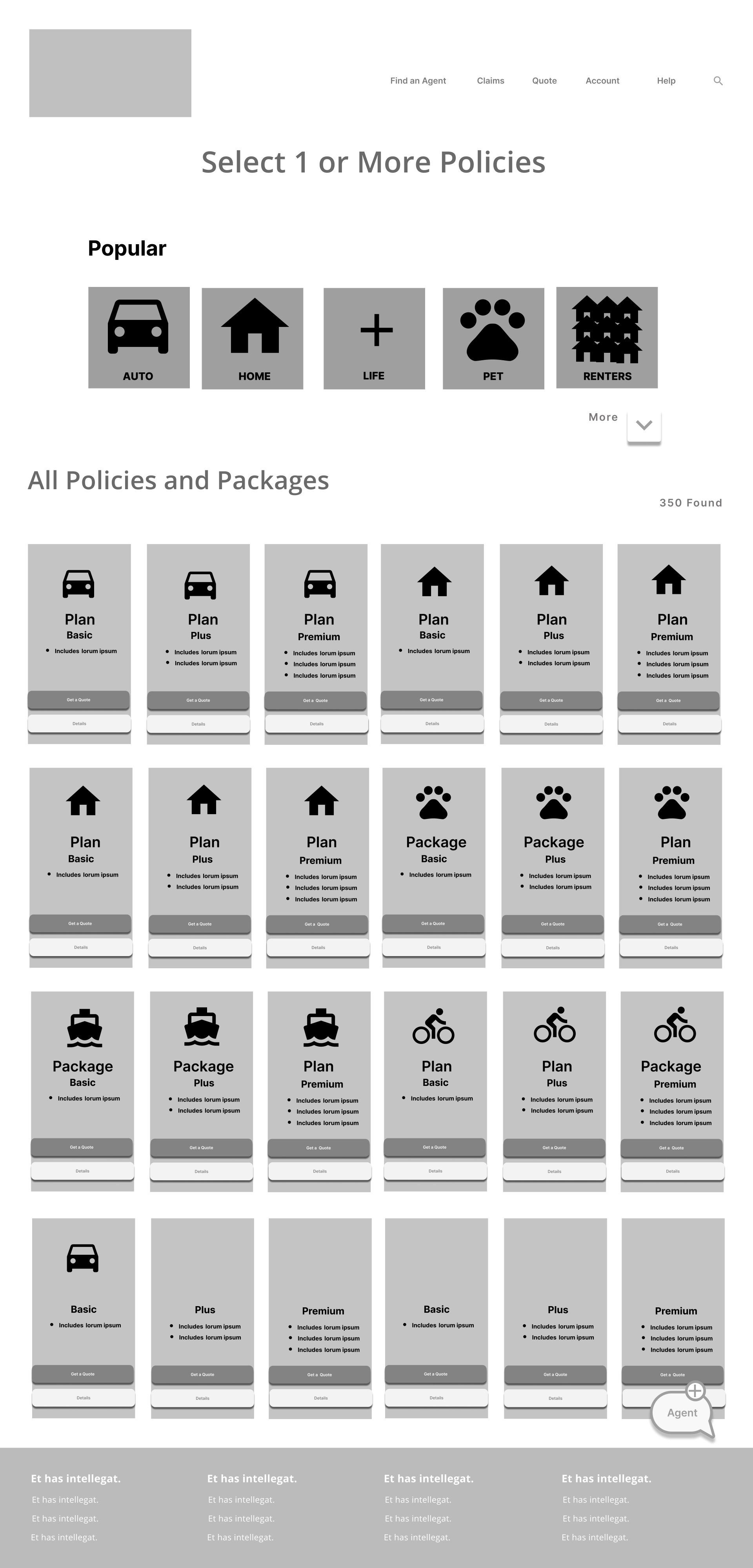
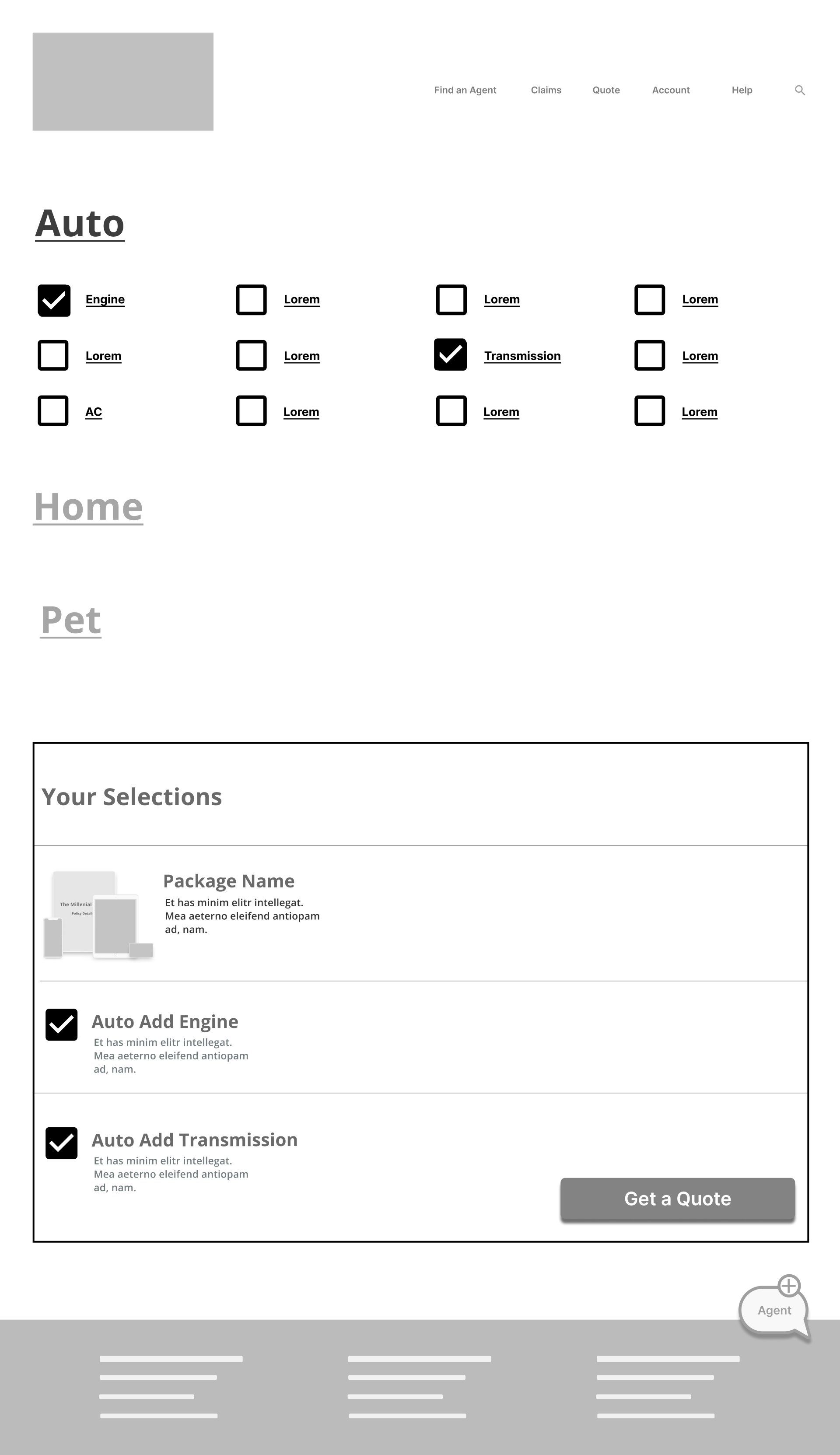
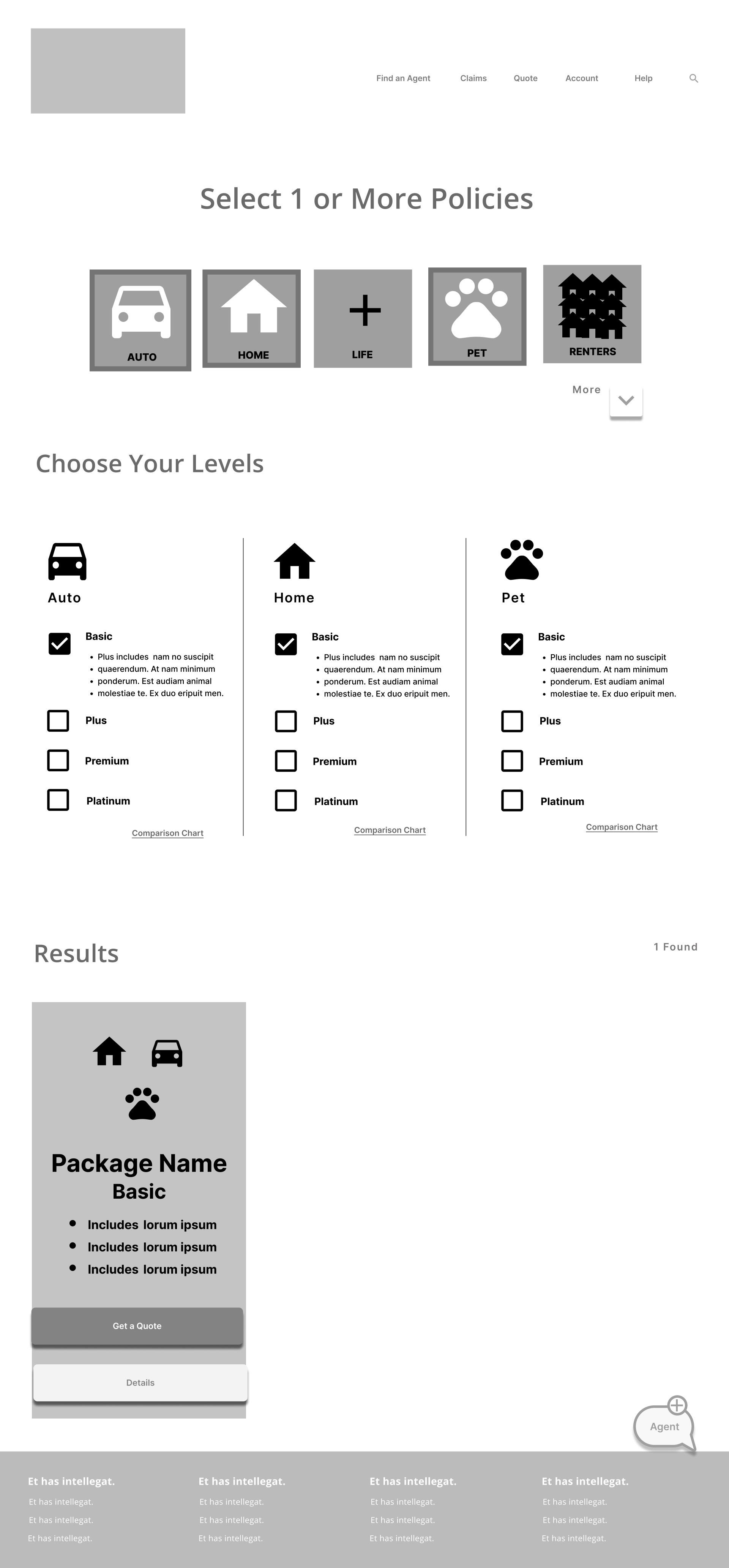
But my peers had some concerns...
The Solution
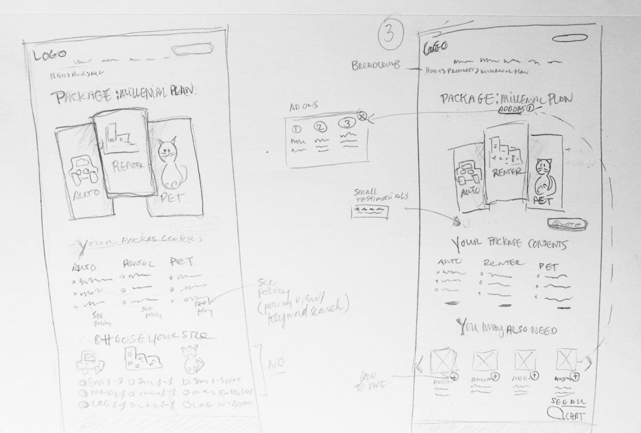
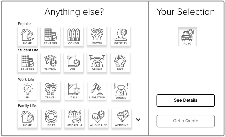
My mentor helped me conceive of a solution that was much more clear and simple for the user. Instead of thinking about the problem as a product filtering issue, I realized that letting the user "build" their own package was achieving the same thing without all of the overwhelming results.
Time to make it shine.
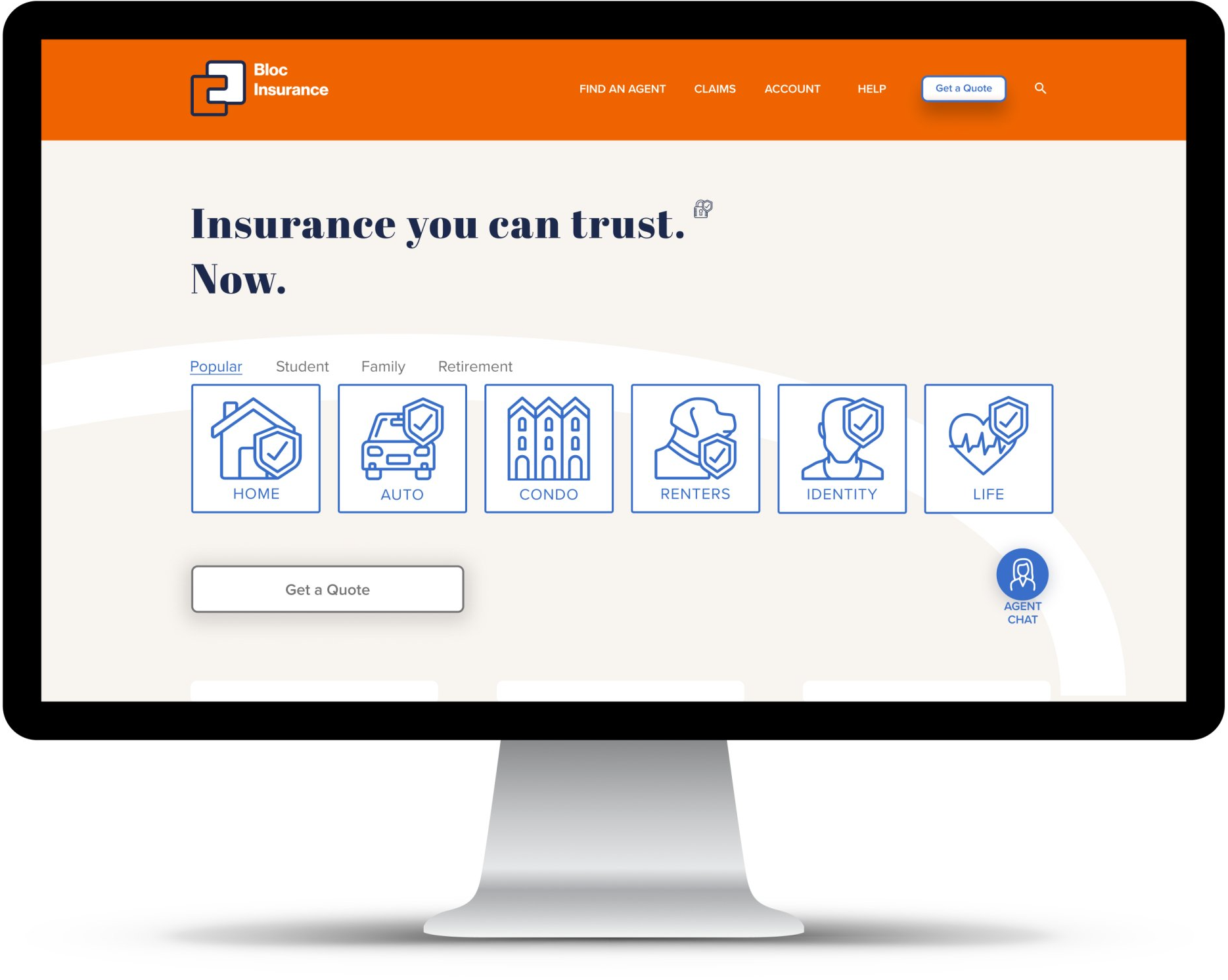
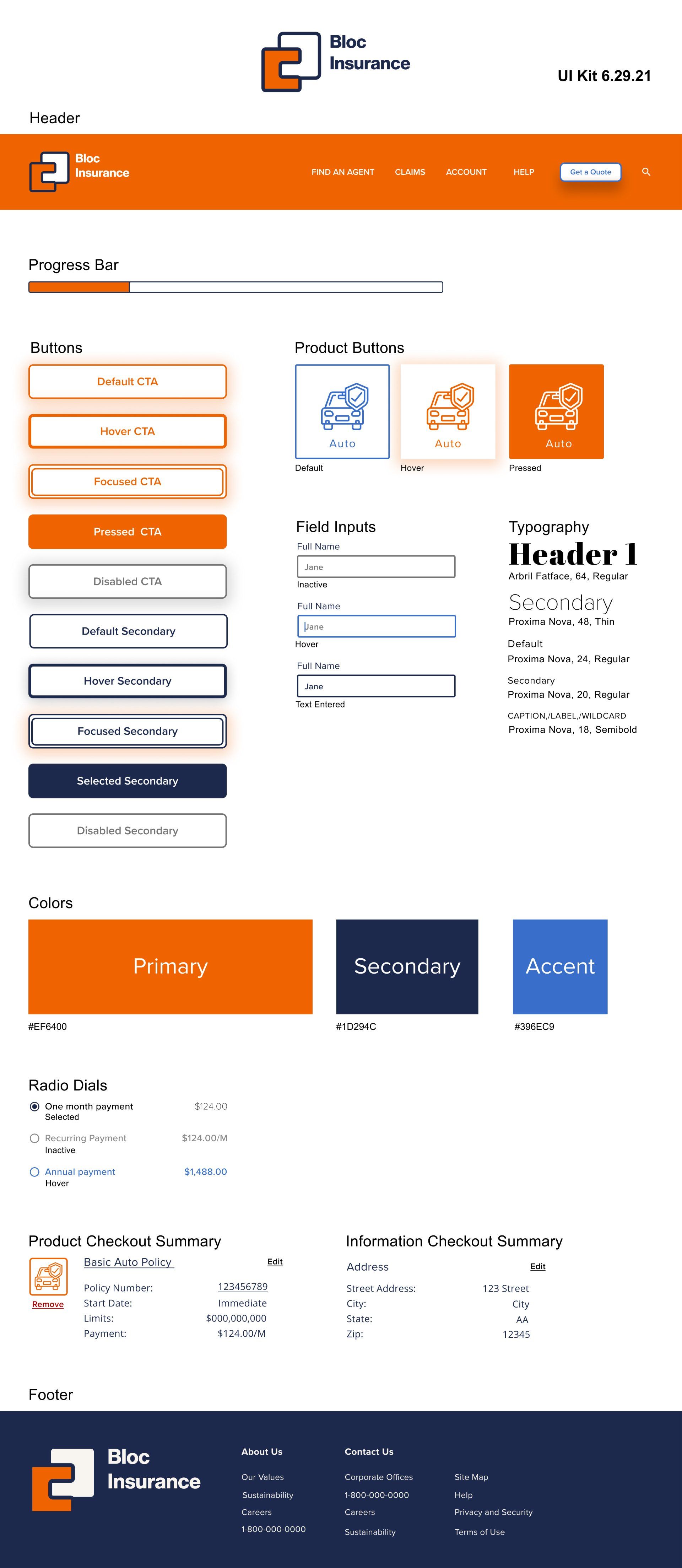
Bloc needed a rebrand. So I gave them one.
UI Kit
Then I made the prototypes
and tested.
Then I made the prototypes.
Hover over image to use prototype.
Hover over image to use prototype.
And tested.
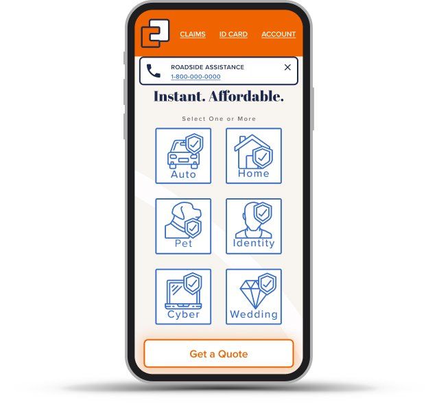
Mobile Testing
I tested the mobile prototype with 6 students aged 20-30 years old using Maze. I tasked the participants with selecting a policy and getting a quote. I considered the test results a success as expressed in these quotes:
"Nothing unexpected."
"Pretty straightforward."
5/6 thought the product was similar to another one.
4/6 found it “Very Easy” to understand.
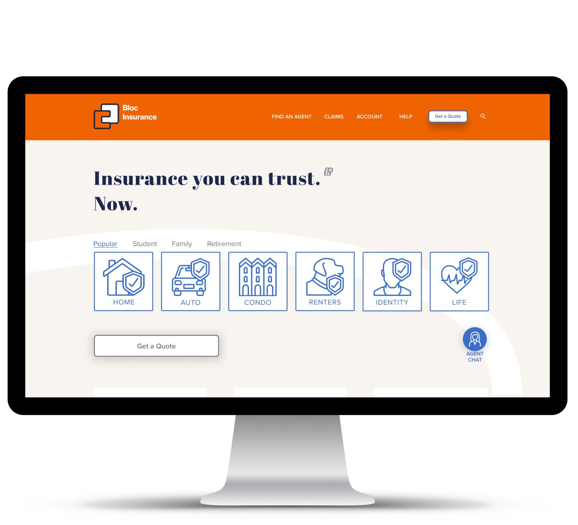
Desktop Testing
I tested the desktop prototype with 4 participants aged 30-41 years old using both remote and in person 1:1 interviews. I tasked the participants with browse site, get a quote for home+auto, and find policy details.
Notably, none of the participants scrolled on the homepage or on the policy selection page. Much of the homepage was irrelevant to them. I learned that persona 2 users were interested in more information between sites as opposed to within them and that they were interested in more information after the quote process (digging further into options after getting a "baseline" cost).
When shopping across sites, participants said they toggled back and forth between sites and took notes in various ways from pen and paper to printouts to .csv files.
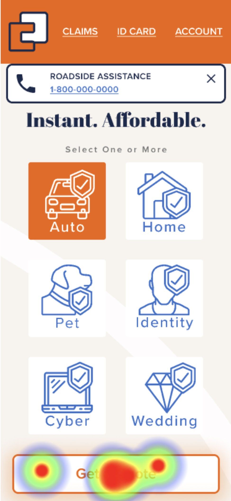
Participants also didn't know what the agent chat was. One participant was confused where to click on the homepage because the quote button was in an active state to get more attention as a CTA. Participants also wondered why policy details didn't immediately populate beneath their selections.
quote process (digging further into options after getting a "baseline" cost). When shopping across sites, participants said they toggled back and forth between sites and took notes in various ways from pen and paper to printouts to .csv files.
Participants also didn't know what the agent chat was. One participant was confused where to click on the homepage because the quote button was in an active state to get more attention as a CTA. Participants also wondered why policy details didn't immediately populate beneath their selections.
Desktop Testing
I tested the desktop prototype with 4 participants aged 30-41 years old using both remote and in person 1:1 interviews. I tasked the participants with browse site, get a quote for home+auto, and find policy details.
Notably, none of the participants scrolled on the homepage or on the policy selection page. Much of the homepage was irrelevant to them. I learned that persona 2 users were interested in more information between sites as opposed to within them
and that they were interested in more information after the
quote process (digging further into options after getting a "baseline" cost). When shopping across sites, participants said they toggled back and forth between sites and took notes in various ways from pen and paper to printouts to .csv files.
Participants also didn't know what the agent chat was. One participant was confused where to click on the homepage because the quote button was in an active state to get more attention as a CTA. Participants also wondered why policy details didn't immediately populate beneath their selections.
Desktop Solutions
- reduce desktop scrolling
- combine homepage with policy detail
- make agent chat more apparent
- add .csv and .pdf quote information options
- keep CTA button state inactive until policy icon is in hover state, then turn active
- add .csv and .pdf quote information options
- keep CTA button state inactive until policy icon is in hover state, then turn active
And iterated.
I cleaned up the UI on mobile and added the ability to select multiple policies to build a package.
I applied solutions from 1:1 user testing sessions to the desktop version.
Lessons Learned
The lesson I learned from this project is that more research on the front end of the project can save lot of time down the line. If I would have better understood the wider experience of insurance shopping, I may have avoided the assumption that 2 personas necessitate 2 paths from the start. There may be 2 paths, but it's important to identify where they begin, diverge, etc.
See More Work >>>
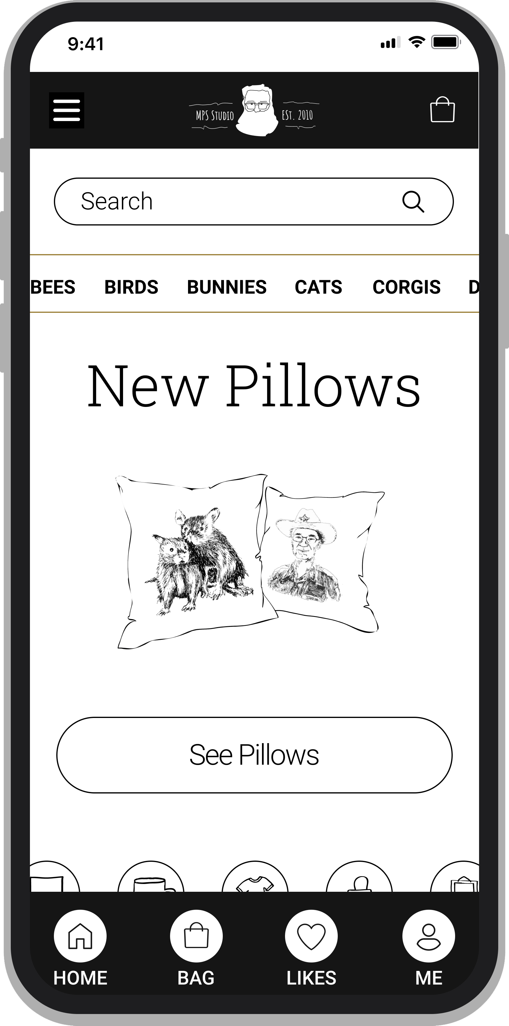
Montplaisair Studio needed a site independent of Esty to directly reach customers and better convey a unique brand.
"It's time I got a website."
-Client
See More Work >>>
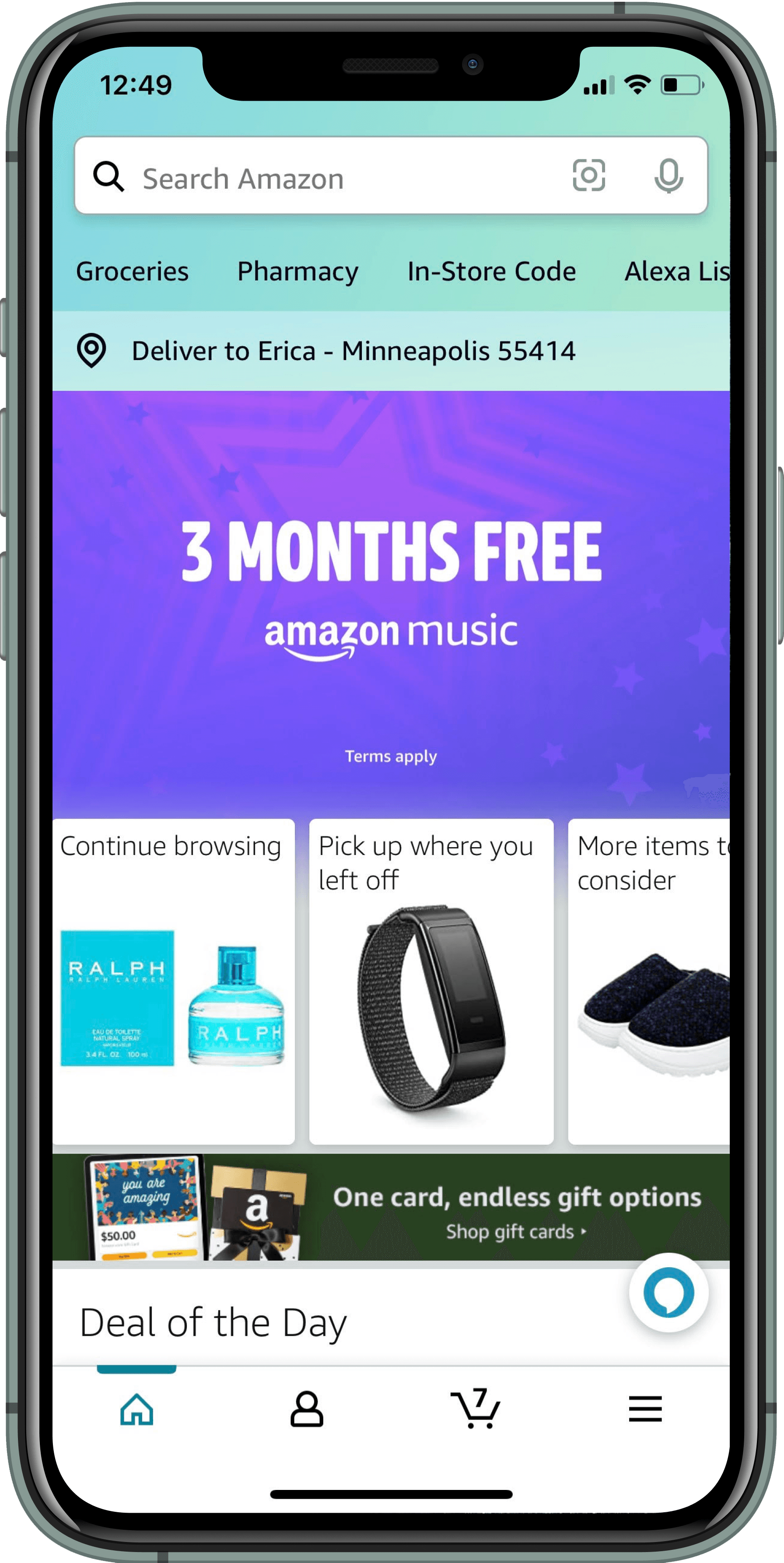
Amazon Prime gift givers wanted more out of their shopping experience. They needed reminders for important dates and product suggestions that were personalized to their gift recipients.
"So there has to be some sort of curated something for me to want to just randomly look."
-Client
